Issues
Silver Surfing
The archive of Danish company Georg Jensen – a maker of fine jewellery, watches, silver and steel homeware that has long been a purveyor to the Danish royal family – is in an undisclosed location inside its Copenhagen headquarters. To enter, written permission must be obtained and journalists have to agree that no windows are pictured in photographs of the space so as not to show neighbouring streets and inadvertently reveal its location.

The archive is currently in the company’s possession but an agreement involving the Danish government’s committee on cultural values in 2000, when the company passed hands from Carlsberg to Royal Scandinavia, specifies that any future owner needs to respect that it is an essential part of Denmark’s cultural history and must be kept on its territory. If Georg Jensen were unwilling or unable to run the archive, the Design Museum would have to approve what would happen to the more than 5,000 objects, 20,000 sketches, press clippings and miscellaneous memorabilia collected since the company was founded in 1904 by its namesake master silversmith.
The agreement ensures that the archive will stay rooted in Denmark, despite investment from abroad. The move shows some forward-thinking from the Danish design community, which, more than 23 years ago, foresaw the global appeal of Georg Jensen. The brand was bought by Finland’s Fiskars Group this September, having been owned by Bahrain-based private equity company Investcorp since 2012. And, since 2003, part of its production moved to Chiang Mai in northern Thailand (though all of its silver hollow-ware is still made in Denmark).
Despite these tight bureaucratic controls, the atmosphere when Monocle gains access to the archive is surprisingly laid-back.
Teapots, jugs, plates, cutlery, hollowware and more niche objects such as chauffeurs’ hats, baby rattles and cantaloupe knives are piled on shelves or displayed on tables and counters. A tan-leather Egg chair by Arne Jacobsen from 1958 sits in the corner near a small library, flowers decorate a central table and pictures on the walls imbue the space with the warmth and hygge of a Danish living room.
Georg Jensen’s friendly heritage and archive manager, Ida Heiberg Bøttiger, shows Monocle various silver pieces stored on shelves and in olive-green safes, explaining how every object links across time and aesthetic movements. “Working here, you can’t help falling in love with the history and the stories of the products,” says Heiberg Bøttiger, who assumed her current role in 2011, taking over from two retiring archivists who left her a manual of instructions, a paper model of the archive and a Post-it note with a phone number should she have any questions. “Passing that on is the best part of the job.”


In civic-minded Denmark, the decision to keep a design archive off limits to the public might seem out of step with the national character, especially when heritage firms such as Fritz Hansen are upping the ante by opening their own museums. But pieces from Georg Jensen are regularly found in public institutions in Denmark and beyond (latest example: the loan of jewellery designed by Nanna Ditzel in the 1950s for an exhibition at the Trapholt museum in Jutland). “This isn’t a public place,” says Heiberg Bøttiger. “For now we collaborate with museums and institutions such as the kea Copenhagen School of Design and Technology. I also spend a lot of time answering questions from customers who want to know more about the history of their Georg Jensen objects. That’s how we try to make our archive useful to the public.”
The true use of the archive, however, comes to the fore when new Georg Jensen pieces are being developed. On such occasions, the silverware and jewellery are handled and used as references. The company’s team of internal product designers also use its objects as inspiration when creating new tableware or expanding existing ranges. If a particular piece from the archive is being reissued, it is Heiberg Bøttiger’s job to pull out as much information as possible to help Georg Jensen’s silversmiths to craft it anew.
This year, a large tureen is being painstakingly recreated by silversmiths who have spent months hammering out the bowl and the intricate decorative details. And while the archive is expansive, it is not yet comprehensive; should a designer or silversmith need to refer to a design that’s not physically in the collection, an array of sketches, images, film negatives and composition notes can be used to help fill in the gaps. Finding them, however, can be a challenge: up until Heiberg Bøttiger took over the archive, every record was kept in an analogue format. “Everything up here used to be registered by pencil on paper,” she says incredulously. Over the past decade, she has been making strides towards digitising the inventory.
When designers are invited to collaborate with Georg Jensen, they start by visiting its smithy in Frederiksberg, just west of Copenhagen’s city centre. They are then invited to the archive to get a sense of the craft and history of the company. Despite being responsible for a collection of rarities and priceless objects, Heiberg Bøttiger is not one for being overly precious, allowing her visitors to touch and feel the silver without gloves, even if it leads to tarnishing. “Designers need to see with their fingers,” she says. “Some archivists swear that you should always wear gloves but, in my opinion, they make you clumsier. And we can always polish the silver when it’s time for display.”
One of the teapots in the archive belonged to regular Georg Jensen collaborator Henning Koppel’s daughter and shows the marks and traces of a long and useful life. Many of the preserved objects were designed to fulfil a specific daily function, be it as a tureen for soup, an eel dish or butter knife. “It’s not a matter of staying in the past; it’s a matter of understanding it so that we can create the future,” adds Heiberg Bøttiger. “Georg Jensen wasn’t founded yesterday. We’re proud of our heritage and history; it’s something we lean on every day.”
This spring, when creating a jewellery collection for Georg Jensen, Danish knitwear designer Amalie Røge Hove took inspiration from the silver beads found on the Moonlight Grapes range of tableware from the 1920s. A recurring collaborator, Danish architect and designer David Thulstrup, has dived into the archive on two occasions: once when designing Georg Jensen shops and, more recently, to create the silver sculptural hollow-ware piece Penumbra, released earlier this year. “Being Danish, I grew up with Georg Jensen in my veins,” says Thulstrup. “The archive is a treasure trove with an overwhelming amount of beautiful objects, many of which I had never seen before. I found inspiration from large hollow-ware made between the 1900s and 1940s and the more functional pieces by Sigvard Bernadotte, who worked a lot with very linear and strict shapes.” Penumbra, like any new addition to Georg Jensen’s expansive collections, will become part of the archive and, in turn, part of Danish silverware history.


It’s a prospect that might seem daunting, with new works landing alongside pieces by mid-century masters such as Verner Panton. “Designers like the challenge of creating for longevity,” says Heiberg Bøttiger. “Many of our silverware objects from the mid-century look contemporary and remain bestsellers to this day, such as the Pregnant Duck jug by Henning Koppel from 1952.”
Heiberg Bøttiger draws monocle’s attention to a tea set designed by Australian industrial designer Marc Newson. The rounded, hand-hammered silver pots, sugar bowl and creamer feature bases with rattan weaving and handles made from mammoth tusk (yes, you read that right). The five-piece collection was released in 2015 as a limited edition of 10 sets that sold for €93,500 each. “It wasn’t in the archive but it’s so special that we obtained permission to make the 11th iteration, so we could have a copy for reference.” Given how covetable such a tea set is, maybe keeping the location of this archive secret isn’t such a bad idea after all.
Warm reception
Loro Piana
Italy
Milan-based Loro Piana has repurposed old prototypes and knitwear leftovers into new items as part of Loro, a new capsule collection of recycled cashmere pieces for autumn. The process of upcycling surplus fabrics from the brand’s mills in northern Italy began with selecting individual items before unravelling each yarn by hue, categorising them by colour and respinning them with virgin, undyed cashmere to create high-quality blends. “This collection showcases our know-how and savoir-faire when it comes to fibre,” says the brand’s product development director, Alessandra Varianini. “We went through the materials manually to ensure that the textiles didn’t get stressed too much. This is a process that no machine can do.”

The new collection, the first of its kind for the brand, consists of jumpers, a scarf, hat and pair of lightweight trainers, all crafted using upcycled fibres. In true Loro Piana style, the colour palettes are neutral and the silhouettes relaxed. “We could not overdye the final yarn because that would affect the fibres,” adds Varianini. “Plus, we didn’t want anything too bright or decadent.”
loropiana.com
Perfumer H
Hong Kong & Taiwan
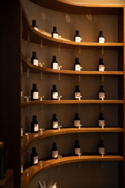
Based in London and known for its modernist retail spaces and unconventional scents, Perfumer H is now expanding to Hong Kong and Taipei. In-house spatial designer Kathryn Pell and founder and creative director Lynn Harris have been working on the shops’ interiors to marry the design signature that they established in London with new features and local materials. In Taipei, the boutique’s front desk and display cases are made using batu wood, while its façade is framed with handmade clay tiles. Inside, olfactory testing shelves feature handblown glass bottle stoppers suspended in test tubes.
Behind a pair of linen curtains in the new Hong Kong shop, you’ll find a laboratory where Harris and her team prepare bespoke formulas and refill candles. “Our clients appreciate the level of detail, from the product to the shop design; they want something that highlights their individuality,” says Harris, who looks to Taiwan, Hong Kong and Japan for inspiration.
perfumerh.com
APC x JW Anderson
France & UK

Jonathan Anderson is the latest designer to participate in APC’s ongoing collaboration series – or “interactions”, as the Parisian label likes to call them. Anderson was thinking about his own dream wardrobe when designing the line with apc founder Jean Touitou. It ranges from rocker-inspired fitted biker jackets to looser knits and traditional British duffle coats made with rough, textured wool. The Northern Irish designer, whose JW Anderson label is known for its experimental silhouettes, also encouraged APC to divert ever so slightly from its purist design ethos, adding raw edges on denim and bursts of colour on knitwear. “Thanks to Jonathan, we were able to go a little further than usual,” says Touitou.
“Our work meetings have been like a very quick and productive ping-pong game. When I brought an idea, he immediately transformed it into something better,” adds the designer, who sold a majority stake of APC to LVMH investment fund L Catterton earlier this year.
apcstore.com

Descente
Japan

Osaka-based skiwear brand Descente works with designer Mitsuru Yamada on its line of everyday clothing, Descente Allterrain. Yamada, who developed the outerwear worn by Japanese athletes at the 2010 Winter Olympics in Vancouver, is best known for his ability to marry technical materials and sportswear details with more classic designs. This black suit is a stellar example: it is made from a quick-drying polyester twill, a utilitarian fabric that was initially developed by Descente for the slopes. Better suited to streets (and boardrooms), it’s also wrinkle-free and has a hidden elastic waistband for extra comfort. We will be wearing this handy two-piece on our next transpacific flight and keeping it on to attend business meetings. All terrain, indeed.
allterrain.descente.com
Maison Kitsuné x Barbour
Japan & UK
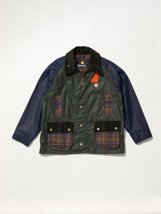
French-Japanese label Maison Kitsuné is lending its irreverent spirit to Barbour’s waxed jackets as part of a newly launched autumn collaboration. The capsule collection consists of waxed jackets updated with oversized fits, sharp military jackets featuring playful tartan linings, as well as matching bucket hats and soft Shetland wool jumpers. The Maison Kitsuné fox, the label’s popular mascot, has also been embroidered across sweaters and T-shirts – all dressed up in a sage-green Barbour jacket.
barbour.com
Burberry
UK

Burberry’s autumn/winter collection, the first designed by chief creative officer Daniel Lee, has made its debut. The launch is part of Burberry’s extensive rebrand, which includes a new logo, refurbished London flagship shop and a return to the equestrian knight motif. Lee, who grew up near Castleford, where Burberry’s trench coats are made, is striving to reclaim its British identity, having shot campaigns against London landmarks and taken over the Bond Street Tube station.
On the sartorial front, there has been a return to brand classics too, with check patterns and smart gabardine overshirts taking centre stage. We have our eye on a loose forest-green car coat.
burberry.com

Shiro
Hong Kong
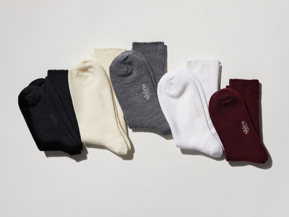
Are these the perfect socks? They are made in Brescia, Italy, using the finest merino wool and are inspired by the spirit of US sports. “I wanted to create something that customers could get pleasure out of daily,” says Shiro’s founder, Jonathan Kam. “I love the idea of an item that’s so indulgent yet hidden within a shoe.” Kam came up with the design after seeing a pair of sports socks from 1985, which inspired the fit: neither too baggy, nor too tight, with an ultra-soft feel. Offered in a variety of neutral colours, Shiro socks are now available on the brand’s online platform and in speciality shops worldwide. Head to the Clark Street Mercantile in Montréal or Chickee’s Vintage in New York to replenish your sock drawer.
shiro-webshop.com
Prime time
As modern luxury develops, traditional values of handcraft and timeless design are gaining renewed relevance. It’s partly why the watch industry has continued its growth trajectory despite wider economic challenges, ranging from inflation to the effects of the coronavirus pandemic. Indeed, waiting lists for classic designs – be it a Rolex Daytona, Cartier Tank or Audemars Piguet Royal Oak – have never been longer.
Luxury fashion houses are venturing into the category to take advantage of the lucrative opportunity. Gucci, for example, has just opened a manufacturing facility in Cortaillod, Switzerland, while Louis Vuitton is investing heavily in the sector with its new range of sporty Tambour watches.
This recent flurry of activity has resulted in a wider range of designs and prices, opening up the market to new audiences. Today brands are investing in training the new generation of watchmakers, offering more playful designs and experimenting with innovative retail concepts – Jaeger-LeCoultre, for instance, has recently opened a pop-up shop, café and cinema at London’s Battersea Power Station. Female watch buyers have also risen in prominence, so jewellery watches and an array of delicate, art deco-inspired designs are diversifying the market even further.
Demand is rising but the sector remains far from the point of saturation. “This is probably the market with the biggest growth potential,” says Antoine Pin, managing director of Bulgari’s watch division. “The creation of timepieces has sustainability at its essence, so these are products that represent very modern values. Part of the beauty of it is that you can simultaneously invest in new technologies and handcraft principles established hundreds of years ago. From a strategy perspective, that makes the business future-proof.”
Here, we speak to Pin, alongside executives from Japanese luxury watchmaker Grand Seiko and Paris-based Van Cleef & Arpels, to find out how they are carving their own niches in the competitive sector – and where the biggest opportunities lie.
The value of a high-low strategy

Antoine Pin
Managing Director
Bulgari watch division
Bulgari made headlines last year when it released the world’s thinnest watch, a version of its Octo Finissimo with its octagonal case reduced to 1.8mm. “It helped us to make enormous improvements in the way that we’re manufacturing all of our products,” says Antoine Pin, managing director of Bulgari’s watch division. “It’s a divisive watch but we’re passionate about design, so we love to push the boundaries.” Since its launch in 2014, the Octo Finissimo has become a brand signature and is coveted by collectors. “I wouldn’t call it an ‘icon’ because it can take a long time for icons to establish themselves but it has made a mark on the industry,” says Pin.
This year the Italian brand has been looking to new segments of the market, from chiming watches to entry-level timepieces such as the Octo Roma, which was given a design refresh and is priced between €7,900 and €9,970. “We decided to differentiate it from the Octo Finissimo by softening the edges, tweaking the case and ensuring that every element is considered to make this the most exceptional design at this price range,” says Pin. He points out the watch’s easily interchangeable straps. “Versatility is important because when you are buying a watch at this price point, it might not be your first but it’s probably not your 10th either.”
Bulgari is going against the current. Most of its luxury peers have focused on the premium end of the market, which is less likely to be affected by challenging market conditions. “The entry-level segment is actually more important during tough economic times,” says Pin, who warns of a 10 per cent rise in costs across the sector and a “shortage of everything”, primarily manpower. “You have to get new customers onboard and explain to them the value of watchmaking,” says Pin. Offering entry-level watches might be a strategic move but it also reflects the Italian house’s broader ethos. “The passion for watches shouldn’t start at €20,000,” he says. “We need to find ways to be cost-efficient and offer as many products at between €4,000 and €10,000 as we do €50,000 ones. It might be easier to remain a niche premium brand but that doesn’t align with our values.”
Instead, the brand is betting on personal relationships, whether that’s with a customer who is starting their journey as a collector or the next generation of artisans. The company has recently appointed a new head of education for its watch division, dedicated to training apprentices, helping employees to diversify their skills and giving retirees the opportunity to stay involved by teaching. “At the end of the day, luxury is about people,” says Pin.
bulgari.com
Catering to the women’s market

Nicolas Bos
President and CEO
Van Cleef & Arpels
When French jeweller Van Cleef & Arpels started focusing on developing ambitious complications for women’s watches in the 2000s, many raised an eyebrow. “The consensus was, ‘No, you’re not going to create such complicated movements for women – it doesn’t work like that,’” says Nicolas Bos, the company’s president and ceo. “But we tried anyway.” The brand had identified an opportunity in giving the underdeveloped women’s market a distinctive design perspective. “A woman’s watch isn’t necessarily a man’s watch made in a smaller size, with a pink dial and some diamonds on the bezel,” he says. “You can offer an entirely different point of view.”
These days, Van Cleef & Arpels regularly has one of the busiest booths in Geneva’s Watches & Wonders fair, where collectors line up to see its one-of-a-kind objets d’art and watch collections. Much of the excitement this year revolved around the re-edition of the Ludo, an art deco bracelet launched in the 1930s, featuring a hidden watch. The house has carved its own niche with jewellery watches but has equally become far more confident in its capabilities as a watchmaker, with a growing in-house workshop that specialises in engraving and customising movements.
Demand for the brand’s watches has steadily increased as the sector has begun to pay closer attention to female customers. “In the past 20 years, the wider industry has realised that women exist,” says Bos. “Now there is no brand that doesn’t have its own versions of feminine watches. That has opened up the market. There are more perspectives and designs that are less driven by commercial strategies, and larger audiences. It used to be all about big watches one year, then chronographs the next. But today every brand can express its identity more freely.”
These changes in the market – coupled with a global fascination for heritage brands such as Van Cleef & Arpels, which was founded in 1906 on Paris’s Place Vendôme – have created lucrative growth opportunities for the Richemont-owned business, including in Asia. But growth doesn’t always have to be the “ultimate objective”, says Bos, who believes that brands should focus more on simply “maintaining their activity and continuing to exist”. New opportunities are cropping up in markets such as India, which is just beginning to open up to European luxury houses. “We’re going to see a period of stability,” says Bos. “But we are confident enough to continue investing in the future. That means plenty of new collections, workshops and training schemes for young craftsmen.”
vancleefarpels.com
The power of brand Japan

Akio Naito
President
Seiko Watch Corporation
You might think of Grand Seiko as a relative newcomer. Though the luxury brand has been operating in Japan since the 1960s, it made its international debut in 2010 – and it wasn’t until 2017 that it started to command the attention of retailers and collectors in the West. Its roots go back to 1881, when Kintaro Hattori, founder of the label’s parent company, Seiko, opened a shop in Ginza that sold and repaired watches. He created Japan’s first wristwatch in 1913; the company also launched the world’s first automatic chronograph with a column wheel and vertical clutch in the 1960s.
Despite this heritage, establishing Grand Seiko as a premium label in a global market dominated by Swiss timepieces was an uphill climb. “Seiko’s existing business focused on mid-market department stores, so it was hard for us to build luxury distribution for Grand Seiko,” says Akio Naito, president of the Seiko Watch Corporation. “Retailers assumed that Japanese watch brands could only operate in that mid-price range.” Yet a new logo and a series of events with watch connoisseurs who saw the value of the brand’s meticulous designs created new momentum. “We showed that we had cult followers across the US,” says Naito. “That convinced retailers to start working with us.”
For collectors, the company’s Japanese heritage is a major draw. “These are people who don’t trust big celebrity campaigns,” says Naito. Brand Japan has consequently become a key part of Grand Seiko’s identity. “Today the country isn’t just an exotic place in the Far East. Ramen, animé and sushi are part of people’s everyday lives and there’s a better understanding of our craft heritage.”
Naito has been focusing on expanding the brand’s global retail footprint with boutiques on London’s Bond Street and New York’s Madison Avenue. He has also negotiated its presence at the Watches & Wonders fair. “It was important to get the same treatment as the Swiss brands,” he says. “After six months of discussions, we became the first non-European brand to attend.”
Interest in the art of watchmaking is particularly strong in Japan, so Grand Seiko doesn’t have to contend with a shortage of new talent like most of its European counterparts. “I have no concern about keeping up with increased demand,” says Naito, proudly citing the Japanese team’s ongoing pursuit of design perfection and the recent launch of the Kodo watch, which won the chronometry prize at Geneva’s Grand Prix d’Horlogerie last year. By reaching these milestones, the brand is claiming its seat at the watch industry’s top table and creating a new generation of classics along the way.
grand-seiko.com
Light touch
Barbara Arts only had to see the front door to know that she wanted to move in. In Lier, a medieval town on the outskirts of Antwerp, the house is hard to miss. Its polished stainless- steel door, which is flanked by pillars clad with golden tiles, distinguishes it from the town’s brick townhouses that line the river Nete. Arts lived around the corner with her husband, Gregory D’Hulst, and two children, and would often walk by. When the house came up for sale, she didn’t hesitate to take the whole family for a viewing. That was when her 11-year-old son, who proved less enthusiastic about the entrance, tried to put a stop to the plan. “Our youngest didn’t go further than the hallway,” says Arts. “He said he would never live here.”
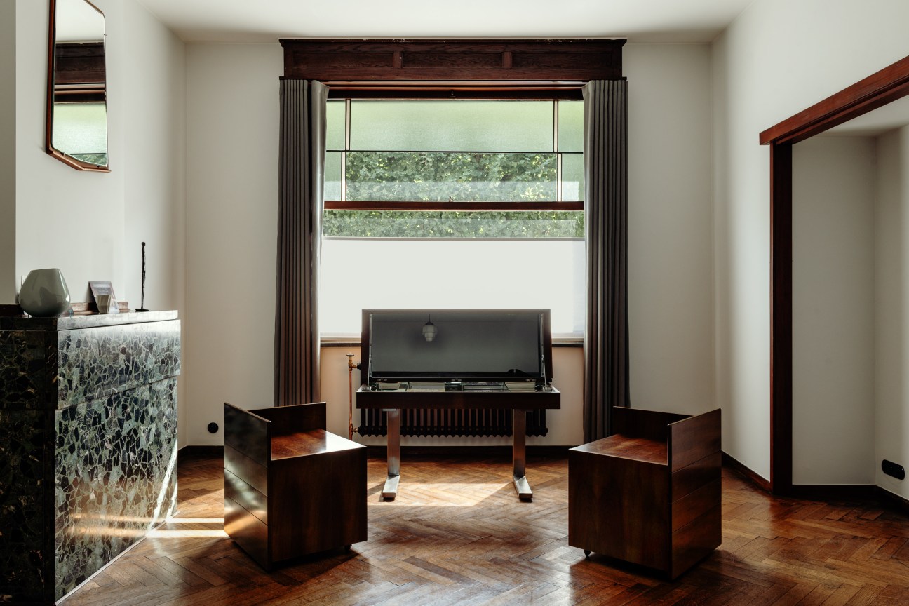
What put him off was exactly what charmed his parents. The vault-like door opens onto a dim hallway with wood-panelled walls, dark-green terrazzo floor and old, scuffed-up furniture. The house was designed in 1932 by Jozef Meulepas, who served as the city architect for much of the first half of the 20th century (who else to have the most eye-catching entrance in town?). Meulepas stuck to a quite conservative, neoclassical style in the buildings he planned around Lier but when it came to his own home, he revealed a taste for the avant garde. The house combines art deco elements – that gilded entryway – with hallmarks of modernism, visible in the streamlined balcony railings above. The house had remained in the family (a recent resident was Meulepas’s octogenarian niece) and was almost fully preserved, down to the stained-glass window, yellow kitchen tiles and even an in-built aquarium in the stairwell. Such features saw the house placed under monument protection in 1995 as an example of early modernist architecture. So, despite their son’s protests, Arts and D’Hulst didn’t budge but negotiated. “We had to promise him a dog,” says Arts, laughing.
Having overcome their first obstacle, Arts and D’Hulst set out to tackle the house itself. The couple were well suited to the task: Arts is an executive architect at Bureau Bouwtechniek, where she focuses on major renovations such as, most recently, Antwerp’s Royal Museum of Fine Arts. D’Hulst grew up near Lier and his brother, David, is an architect with a solo practice, Studio Ambacht, that specialises in residential projects (the couple met through David, who was Arts’s friend at architecture school). The building’s listed status still left room for modernisation: the rear of the structure had been cheaply modified in the 1970s and didn’t fall under heritage protection. “We probably wouldn’t have moved here otherwise,” says Arts. Everybody agreed that the house needed more light.
For David, the commission combined two potentially tricky clients: a sibling and another architect. But the collaboration ran so smoothly that the trio look perplexed when asked whether there were dust-ups. “I’ve always seen it as something positive that we were many architects focused on this project,” says David. “We were all working towards the same goal.”
The renovation’s challenges, instead, were caused by bureaucracy. In Belgium, buying a listed building is incentivised with a tax credit but to qualify for it, the new owners’ previous home has to be sold within a year. “It had to be a lot faster than usual,” says David. In December 2020, three months after purchasing the house, Studio Ambacht filed a planning application for rebuilding the back façade with glass, extending the first-floor bathroom by reducing the number of bedrooms from five to four, and adding a roof terrace. Soon, an inspector from the heritage protection office came on site to catalogue the valuable parts of the building. With a few tweaks – all corners of the kitchen had to stay, for instance – the scheme was given the green light.
D’Hulst brought in a trusted local building firm, Oostkaai. The kitchen was opened up by taking down one wall and putting in a sliding glass door (the yellow wall tiles were saved and tucked into a basement cupboard for any future needs). What had been a storage room behind the kitchen became a light-filled sitting area with a sunken floor, double-height window and a skylight. Next to the kitchen was a small patio, built in the 1970s, where orange floor tiles were replaced with a muted terrazzo, and the space turned into a glass-walled winter garden. The most stressful moment, says David, was when the high glass panes had to be lifted over the building into the garden and fitted, with very little room for error.


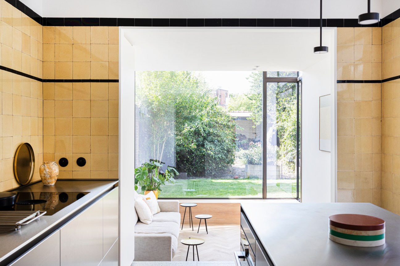
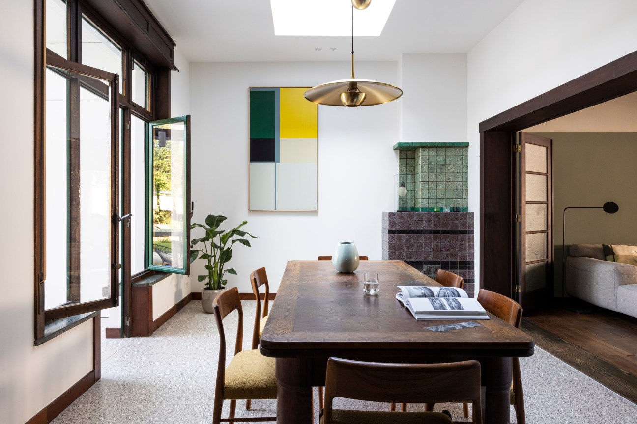


Meulepas kept a meticulous archive and when Arts and D’Hulst bought the house from his heirs (all 11 of them), they handed over a trove of plans, invoices and receipts from the original construction. Despite the heritage protection, Arts and D’Hulst didn’t need persuading that as much as possible needed to be saved: Meulepas hadn’t been stingy with materials and many features would be impossibly expensive to put in today. Additions in most rooms are negligible; in the bathroom, a bathtub of solid yellow terrazzo was simply fitted with a new tap. Even where the finishes needed updating, the interventions were minimal. In the bedrooms, a brown laminate floor was peeled off to reveal wooden planks that only needed to be sanded; the old wallpaper had been covered up but preserved.
The touch-ups only served to highlight Meulepas’s original design. “He was really inventive,” says David. In the downstairs dining room, part of the ceiling is lowered and painted a mint green with wooden accents. Directly upstairs is a wooden bench running along the side of the wall. The bench was Meulepas’s way of cleverly integrating a large concrete structural beam into the interior. Interestingly, almost every room has what looks like an enclosed stove, even though the house is heated with radiators. The new owners suspect that the faux fireplaces, built with terrazzo and glazed tiles, were designed to have no other function than to create the warming sense of a hearth in the house.
Once the renovations were complete, the furnishings fell into place quickly. Sofas and beds were driven over from Arts and D’Hulst’s old house a few hundred metres away and thanks to all the built-in cabinetry, not much more was necessary. Meulepas’s old dining table still stands in the living room, now flanked by mid-century chairs. Under the bathroom’s new corner window stands a rattan lounger. The trickiest part was to decide on kitchen counters that would neither imitate nor clash with the 1930s interiors. It was Arts’s idea to put in a brushed-aluminium kitchen from German firm Bulthaup, which both echoes the house’s stainless-steel front door and goes surprisingly well with the sunny yellow tiles. “When the morning sun comes in, it all looks golden,” she says.
When Monocle rings the doorbell next to the sizeable steel plaque saying “J Meulepas”, there’s no time for handshakes before Luca, an excitable sheepdog, bounds up. He’s no longer a puppy: the family moved in more than a year ago, having just made the tight 12-month deadline for the renovation. Now only the hallway remains dark, while the rest of the rooms are bathed in light. For the most part the house has kept its personality: the stately bureau of the city architect now stands in the upstairs office. “The heirs are happy that an architect is again living in the house,” says Arts.
And how about the children? Today their son is finding little cause for complaint in the historic house and goes to school in a building also designed by Meulepas. “He’s totally fine, of course,” says Arts. The wonders that one year, and a dog, can do.
City architects’ houses
Jozef Meulepas isn’t the only city architect to have designed a grand house that proved to be the envy of the municipality. Here are three other visionary residences.
Villa De Wikke
Willem Marinus Dudok
A leading figure of Dutch modernism, Dudok became city architect in Hilversum in 1928. Here he designed the structure and furniture of the municipality’s Town Hall, which was completed in 1931. In addition to his civic work, he also completed a number of houses, including his own, Villa De Wikke. The home, whose gabled roof drew parallels with the work of US architect Frank Lloyd Wright, also served as his architectural office.
Dom Hilarego Majewskiego
Hilary Majewski
Majewski served as city architect of Lodz, a compact industrial centre in central Poland, between 1872 and 1892. He is credited with shaping much of the city’s identity, overseeing the construction of its grand central hotel, high-end residences and factory buildings. Many have since been converted into museums and galleries, including his own stately home, which is defined by beautiful stained-glass windows, baroque details and parquet floors.
Gegerfeltska Villan
Victor von Gegerfelt
City architect for Gothenburg in the late 19th century, Von Gegerfelt built his family home near the city centre. An imposing, boxy house in the renaissance revival style, it is now one of the few grand villas remaining inside the city’s historic centre. It received heritage listing in 1967.
Tests of time
The storyteller
Renzo Piano

Renzo Piano was always going to be an architect. The octogenarian Italian designer – whose studio, Renzo Piano Building Workshop, has offices in Paris and his hometown of Genoa – was born into a family of builders. “I grew up with this idea of the architect-builder,” he tells Monocle from a sunny meeting room overlooking the Ligurian Sea. “For me, making buildings has always been enjoyable but it’s also about building a better world. If you do not believe in doing that, then you are in bad shape to be an architect.”
It’s an ethos that is evident across his portfolio; projects are largely public-facing, including the Centre Georges Pompidou, which was completed with Richard Rogers in 1977 and which Piano affectionately refers to as Beaubourg, the name of the Parisian district in which it is located. There’s also The Shard in London (2012), Athens’ Stavros Niarchos Foundation Cultural Center (2016) and the newly opened Istanbul Modern, a shimmering art museum on the Bosphorus that has brought much-needed energy to the portside Beyoglu neighbourhood.
Piano’s civic and culturally minded approach to architecture also saw the 1998 Pritzker Architecture Prize-winner appointed a senator for life in Italy in 2013 – a more than appropriate post for a man whose work has helped to shape cities and countries for more than 60 years.
Tell us about your approach to architecture.
In my view, architecture is about telling stories. There is no building in the world that doesn’t tell a story. Even the most modest hut is telling a story – it’s not just answering a need but answering the desires and aspirations of the person who lives in it. Architecture is a profession where you need to be very serious about seeking truths. You also need a vision of humanity and a better place to live.
How does this studio in Genoa, a tiered structure tucked into the hillside and filled with natural light, tell a story about you? It has been the office of Renzo Piano Building Workshop since 1991.
Architecture is, in this case, like an autobiographical story. We don’t have a road that comes up to the studio; we have the funicular – it’s total madness. As a child, after the Second World War, I remember spending a lot of time with my father on building sites and, for me, that was pure magic: one day you see nothing but sand, bricks and stone, and the next morning there would be something standing up. It was a miracle and I developed this idea that there’s not much of a distinction between the architect, the engineer and the builder. You mix every discipline – and you can see that in my office.
So the architect isn’t just an architect?
Correct. You change every five minutes. You’re a designer, a philosopher, a builder – you’re always mixing things. It’s the same for other disciplines. If you talk to a great film-maker, they always speak about light and shadow at the same time that they discuss camera equipment and filming techniques. It’s about mixing technique with technology for a final emotional result.


Tell us about what was required on your recently completed Istanbul Modern.
The first thing that we thought of for this job was the way that light hits the Bosphorus and how the building was going to play with that and the constant movement of ships on the salty water. In some ways, the panels on the building are like silver fish jumping out of the water and catching the light. But this is only part of the story because the most important aspect, perhaps, is the role of this building in a city like Istanbul. It’s a place where you go to meet other people, to share values, to enjoy the beauty of the artwork, the music, the cinema and the other people that are in the building. The word “beautiful” in Turkish, as well as in Greek and Italian, does not just refer to beauty in terms of what you see but also beauty on the inside. When you make a place for people to come together, like Istanbul Modern, you create something for beauty in that wide sense of the word.
Speaking of the role of a cultural building in the city, how did you embed the Istanbul Modern into the life of the Turkish metropolis?
We started thinking about making the building “fly” – because if you make the building fly, it frees up the ground beneath and around it, and becomes part of the city. Transparency was also essential in terms of accessibility and openness. Old public and cultural buildings are often big and made from marble – they are asking for respect but are also intimidating. But this idea, of making a building that is like a flying vessel, naturally creates a place that isn’t intimidating and where people are attracted by their own curiosity.
Is this an approach that can be found across your whole portfolio?Beaubourg was also a flying vessel. It was completely out of place at the time it was built but it was necessary because we needed to make a statement about public buildings for culture and art – these needed to create curiosity and be open, accessible and not intimidating. What has remained the same across my projects like the Menil Collection in Houston and the Whitney Museum in New York is the idea that a public place or a place for culture should be making its city better. The idea in these buildings is that as a visitor you do something together with others; you can make a beautiful concert hall but walking through it is completely different to sitting with 2,000 other people enjoying the same concert. You can’t create this sense of participation, of sharing something, if you intimidate people with architecture. I think that Istanbul Modern is not intimidating.
That sense of bringing people together must be incredibly rewarding. What makes you happy in your work?
In 1976, after finishing Beaubourg, the film-maker Roberto Rossellini came to make a movie there. It was the last piece he made before he died and it was at a time when I was very worried about how people would react to this unexpected building. I was there one day, walking around anxiously, and Roberto told me, “Renzo, you should not watch the film of the building. Watch the people watching the building. That’s much better.” It was a very good suggestion because you see the building reflected in people’s eyes. Since then, I have always done this. I sometimes go back to look at my buildings and the people using them. It makes me happy to see happy people. If they are happy, the building is happy.
It seems like some architects fear their buildings being lived in and changing as people use them.
I love to make buildings that change. They are like an organism. I don’t believe in perfection. I try to design for the quality of flexibility and this means that you make spaces that can adapt. Take Beaubourg. In the past 40 years it has been changed twice – and it will change again – but being able to change with the times is an essential quality of buildings, especially public ones. Making buildings flexible, generous and tolerant is very important. Fundamentally, architecture is about making shelter for human beings and communities, so you must be stupid not to understand that this means you need to make shelters that can change. For an architect, I think it might be a bit paralysing to make buildings that are only good when you don’t touch anything.
Is this ability to adapt and change essential to the longevity of a building?
I will never forget when we won the competition to design Beaubourg and Richard [Rogers] and I went to see Mr Pompidou. He said, “Do you understand, Mr Piano and Mr Rogers, that this building will last 500 years?” At the time, Richard and I had never built anything that had lasted more than six months. But when we left the meeting, Richard said, “Why should the building only last 500 years?” We had the realisation that the building, which was a kind of provocation, was going to need to be accepted as a symbol of change and buildings are made to change. It doesn’t mean you have to blow up everything or betray the building’s intent but if you mix up everything to serve new needs, that’s fine.
The carpenter
Shigeru Ban

When it comes to timber structures, there is no one better than Shigeru Ban. Born in Tokyo in 1957, the Pritzker Architecture Prize-winner is known for his use of wood – and products made from timber, including paper – as building materials. His permanent works range from the Centre Pompidou-Metz (2010) to the recently completed Zenbo Seinei meditation retreat (2022) on Japan’s Awaji Island. He has used paper tubes and cardboard to create a variety of structures, including a greenhouse in Kanazawa, a tea house that was auctioned in London and a temporary cathedral in New Zealand. It’s work that has left him well placed to tackle projects where short-lived structures are essential. Over the course of his career, Ban has built shelters for people displaced by natural disasters in Japan and war in Ukraine – all part of his disaster-relief efforts with the Voluntary Architects’ Network, which he founded in 1995. Most recently, he provided shelters made from cardboard tubes and fabric, called Paper Partition Systems, for victims of the Turkey-Syria earthquake.
Ban founded his practice, Shigeru Ban Architects, back in 1985. Today its 80 employees, who are based in offices in Tokyo, New York and Paris, reinforce his commitment to disaster relief and ecological design in works that span hospitals, housing, vaccination centres and more. To find out about Ban’s design ethos and his innovative use of materials, Monocle caught up with him in the French capital.
You are revered for your use of timber. Is there a time and a place for using it?
I like to use timber as much as possible, as long as building regulations allow it. When I was a child, my family’s house was renovated by a carpenter. Nowadays carpenters use power tools but back then they only used hand tools. It was magic. It is comfortable to be inside spaces that use timber. They offer temperature and climate control because they breathe. Wood is also warm and nice to touch and, unlike concrete or steel, it doesn’t require a finish. But there are limitations with timber: when you make something out of steel, there are no limitations, whereas with timber you have to know the nature of the wood so craftsmanship becomes very important. Using timber, we have to turn its disadvantages into strengths and work with very good engineers who specialise in the material.
You’re currently designing wood-clad housing blocks in Antwerp. What are the challenges or disadvantages you have to work with when using timber there?
Unfortunately, the legislation in Belgium is strict when it comes to timber so we are mostly using it for the finishing. The only structural work we are doing with timber is on the roof. We were allowed to use timber beams, which will make the penthouse the most interesting space. I hope that when people see this residential project using some timber, it will usher in more similar and widespread use of the material.
You used paper as the main building material for the shelters you designed for survivors of the Turkey-Syria earthquake. How did you want the people temporarily living in these buildings to feel?
Earthquake survivors feel more comfortable in spaces made from paper and wood because they cannot hurt them. I first understood this after the 1999 earthquake in Turkey: people stayed in their damaged homes in the daytime but slept in tents in their gardens at night. They were afraid to sleep in brick and concrete houses after what they had experienced. I have designed houses for Ukraine too. After disasters, general contractors are very busy and materials become very expensive, so I have sought to design affordable housing that bypasses these challenges. This also creates new employment opportunities for unskilled workers.
Are there any lessons from designing temporary shelters that can be applied to more permanent architectural works?
There are no differences between my temporary and permanent structures – many of my structures that were designed to be temporary became permanent. I also want buildings that can be built by anyone. Lightweight materials can be carried without machines. Wood and paper are a good combination because it is cheaper and lighter than wood alone.
There is an abundance of natural materials as well as natural light in your work. How do you strike the balance between natural and artificial light?Light and shadow are very important in all my projects. Artificial light is needed in the evening but I try to take advantage of natural light. The mood varies depending on the time of day so I like it to be as limited as possible, only lighting where necessary instead of the whole space. At the Centre Pompidou-Metz, for instance, it was very important to introduce natural light via a semi-transparent roof structure. In the evening, the artificial light inside glows through the roof, casting a beautiful shadow on the surrounding area.
Which of your projects should we keep an eye on over the coming year?
I have just finished a small private museum with a hotel and restaurant just outside Hiroshima. The gallery floats on the water; you can change its location based on the exhibition. This was a new challenge.
The biologist
Jeanne Gang
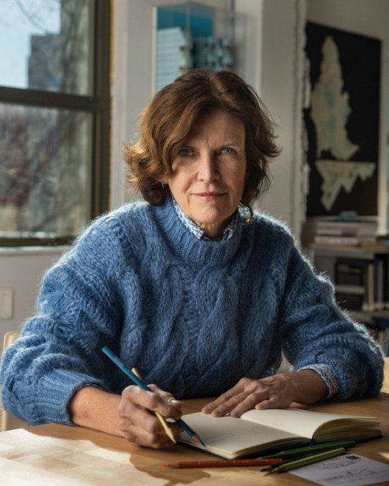
US architect Jeanne Gang made headlines in 2009 when her Aqua Tower topped out at 267 metres in Chicago, making it the world’s tallest building designed by a woman. It was a title that the structure held until Gang’s St Regis skyscraper, also in Chicago and completed in 2021, beat it by about 100 metres. Despite these towering achievements, the architect’s office, Studio Gang, is best known for work that is more humble and understated. Its expansive portfolio is varied and public-facing, including parks, community centres for disadvantaged children and public institutions such as the Richard Gilder Centre at the American Museum of Natural History in New York (2023) and the Arkansas Museum of Fine Arts in Little Rock (2023). All seek to respond to the needs of their communities. For proof of such an approach, Monocle visits the Chicago-based architect’s studio-cum-public gallery in the city’s Wicker Park neighbourhood.
Let’s take it back to the start: why architecture?
As a kid I made treehouses. I would go to building sites and look at how the structures were being built. I was also artistic and maths-oriented, and I thought that all of that coming together would be what architecture is.
Have these expectations lived up to your reality?
Yes. I still make things with my hands, as well as digitally. I like seeing something turn from an idea or drawing into a three-dimensional thing. There’s an aspect to architecture that lets you connect the dots in a way that’s bigger than the project. You can’t not see certain things, such as inequalities in cities, after you have been working so close to them. I look at projects from outside of architecture, considering how to pull in other assets in the urban environment or nature to make them stronger.
You recently completed work on Tom Lee Park, a new waterfront landscape in Memphis. How does this project connect the dots?
We worked closely with high-school students to figure out what would make them use the waterfront. We called it the “youth design leadership programme”. It was about understanding people’s attitudes towards the potential park. The project wasn’t just about designing this building and park but reaching out to all Memphians across the city for ideas and input, and making them part of the process.



How do you strike the balance between listening to the community and delivering new work?
It’s not a direct relationship between listening and what we draw on paper. In Memphis, everyone said that they wanted a basketball court but that doesn’t mean that you put a standard one in. Instead, we asked ourselves how basketball changes when it comes to the Mississippi riverfront. We realised that playing it here was like being on a stage, so we designed a court and an environment that reflect that. We took information that didn’t have any design attached to it and transformed it into something extraordinary.
In addition to listening to the community, what other research or collaboration inform your work?
We’re always engaging with biology and artists because those are fruitful collaborations for us. I’m researching grafting and the biological process as a way of adding new components onto existing buildings. Architecture needs to look at minimising its carbon footprint not simply by reusing buildings but reinventing them; this will help to shift the mentality that buildings become obsolete and eventually need to be torn down. Architects are well-equipped to solve problems but we can’t do it alone.
How does your Chicago office physically give back to the neighbourhood you’re in? And how does this reflect the ethos of Studio Gang?
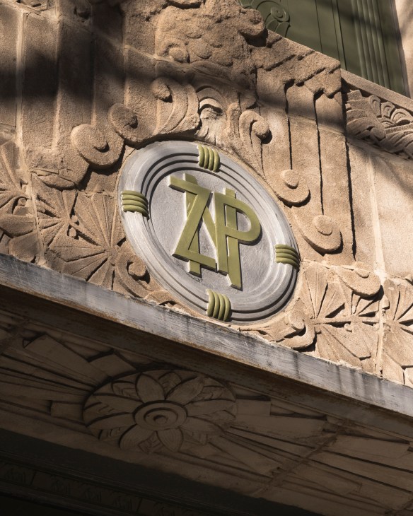
Our studio is an old art deco building, formerly owned by the Polish National Alliance. Our studios are on the upper floors but we spent some time trying to figure out what to do with the lower level. Initially we were looking to let it out but we didn’t find anyone who was a good match for us, so we just started putting our models down there and later converted it into our own archive. It evolved into a gallery to show our work but then we started showing other people’s work. Now we’re planning to use it as a place to host repair workshops, where people can bring broken objects in and our team will design ways to repair them.
How Studio Modijefsky is reinterpreting Amsterdam’s brown cafés for a new era
It’s one of those changeable Amsterdam days where you might experience all four seasons in a single morning. Outside, people are wrapped up against the rain, heading to a waiting ferry to cross the IJ river. Inside Polly Goudvisch, a restaurant that overlooks the departure bay, table-top candles flicker and patrons tuck into berry-laden portions of wentelteefjes (French toast to you and me). “Details matter,” says designer Esther Stam, from her perch on a tall bar-stool. “That’s what I like about hospitality over retail. You have people with you for a couple of hours. They have time to notice things.”
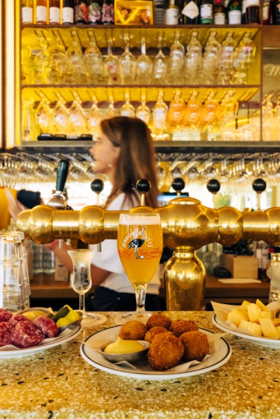
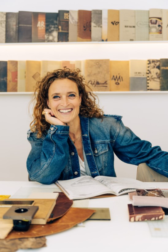
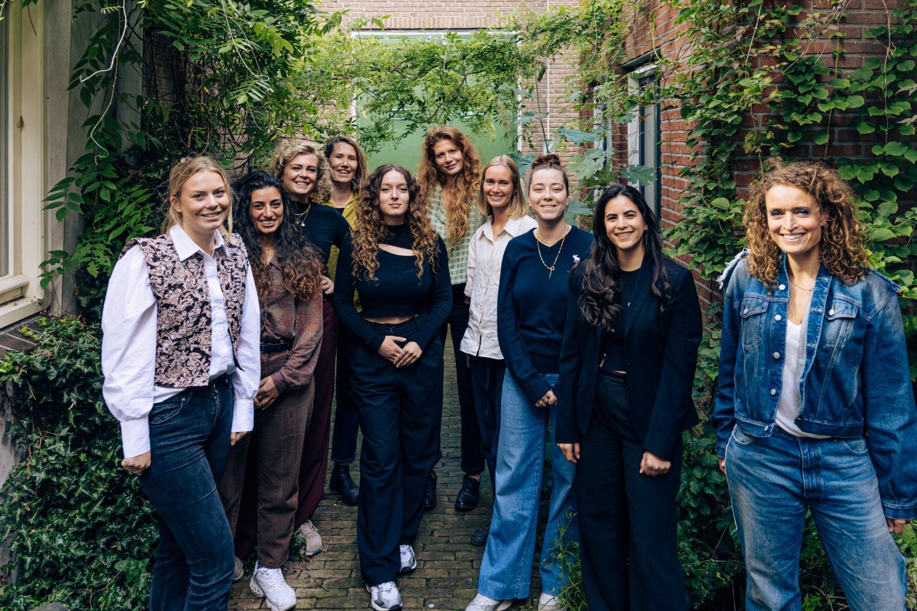
Stam is the founder of Studio Modijefsky, the interior-architecture firm that she set up in 2009 that now counts a team of 12 women, and her work can be seen on some of the Dutch capital’s most atmospheric bars and restaurants, including Polly Goudvisch. For each site, Stam tries to either tease out the place’s history or create a new narrative. Polly Goudvisch, for instance, is based on an imaginary family with the surname Goudvisch (“goldfish” in Dutch), with shoals of clever references that reward a visitor’s eye. The theme is in everything, from the shape of the door handles and the angular way that the tabletops have been fashioned to the design of the marble at the bar. After a couple of hours, and perhaps a few pints of Brouwerij’t IJ’s lager, even the least observant diner will understand the concept.
Stam’s work is influenced by Amsterdam’s historic “brown cafés”, traditional establishments that take their name from the wooden panelling and details that dominate their interiors. “They have certain features: wood, marble, neon – but they’re disappearing,” says Stam, with a hint of nostalgia. “We wanted Polly Goudvisch to be a reinterpretation of those spaces but it was necessary for the end result to be contemporary – otherwise we’re doing the job of a set designer.”
Over the next few days Monocle hotfoots its way around Amsterdam, visiting various new and recently completed projects (the studio’s work is in high demand) and popping into its office by a canal in the De Wallen neighbourhood. Studio Modijefsky often redesigns restaurants and bars, employing neon lighting or terrazzo (chips of marble set in cement) to create a sense of texture and tactility within the spaces. It also works with a range of artisans, some in the north of the city, including Dutch glass-blowers and woodworkers.
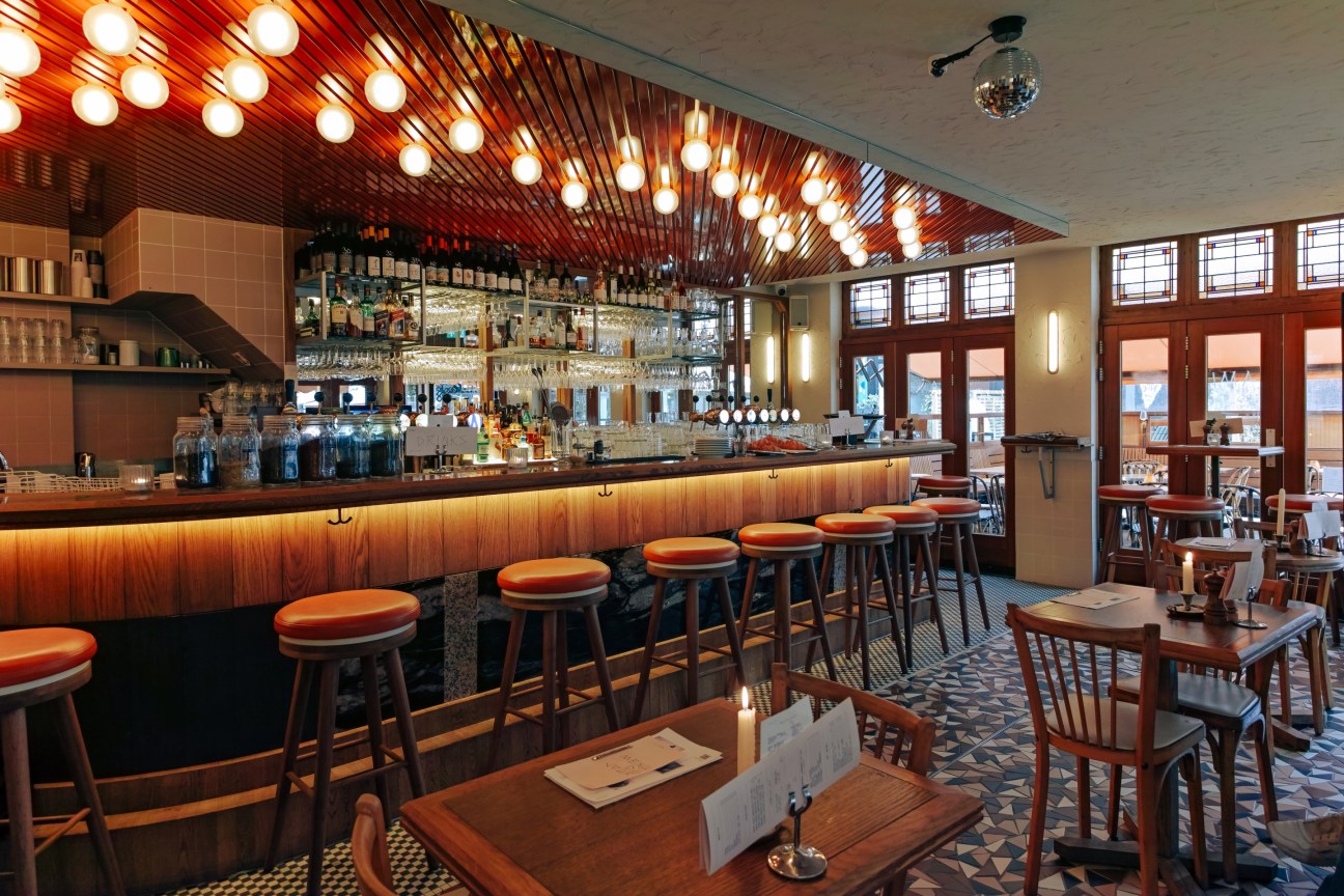
The smallest venue that the studio has designed is a neighbourhood bar called Café Marcella, which sits on the corner of a square that hosts a weekly flower market. The venue might be small but the project threw up some big challenges. It’s a place where everyone seems to know each other; where you come for cake and coffee in the day and stay for a beer washed down with a jenever chaser in the evening. “Nobody drinks the cheap wine here,” jokes the co-owner, Thijs Barelds, as waiters whisk around tables serving snacks, including bitterballen (fried meatballs) and slices of gouda, served with mustard and pickles.
Though the brown-café influence is present at Café Marcella, the interiors have been lightened with a marble-effect ceiling and art deco-style zigzag shapes around the bar. Traditional cursive lettering has been used to etch the name of the bar onto one of the large windows – a nod to its 19th-century heritage – while custom-made mirrors, which have been given a weathered feel to create a sense of intimacy, help the 39 sq m space feel bigger than it is.
It was a trip to New York to visit her uncles that awakened Stam’s love for interiors. At the time, she says, the city was way ahead of Amsterdam in terms of the diverse look of its bars and restaurants, and she remembers being captivated by places that might be decked out in anything from sultry red velvet to Moroccan plaster. On her return to the Netherlands, she applied to art school and the rest is history. “What I still like about designing interiors is the power to create your own world,” she tells Monocle. To date, the studio has worked on everything from the careful updating of the 1930s modernist Blauwe Theehuis (Blue Tea House) in Vondelpark, which is now a bar, to refashioning public spaces, such as introducing a huge neon chandelier at Museum Arnhem, an hour’s train ride from the Dutch capital. The studio has also recently finished a brasserie and cinema in Dordrecht called De Witt and has begun work on its first hotel project in Amsterdam’s city centre.


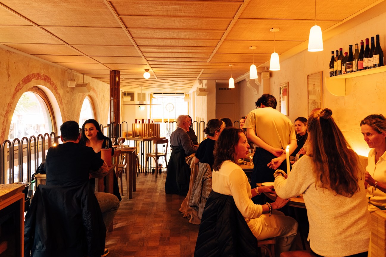
For all the focus on good looks, Stam says that the secret ingredient in creating a good F&B venue is making sure that it’s more than the sum of its parts. “Everything has to flow smoothly,” she says. That means the interiors, food, service, drinks and music should all work in tandem with each other. One of Amsterdam’s most popular restaurants, Gitane, is perhaps the fullest realisation of this idea. The kitchen is overseen by Greek chef-owner Angelo Kremmydas, whose dishes mix Mediterranean, Middle Eastern and French influences with Dutch cuisine and ingredients.
With its rattan ceiling, giant neon lettering above the entrance and integrated terrazzo surfaces, the restaurant is perhaps Studio Modijefsky’s best to date and an indicator of the direction in which the firm is heading as it continues to experiment with and refine its palette. But it wouldn’t be the same without the just-so lighting, the amenable waitstaff and, of course, the food.
As people start to fill up the mezzanine, plates arrive from the kitchen, including taramasalata topped with trout roe, burnt leak and chives, and grilled yellow beetroot in a beurre blanc, sprinkled with tiny, electric-blue edible flowers.
Kremmydas steps out of the small cooking corner for a moment to lean against the bar, clearly designed as a muster point for an aperitivo or a nightcap. “We wanted the restaurant to feel both rough and elegant at the same time,” he tells Monocle. “And that’s where Esther came in.”
studiomodijefsky.nl
Amsterdam address book
The bars and cafés where you’ll find Studio Modijefsky founder Esther Stam.
01.
Bar Parry
Small dishes, charcuterie and cheese – plus plenty of wine. “I love everything about this little venue, from the staff to the ceramic wall,” says Stam.
barparry.nl
02.
Café-Restaurant Amsterdam
Restaurant in a former pumping station dating back to 1897. “You can come here with a big group of friends or with your kids for family dinners. Basically for everything.”
cradam.nl
03.
Café de Pels
One of Amsterdam’s traditional “brown cafés”. “Have a jenever with your beer, eat cheese and sing along to some beloved Dutch songs.”
cafedepels.nl
04.
Toscanini
An Amsterdam classic tucked away in the Jordaan district. “Have a spritz before an amazing Italian dinner. Guaranteed good food, including the daily specials.”
restauranttoscanini.nl
05.
Coba
Mexican restaurant in Amsterdam North. “I love the low-key interior.”
coba-taqueria.com
In focus
Drum D2
Minimalux, UK
The Drum D2 can cast light in any direction thanks to the fact that its tubular shade can be smoothly rotate 360 degrees. Made from partly recycled aluminium, the lamp, which is available in two sizes and colours, is finished with a textured powder coat. The end result brings a sense of relaxed focus to reading nooks and desktops.
minimalux.com

T-02 coffee table
Triqis, UK
Kwaku Boateng, product designer and co-founder of London-based studio Triqis, designed this sleek side table from a single piece of brushed stainless steel, which will develop a distinct patina as it ages – bumps and scratches will add to its edgy, industrial aesthetic. The T-02 also includes a plate that lines the floor to store books.
triqis.com

Nara console
Poliform, Italy
Poliform’s Nara collection by French designer and architect Jean-Marie Massaud is handcrafted from solid wood. Its latest addition is this console, with a striking form reminiscent of a Japanese torii (gate). It exudes elegance and is versatile thanks to its availability in golden walnut or black elm. The result? A tall console capable of fitting seamlessly into most bedrooms and hallways.
poliform.it
Uccle block throw
Pamela Print, UK
This cosy throw, with rich pops of cobalt blue and indigo, draws inspiration from the patterns and splices of colour found in art deco architectural details. Fittingly, the throw takes its name from an area of Brussels renowned for its art deco window pieces. Made from merino wool and made in batches at a small mill in Bristol, it’s a luxurious addition to any sofa.
pamelaprint.com
Line rug
Woodnotes, Finland
Finland’s Woodnotes was started by textile designer Ritva Puotila and her son Mikko Puotila as a textile company in 1987, and makes fine floor coverings today. This new rug is crafted from natural plant fibres that are tightly woven together, making it particularly resilient to wear and tear. Its earthy tones add a sense of calm to any room.
woodnotes.fi
Woodgate sofa
SCP, UK
Terence Woodgate is one of the UK’s most respected industrial designers, known for his stripped-down yet thoughtful approach. He has collaborated with furniture retailer and manufacturer SCP since the 1990s and his namesake sofa, shown here in a soft wool bouclé by Italian brand Dedar, continues to please with its curving ellipse shape and simple cylindrical legs.
scp.co.uk
Rhea side table
Ligne Roset, France
Designed by French duo Donia Ouertani and Nolwenn Michéa for heritage furniture manufacturer Ligne Roset, the Rhea side table is a homage to nature’s beauty. Blurring the line between furniture and art, it has a solid wood base and a natural limestone top. The table’s irregular leaf-inspired silhouette and waterproof travertine top ensure that it looks good and is durable too.
ligne-roset.com
Soft lounge chair
Takt, Denmark
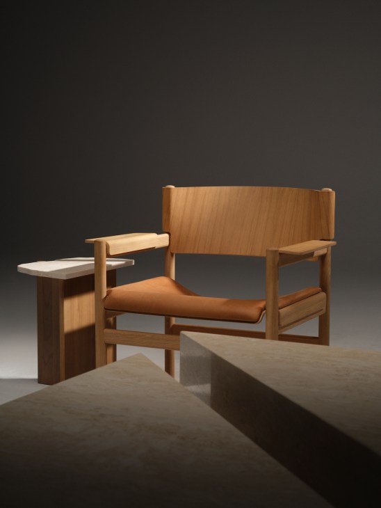
Environmentally minded Danish brand Takt has updated its Soft lounge chair, by Copenhagen design studio Thomas Bentzen, to include a leather seat for added comfort. The chair comes in oiled oak with cognac leather or black lacquered oak and leather. Owners of the previous rendition can also upgrade by adding the leather seat component to their existing chair.
taktcph.com

Trace SC88
&Tradition, Denmark
Danish furniture firm &Tradition has turned to creative studio Space Copenhagen for the design of this sleek cabinet. Made from oak with glass-panelled doors, the piece is inspired by the desire for it to hold sentimental pieces, leaving a “trace” of their owner on its shelves.
andtradition.com
Everyday Life sofa
DePadova, Italy
The sofa is a collaboration between furniture firm DePadova and fashion brand Paul Smith. With plush cushions strapped to a matte wooden frame, the modular sofa reveals Paul Smith’s signature through colourful yet discreet stitching.
depadova.com
Eileen Gray Roquebrune rug
Aram, UK
Eileen Gray, the pioneering Irish architect, designed floor coverings for countless residential projects. Her rugs were based on designs painted as gouaches (opaque pigments ground in water). A similar approach was likely taken for this rug, which Aram has reissued in handspun wool for fans of Gray’s work.
aram.co.uk

9602 Floor lamp
Gubi, Denmark
Danish company Gubi has reissued many forgotten design treasures – a move it has pulled off yet again. Also known as the “Chinese Hat”, the lamp was created by Finnish designer Paavo Tynell in 1935. The new iteration features an airy bamboo lampshade and a rattan-covered stem.
gubi.com
Front sideboard
Mor, Portugal
This piece by Portuguese manufacturer Mor features a slim profile, rounded legs and a hidden drawer, all rendered in warm wood. The sleek design is by Lisbon-based Pedro Sottomayor and available in ash, oak or walnut, with the sideboard working just as nicely as a compact desk or console.
mordesign.com
Lightwood paper cord chair
Maruni, Japan
This slender chair with a woven paper cord seat is the latest addition to the Lightwood series designed by Jasper Morrison. The versatile piece has a gently curving backrest that is both graceful and supporting and comes in a range of finishes. It pairs perfectly with dining tables and desks or makes a stand-alone statement too.
maruni.com
Sound mirror
Fred Rigby Studio, UK
Hand-welded in steel and available in patinated or powder-coated finishes, these bold mirrors can be placed on tables and consoles to gently reflect light around a room.
fredrigbystudio.com
Mateo table
Molteni&C, Italy
Molteni&C’s creative director, Belgian-born Vincent Van Duysen, has designed this table as a celebration of Italian hospitality: its two-piece flared base is a striking talking point, while the circular top invites convivial conversation among those seated around it. Available in wood, marble or glossy lacquer, its final finish is highly customisable to suit all tastes.
molteni.it
Ply rug
Muuto, Denmark
This elegant rug from Danish brand Muuto is made from New Zealand wool. Despite its pared-back appearance, it retains an element of play thanks to a broken twill weave and tassel finishes. The range, which nods to ancient Scandinavian weaving traditions, is available in seven warming colours.
muuto.com
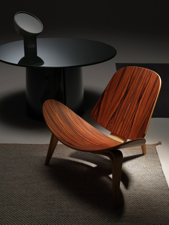
CH07 shell chair
Carl Hansen & Søn, DenmarkTo celebrate this iconic chair’s 60th birthday and to mark Hans J Wegner’s legacy, Carl Hansen & Søn is releasing an exclusive edition made in rosewood and oak, with the option of a black leather seat. Look out for a brass plate engraved with Wegner’s signature and “1963”, the year it was designed.
carlhansen.com

Tsukiko lamp
Alexander Lotersztain, Australia
Brisbane-based designer Alexander Lotersztain has launched the Tsukiko (Moon Child) table lamp, which he developed together with 10th-generation Kyoto lantern-makers Kojima Shoten. It’s a pleasingly bulbous paper lampshade, which is perched on top of a circular bamboo base, bringing an age-old craft, known as jibari-shiki, into the modern age.
alexanderlotersztain.com
Centenniale table
Nikari, Finland
Designer Joanna Laajisto’s low-slung coffee table is made from a formidable solid slab of ash or oak, which is slotted onto rounded legs that have been carved from timber off-cuts. The contrast between the angled tabletop and the chunky feet is intended to bring the wood’s natural character – knots, cracks and all – to the fore.
nikari.fi

Travertino Classico coffee table
Maie, UK
Theres Hoyos, Maie’s London-based Austrian founder, designs made-to-order furniture and home accessories that make the most of his materials of choice: travertine, marble and terrazzo. Their boxy shapes minimise waste. The design of this coffee table features triangular forms that can stand as solo pieces or interlock as a set of two.
maieliving.com
Sacha armchair
Resident, New Zealand
Canadian designer Philippe Malouin’s Sacha armchair for New Zealand company Resident is a follow-up to his fully upholstered side chair. The new addition to the Sacha collection features the same graphic lines and folded, slightly reclined backrest while incorporating fully upholstered armrests for ultimate comfort. resident.co.nz

Lissoni outdoor armchair
Knoll, US
Knoll’s new outdoor collection is both simple and elegant – the hallmarks of its designer, Piero Lissoni. The famed Italian creative’s new armchair has an aluminium frame, available in white, black or dark red, with complementary cushions in durable fabrics capable of withstanding the elements. Its main appeal is its slightly oversized form, allowing one person to comfortably lounge around or two people to cosy up.
knoll.com
Flared lamp
Mud, Australia
This porcelain table lamp is the fruit of a collaboration between Sydney-based designer Zachary Hanna and Mud Australia founder Shelley Simpson. The lamp’s light source is hidden in its base, ensuring that its beam is non-direct and gently diffused.
mudaustralia.com
Plumón side table
Kettal, Spain
Patricia Urquiola’s Plumón side tables are equally at home indoors or out. Made by Kettal, each piece is unique thanks to a 3D printing process that creates the porcelain stoneware bases. It’s an approach that means no mould is required and, as the pieces are fired at a low temperature for a short period of time, there is efficiency across the production process.
kettal.com
Turning over a new leaf
Less than two hours’ drive southeast of the German capital lies a forest farm that seems as if plucked from a fairy tale. The Michelberger Farm’s restaurant and rooms, set in the Spreewald reserve, are a far cry from Berlin’s gritty Friedrichshain, where Nadine and Tom Michelberger founded the brand’s first hotel, home to late-night blow-outs and after-hours DJ sets, in 2009.
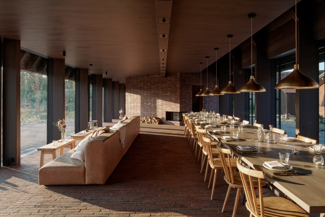
Plans for renovating this sister space were laid in 2019, when Berlin-based Danish architect Sigurd Larsen scoped out a clutch of 19th-century agricultural buildings huddled around a courtyard. While one was replaced to make space for accommodation that sleeps 25 (and can be booked in its entirety), hallmarks of its past were retained and many of the old beams have been transformed into new furniture that now adorns the space.
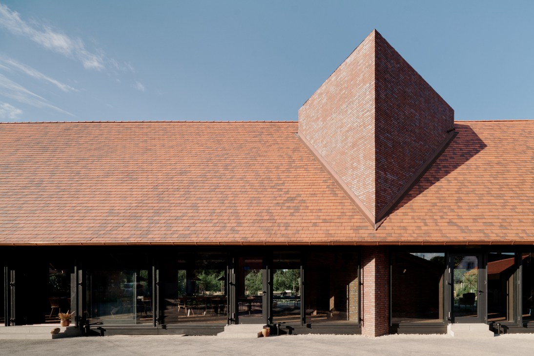
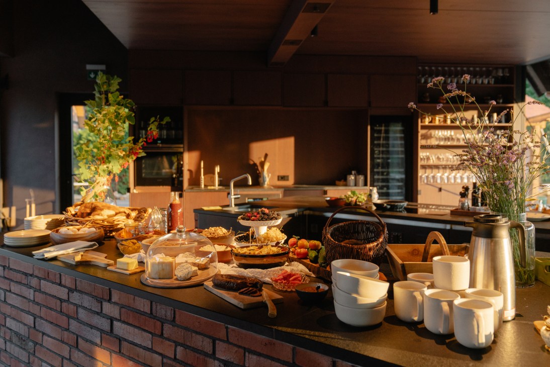
“Making the bedrooms smaller was our way to create the feeling of being in a house rather than in a traditional hotel,” Larsen tells Monocle. “The windows are positioned low. When you enter a room, you see a view framing only the green field outside. But as you sit down on the bed, the horizon and sky become visible over the tree canopies.”
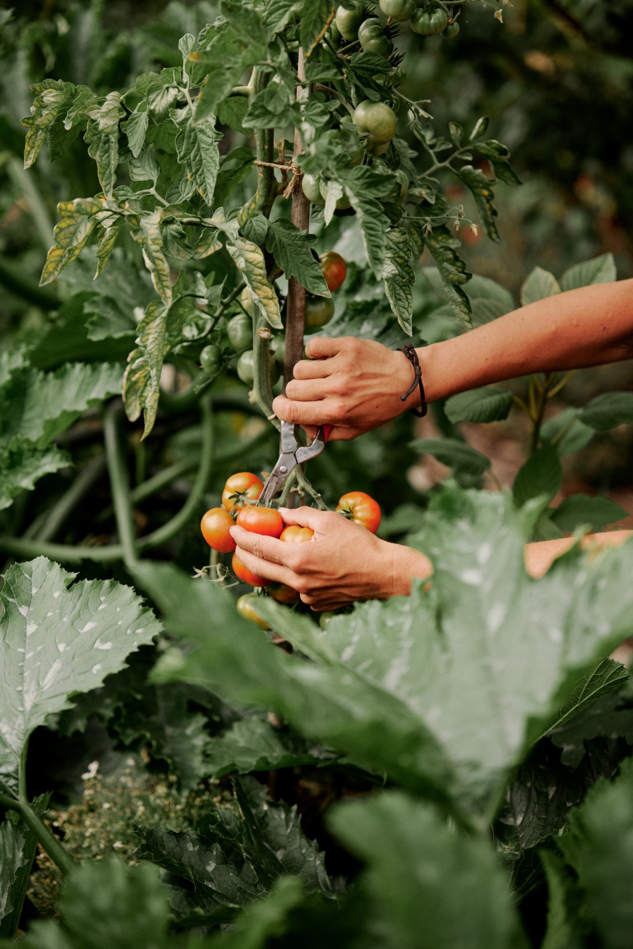
The food and seasonally grown produce from the regenerative farm, as well as nearby producers such as Gut Ogrosen and Landgut Pretschen, are central to the Michelberger mission. The farm opens on Thursdays for dinner and closes after breakfast on Mondays; drop-ins are welcome to stop by for coffee and cake on weekends too.
Even with the cycling, canoeing and horse-riding offered by the Spreewald, returning home to the Michelberger Farm may still be the greatest pleasure. “My favourite part about the farm is waking up in the morning and opening the bedroom door,” says Larsen. “You can hear the kitchen team downstairs preparing breakfast, all made using berries and crops from the field you see from your bed. It’s like waking up at a friend’s house in the countryside.”
michelberger.farm
Inventory
Recipes
Comfort zone
Let these fresh, zesty and mouth-tingling twists on three Italian classics bring a sense of warmth on cooler nights.
Recipe
Ricotta and marjoram ravioli
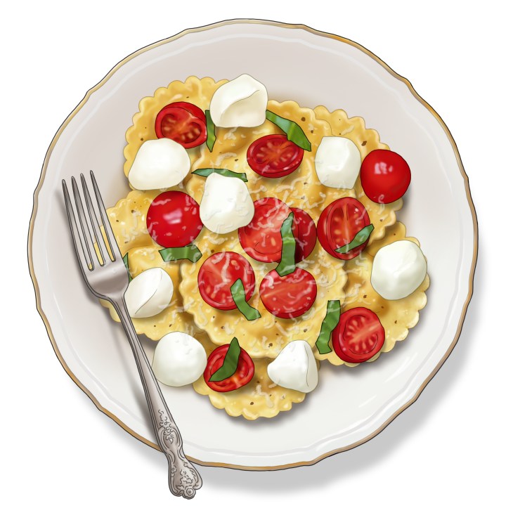
Swiss chef Ralph Schelling has whipped up this fuss-free take on ravioli. Every pasta parcel is filled with a delicate mix of marjoram and ricotta, and topped with garlicky tomatoes. Enjoy.
Serves 4, as a main
Ingredients
For the pasta:
300ml water
900g flour
For the sauce:
2 cloves garlic, peeled and chopped
3 tbsps olive oil
400g peeled cherry tomatoes
15g bunch basil
1 tbsp butter
For the filling:
900g ricotta
140g parmesan cheese
2 eggs
15g bunch marjoram leaves
Method:
1.
Begin with the pasta dough. Use a kettle or small saucepan to bring the water to a boil.
2.
Pour the flour onto a clean work surface. Create a steep well in the middle of the flour. Pour the boiling water into the well a bit at a time and, using a fork, gradually mix the flour and water together until combined. Check it’s cool enough to touch and then knead for 5 minutes. Let the dough rest while preparing the filling.
3.
In a medium saucepan, fry the garlic in olive oil until golden brown. Add the tomatoes and leave them to sweat for 20 minutes while you assemble your pasta.
4.
In another bowl, mix together the filling ingredients.
5.
Use a rolling pin to flatten the pasta dough to a thickness of 2mm or 3mm. Cut in half to make two equal-sized pieces.
6.
Place one sheet of dough on the work surface. Spoon small mounds of filling onto the sheet, leaving 2cm gaps between each. When finished, place the other sheet of dough on top and press the edges together with a fork to seal.
7.
With a knife or pasta wheel, cut out the ravioli. Use a little water to seal if required.
8.
Bring a large pot of water to the boil. When it begins to bubble, add a handful of salt. Put the ravioli in and cook until done; they will float when they’re ready.
9.
Return to the saucepan and add the basil, butter and salt to the tomatoes. Stir until combined. Add the drained pasta and mix until coated.
ralphschelling.com
Recipe
Fettuccine with pea-and-mint pesto and lime

Ralph Schelling is keeping it simple with a riff on Liguria’s basil-based pesto using fresh mint and peas. “Feta goes well with the mint if you prefer that to parmesan,” says Schelling. “You can also use my pesto on bruschetta or as a dip for an aperitivo.”
Serves 4, as a main
Ingredients:
250g fettuccine pasta
250g fresh or frozen peas
2 cloves of garlic, peeled
100g parmesan, plus extra
10g bunch fresh basil
20g handful mint leaves
5 tbsps olive oil
1 lime (zest and juice)
2 tbsps pistachios (or pine nuts)
Salt and pepper to taste
Method:
1.
Cook the pasta in salted water according to packet instructions but take it out a minute early so that it’s al dente. Drain and reserve 120ml of the pasta water.
2.
Blend pesto ingredients to make a paste. Don’t blend until completely smooth so as to leave a little crunch.
3.
In a pan, add the pesto to the pasta along with the starchy cooking water and heat until warm again.
4.
Serve with more parmesan.
ralphschelling.com
Recipe
Tomato, harissa and prawn pasta

Japanese recipe writer Aya Nishimura ventures across culinary borders to pair a classic Italian comfort dish with a spicy North African chilli paste. Needless to say, it works perfectly.
Serves 2
Ingredients:
3 tbsps olive oil
12 large prawns, shelled and deveined
2 cloves garlic
½ medium-sized brown onion, finely chopped
Tin of chopped tomatoes
2 tsps harissa paste
2 tsps tomato paste
2 tsps anchovy paste (or a few finely chopped tinned anchovies)
2 tsps light brown sugar
3 tbsps ricotta
2 pinches of salt and pepper
200g linguine
Parmesan to serve
Method:
1.
Season the prawns. Pour one tablespoon of olive oil into a pan and fry the prawns until pink. Remove, set aside.
2.
Add the rest of the olive oil and garlic to the frying pan and cook until garlic starts to become fragrant, then add the onion. Once softened, add the chopped tomatoes, harissa, tomato and anchovy pastes, and sugar. Cook over a low heat for 10 minutes until sauce thickens, stirring continuously. Add ricotta and stir until combined. Season with salt and pepper.
3.
Bring a saucepan of water to the boil and cook linguine as per packet instructions.
4.
Reserve a few tablespoons of pasta water before draining the linguine and adding it to the sauce. Combine with the prawns and toss until everything is mixed together. Serve with grated parmesan on top.
ayanishimura.com
Down to the letter
Completed in 1747, when America was still a collection of British colonies, The Redwood Library and Athenaeum in Newport, Rhode Island, is the nation’s oldest purpose-built library. Here, in a stately upstairs room, the team from Sharp Type, a type foundry specialising in digital typefaces (think the fonts on a computer) are huddled over a large table.

“Did you see this M?” says one designer at a decibel level more suited for a concert than a library. “That’s the best letter; there’s a lot of opportunity for fun there,” says another emphatically. “Oh my goodness – this R,” says another, poring over a scrapbook of capital letters. Photo-taking, to the delight of the librarians, who seldom see such enthusiasm, commences: it’s as though a rare animal were spotted but instead the attention is on the forms, curves, accents, flourishes and lines of lettering in the books.
The collection from the library’s vault includes a miniature 18th-century atlas from France and a book from William Morris’s Kelmscott Press. But the publication that receives the most enthusiastic reception is a 19th-century artist’s scrapbook containing hundreds of capital letters. “These drop caps are insane,” says Lucas Sharp, who co-founded Sharp Type in 2015 with Chantra Malee. Partners in business and life, the duo’s firm counts Samsung, the Royal Danish Theatre and La Repubblica among its clients. “We’re part of a pretty niche and esoteric industry,” says Lucas. “It’s not something that a lot of us think about, yet type design is omnipresent in just about everyone’s life.”


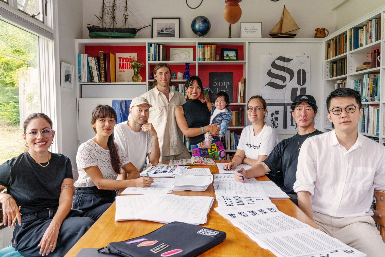
When Monocle meets Sharp Type at the Redwood library, it is because its core team of eight designers has descended on Chantra’s home city for its company retreat. An annual event usually held in different locations across the US, it entails a series of field trips where the team seeks physical inspiration for its digital work. The Rhode Island city has been chosen because there is plenty to appreciate from a typography viewpoint. “Newport represents the Gilded Age, craftsmanship in America and a tradition of letter form as art,” says Chantra. “It’s a good place to remember the origins of our industry, in America anyway, to get our team out of the digital world for a while.”
Sharp Type’s newest project speaks firmly of the modern moment and its impending launch is a big focus of the assembly. Sharp Earth will be the foundry’s newest design. Notably, it will be a global typeface. This means that it will enable disparate language groups – Latin, Arabic, Indic, Japanese, Greek, Thai, English and various indigenous languages – to appear graphically harmonious while remaining legible and true to their origins. The result will allow people and companies across the globe access to a consistent typeface for their materials and branding, and could be called upon in international efforts to create a unified front when tackling problems such as climate change or health emergencies.
While there is exciting potential for more accessible global communication, the main drive was to craft a typeface that is beautiful, functional and of this moment. “Typefaces are markers that represent history and moments in time,” says Chantra, leafing through a 15th-century bible with intricate hand-drawn letters. “This bible speaks of its time. So does something like the psychedelic, acid-font craze of the 1960s, which perfectly encapsulated the spirit of counterculture.”
What, then, does Sharp Earth aim to capture? “We live in a fully globalised and digital world, so Sharp Earth represents what it is like to be here right now,” says Lucas. “If Helvetica was for modernism, and Avenir and Gotham were for postmodernism, then Sharp Earth is for whatever comes next.”
Developing a global typeface, though, is a challenging endeavour. Large companies such as Google and Adobe have developed their own, but Sharp Type is the first small, independent studio to attempt to create one of this scale. It requires drawing on the expertise of people worldwide. This is something that Lucas and Chantra, who are based near San Francisco, understood when they opted to employ a team that covers time and language zones. Those in Newport for the company retreat have made their way from across Asia, North America and Europe, reflecting a diverse slice of humanity that has been essential to the work on Sharp Earth, and the foundry’s mission more broadly. “It gives us a larger perspective on languages and cultures that are historically overlooked in this work,” says Chantra, as the group walks through downtown Newport en route to lunch. A pleasant mix of accents hangs in the air.
Afterwards, the next stop on the tour is a visit to Island Cemetery, which dates to the 1600s. Léna Le Pommelet, a designer from Switzerland, had no sooner entered the grounds before she paused, transfixed by an extraordinarily decorative ampersand. “You’ll never find this elsewhere,” she says, whispering. Meanwhile, Lucas explains why this retreat and associated field trips are essential. Kneeling, he points to a tombstone with a deep V letter etching which, in the afternoon sun, accentuates the two tones in the stone’s mineral. “This effect would all be lost if I tried to digitise it,” he says. Still, this cemetery has been fertile ground for inspiration before. A recent field trip here gave rise to the foundry’s popular Greenstone typeface.


The most exciting stop of the day awaits down the road from the cemetery at The John Stevens Shop, which dates to 1705 and has claims to being one of America’s oldest businesses. The original store’s namesake owner traded rum and molasses but was noted for his unique offering of stone carving, specifically gravestones. The shop remained in the Stevens family until 1927, before it was sold to the Benson family – and it’s Nicholas Benson who greets Sharp Type in the green clapboard shop. “Welcome,” says Benson, who took over the business from his father in 1993, ushering the team inside. Here, books are piled high, granite slabs sit on benches, and mallets and chisels line windowsills.
Like the Sharp Type team, Benson is also a man of letters, only he’s responsible for carving them into stone, by hand. When he’s not in the shop chiselling tombstones or training apprentices (including his daughter), he is often in Washington, carving words into the nation’s finest monuments and museums. Also, like the team at Sharp Type, the shop has a legacy of designing lettering. “My grandfather developed a house style,” Benson tells the group, whose eyes wander from wall to wall. “That form became known as The John Stevens Shop Roman.” Asked if he still uses it, the answer comes quickly: “It is still the shop’s signature typeface.” Occasionally, though, Benson creates his own, most notably for the Martin Luther King Jr Memorial and Eisenhower Memorial.
So what does Benson think of Sharp Type’s mission to find inspiration in old letters to influence new global types? “The world of digital isn’t my language,” he says. “But I do get it. My father straddled both worlds by making typefaces for Adobe.” Those three typefaces, all created in 1994, blended traditional hand-drawn calligraphy style with digital design. Within 45 minutes the tour is over and, with the sun setting, the Sharp Type team files out onto the cobblestone streets of Newport.
Could a few new fonts, or at least letters, have been inspired today? “Check in with us in six months,” says Lucas. “Something usually lights a spark.”
The following morning, Sharp Type assembles in the living room of a house overlooking the harbour, which is their base for the retreat. On a table are pastries and proofs of Sharp Earth in Arabic, Thai and Japanese Hiragana, all of which show how the languages can be brought into a pleasing, uniform visual system.
This ambitious project begs the question: what role do old typefaces, created by instruments such as quills and chisels, and found in the libraries and cemeteries in New England, play in creating a digital, global font? Neither Lucas nor Chantra sees the two as mutually exclusive. “We want to be a bit of a bridge between these worlds,” says Lucas.
And Newport, Chantra adds, is just the start. “If we want to continue to cover every language system but maintain its identity and context, that will mean getting our hands dirty, and turning over stones around the world in Asia, Europe and Africa, like we did this week.”
Matters of perspective
From a searing look at the travails of North Korean defectors to glimpses of beauty through a German master’s viewfinder, we present the season’s cultural highlights.

Art
Herbert Boeckl – Oskar Kokoschka
Albertina Modern, Vienna
Two of Austria’s finest expressionist painters finally share a stage. Herbert Boeckl’s Cézanne-inspired landscapes and still lifes brim with personality, while Oskar Kokoschka’s agitated brushwork remains bracingly modern. Boeckl’s anatomical sketchbook reveals a debt to Kokoschka, whose late watercolours display a creativity undimmed by age.
Runs from 17 November to 18 February 2024
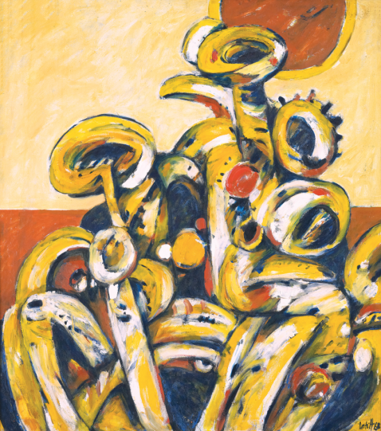
Tropical: Stories from Southeast Asia and Latin America
National Gallery, Singapore
This survey of more than 200 works explores two regions that were united in the 20th century by struggles against colonialism and a desire to assert new cultural identities. It draws parallels between artists such as Mexico’s Frida Kahlo and Malaysian modernist Latiff Mohidin, while spotlighting lesser-known figures who spun traditional techniques and political beliefs into exciting forms of expression.
Runs from 18 November to 24 March 2024
Film

Beyond Utopia
Madeleine Gavin
Though many documentaries have tackled life in North Korea, none resonates quite like Madeleine Gavin’s latest film, which deservedly picked up an Audience Award at the Sundance Film Festival. Using secretly filmed footage, Beyond Utopia focuses on the hazardous journeys that defectors make to flee the Democratic People’s Republic, as well as the underground networks assisting them. From mothers trying to reunite with their sons to entire families risking it all, this compelling film embeds us in a world that has seldom been documented and explores the lengths to which people are willing to go in pursuit of freedom.
Released on 27 October

Saltburn
Emerald Fennell
Writer-director Emerald Fennell’s debut feature, Promising Young Woman, won an Academy Award for best original screenplay. Now she has returned with a lavish exploration of privilege and desire. Oxford University student Oliver (Barry Keoghan) becomes infatuated with his aristocratic friend Felix (Jacob Elordi), who invites him to spend the summer at his family estate. Cinematic convention tells us that a trip to an isolated location with mysterious acquaintances rarely ends happily but it makes for a thrilling set-up.
Released on 17 November

Anatomy of a Fall
Justine Triet
When her husband is found dead in the snow near their home in the French Alps, all fingers point to celebrated German writer Sandra (Sandra Hüller), who must defend her innocence in a trial that picks apart both her relationship with her husband and her work. Justine Triet’s wonderfully spiky courtroom thriller won the Palme d’Or at this year’s Cannes Film Festival and is sure to provoke plenty of conversation.
Released on 10 November
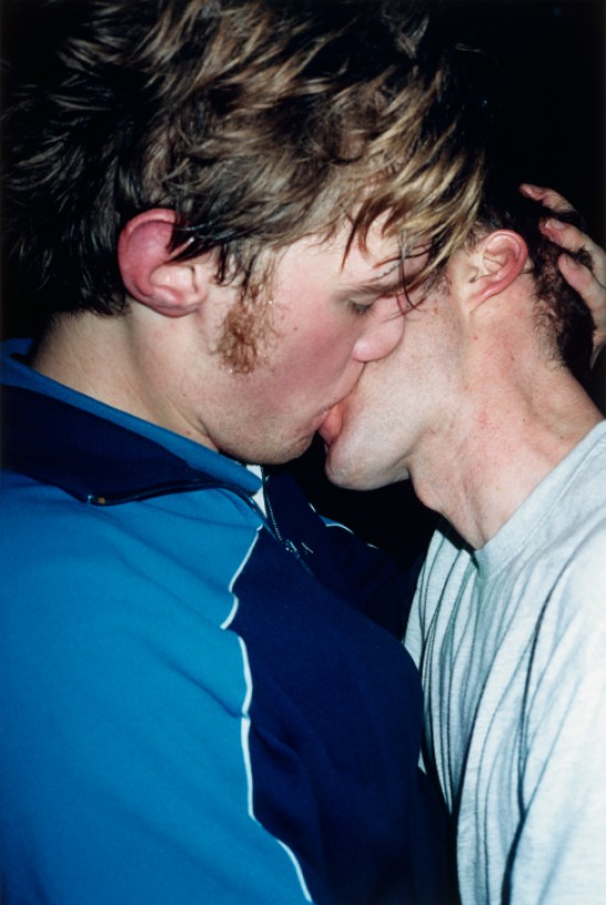
Photography
Wolfgang Tillmans: To Look Without Fear
San Francisco Museum of Modern Art, San Francisco
Part of a tradition of photo-diarists that includes Larry Clark and Nan Goldin, Wolfgang Tillmans has created a body of work that reminds us that beauty is out there if you know where to look, from crumpled clothes and tender kisses to awestruck images of musical icons and natural wonders.
Runs from 11 November to 3 March 2024
Music
Jardin
Munya
If you’re craving lush synths, seek out this excellent set of electro-pop tracks. Québec-based singer Munya started playing piano when she was just four years old, before moving on to opera and classical singing as a teenager. In Jardin’s first single, “Un Deux Trois”, she pays tribute to Giorgio Moroder. Her breathy cover of New Order’s “Bizarre Love Triangle” is a highlight, as is the bouncy “Hello Hi”.
Out now
Anime Parallele
Laura Pausini
Italian music legend Laura Pausini’s new album sounds as fresh as her 1993 debut, “La solitudine”. She sings as alluringly as ever on the ballad “Durare”, while dance number “Il primo passo sulla luna” tells the story of a friendship that ends over a refusal to compromise. This year, Pausini will be honoured by the Latin Recording Academy and start a world tour in Rimini on 8 December.
Released on 26 October
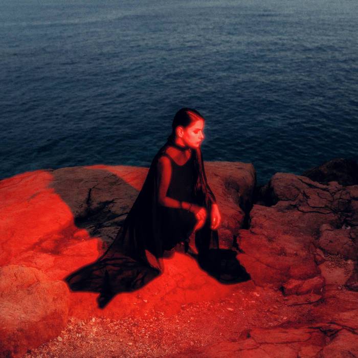
Madres
Sofia Kourtesis
Berlin-based Peruvian DJ and producer Sofia Kourtesis dedicates her debut album to her mother – but she also celebrates a neurosurgeon called Peter Vajkoczy who operated on her, with the joyful single “Vajkoczy”. The album’s title track gives the collection a bright start but the highlight is the dance-floor-ready “Si Te Portas Bonito”. Having already performed at Glastonury, Primavera and Green Man, Kourtesis will be one to watch on next year’s festival circuit.
Released on 27 October
TV

Race to the Summit
Netflix
After Dani Arnold broke Ueli Steck’s record for the speediest ascent of the Eiger’s north face in 2011, the Swiss mountaineers began a rivalry that culminated in a series of dangerous ascents up the Alps, often with little regard for safety equipment or procedures. This documentary by film-makers Nicholas de Taranto and Götz Werner follows the death-defying duo up to the snowy peaks, from the Eiger to the Matterhorn.

A Murder at the End of the World
Hulu
A mysterious billionaire invites guests to a remote resort, where they witness a murder: despite its rather old-fashioned premise, this gripping new series from The OA’s Zal Batmanglij and Brit Marling defies expectations. A Murder at the End of the World features an impressive cast that includes Marling, Emma Corrin, Harris Dickinson and Clive Owen, who bring humanity to a plot with plenty of twists and turns.
The Sea Beyond (Mare Fuori)
RaiPlay
Filippo Ferrari, a gifted piano player from a wealthy Milanese family, and Carmine Di Salvo, the son of a Neapolitan crime boss who dreams of becoming a hairdresser, form a bond when they are arrested on the same night and sent to a juvenile detention centre. This hit Italian drama, created by Cristiana Farina, follows the pair as they navigate life beyond bars. Watch it for its suspenseful storylines and top performances by a cast of previously unknown actors.

Books
Julia
Sandra Newman
US author Sandra Newman’s latest novel is a provocative retelling of George Orwell’s Nineteen Eighty-Four from the perspective of Winston Smith’s lover, Julia Worthing. It takes courage to reimagine one of the 20th century’s most iconic novels and Newman serves up some compelling revisions.
Out now

Welcome to the Hyunam-dong Bookshop
Hwang Bo-reum, translated by Shanna Tan
This quirky debut novel tells the story of Yeongju, who leaves her corporate job and career-oriented husband to open an independent bookshop in Seoul’s Hyunam-dong neighbourhood. It’s a tale about community and finding comfort in small things.
Published on 26 October

A Shining
Jon Fosse, translated by Damion Searls
Norwegian essayist, novelist, poet and playwright Jon Fosse has been compared to Henrik Ibsen and Samuel Beckett, and has attracted a loyal following with his “slow prose”. This 56-page novella tells the story of a man who gets lost in the woods as he sets off on foot through the cold and dark in search of help after his car breaks down. Beautiful and haunting, it is sensitively translated by Damion Searls.
Published on 31 October