Issues
Get behind the wheel and fall in love with driving again : The all-new Toyota Land Cruiser 250
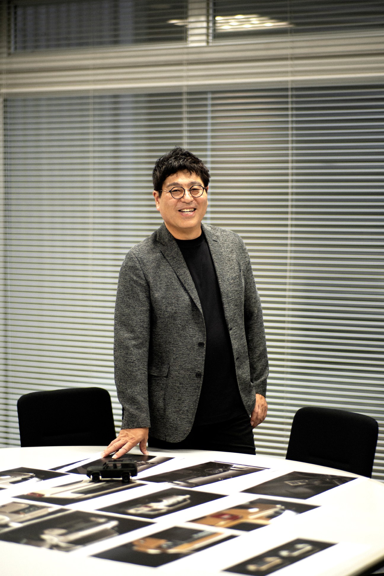
It’s rare that the launch of a new vehicle excites enthusiasm beyond the auto industry but when Toyota unveiled its new Land Cruiser 250 last summer, the word on the street was that the Japanese car giant had a classic on its hands. Its boxy lines, stripped-back aesthetic and absence of chrome announced a fresh direction for Toyota’s longest-running vehicle. The chief designer is Yoshito Watanabe, an amiable figure for whom the Land Cruiser holds a strong personal connection. On his desk in Toyota’s under-wraps design lab is a photo of himself as a 10-year-old standing in front of his father’s prize Land Cruiser 60. For a man whose team works on everything from a moon buggy to state-of-the-art mobility vehicles, this was his dream project.
For Toyota too, the Land Cruiser is rooted deep in its DNA. The story goes back to 1951 when Japan was under US occupation and a call went out to Japanese car makers to produce a domestic equivalent to the Jeep. Toyota’s response was the Toyota Jeep BJ, a no-nonsense vehicle that was the first to make it up (and down) Mount Fuji. By 1954 that original vehicle had been tweaked and renamed the Land Cruiser, and was being exported, first to Pakistan and then to Saudi Arabia.
Since then there have been multiple models and myriad variations of the Land Cruiser; more than 11 million have been sold in more than 170 countries. Each iteration has its fans: the 40 series (which started in 1960) and its successor, the 70 (from 1984), are admired for their rugged functionality, while the 60 (1980 to 1990) and its successors pointed the Land Cruiser in more of a lifestyle direction. Its reputation for durability and easy maintenance in tough conditions have taken the Land Cruiser to the furthest corners of the globe. Aid workers have counted on its reliability in the harshest environments; Toyota has even made a special version for the United Nations.
And so to the new Land Cruiser 250, which, after much discussion, is a back-to-basics project. “When we were talking about the direction of the design, Akio Toyoda [Toyota’s chairman] told us that we should, ‘Go back to the origins of the Land Cruiser,’” says Watanabe. “There were no specifics as to what the ‘origin’ meant, or what he envisioned exactly, but it got us thinking about the essence of the Land Cruiser. His words were enough to give us the courage to make a major change in direction.”
The challenge was to create a vehicle that would keep the core traits of the Land Cruiser, be more environmentally friendly than its predecessors and with a broad enough appeal to sell in dozens of countries to customers with very different needs. “Over the years, there had been an evolution in a more luxurious direction,” says Watanabe. “We decided to strip away the excess so that we could offer the full performance to a wider range of customers.” Watanabe says the no-frills Land Cruiser 40 – the one that marked the transition from police to civilian vehicle – was the “spiritual starting point of this process”.
If functionality was essential, so too was recapturing the joy of driving. The sloping angles of modern cars that can make them feel claustrophobic have been replaced by a more upright stance which drivers will love; the bottom of the window frame has also been lowered by 3cm to increase road visibility. The headlights have been pushed towards the middle to minimise damage from debris on rough roads (“wide car fronts are fashionable, but we went in the opposite direction”). The bumper is made up of small parts like a jigsaw puzzle so that it can be repaired without having to junk the whole piece.
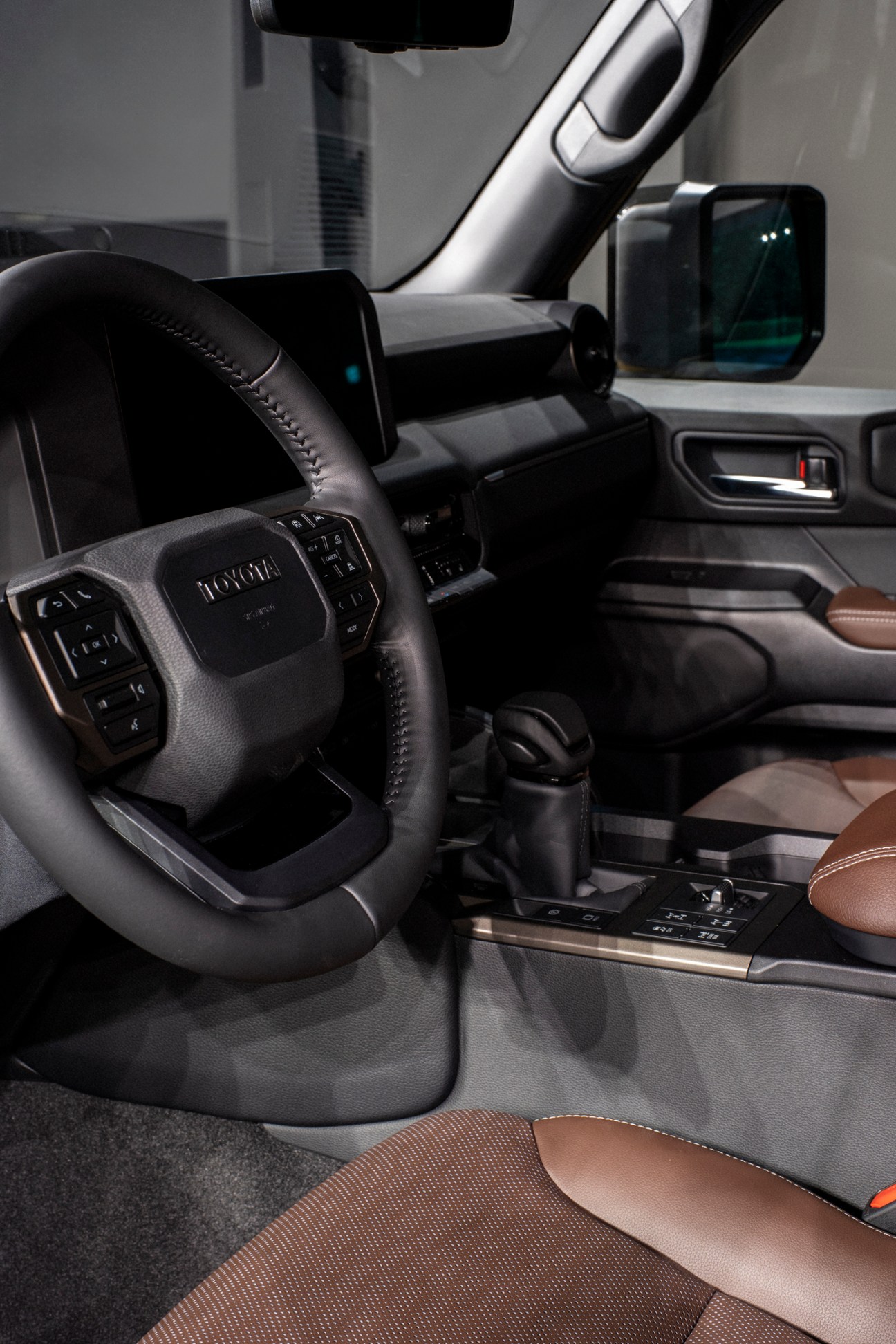
The inside is refreshingly pared back too. Instead of touch panels, Watanabe opted for proper buttons (“like keys on a piano”), which are easy to access and satisfying to use. The team talked to rally driver Akira Miura to see what works best when drivers are careering over rough terrain and therefore can’t look at the controls. Instead of urban metallics, the earthy colour palette includes a “desert sand” and smoky blue colourways. It took some convincing to persuade top management that the car would be better without Toyota’s triple oval logo but Watanabe got his way: the word “Toyota” appears in its place.
The new frame is lighter, the carbon footprint is lower and seat fabric uses thread made from recycled bottles from the Toyota office. There is a new hybrid option (as well as regular versions) and electric power steering – also a first. Watanabe anticipates enthusiasts will want to customise their Land Cruiser. The car can survive the worst conditions but might also be used in smooth urban settings. “It’s like owning a watch that can function on the moon,” he says. “There’s still pride in knowing that the car can do all these things even if you don’t put it to the test.”
Watanabe didn’t want to do a retro Land Cruiser. “All the different past designs are so iconic and many of them are still up and running, so there’s no point in just imitating.” His ambition was to create “a modern space that is comfortable even after hours of driving”. Watanabe says that many people were reluctant to make drastic changes to the existing model. We’re glad that he didn’t listen to those voices. The Land Cruiser 250 launches in Japan this spring: please form an orderly queue.
monocle.livement: Automotive brands have been reluctant to celebrate the pleasures of driving, creating cars that dampen our enthusiasm for getting behind the wheel. But good design looks set to make a timely return.
Limburg’s velodrome puts its users’ needs front and centre
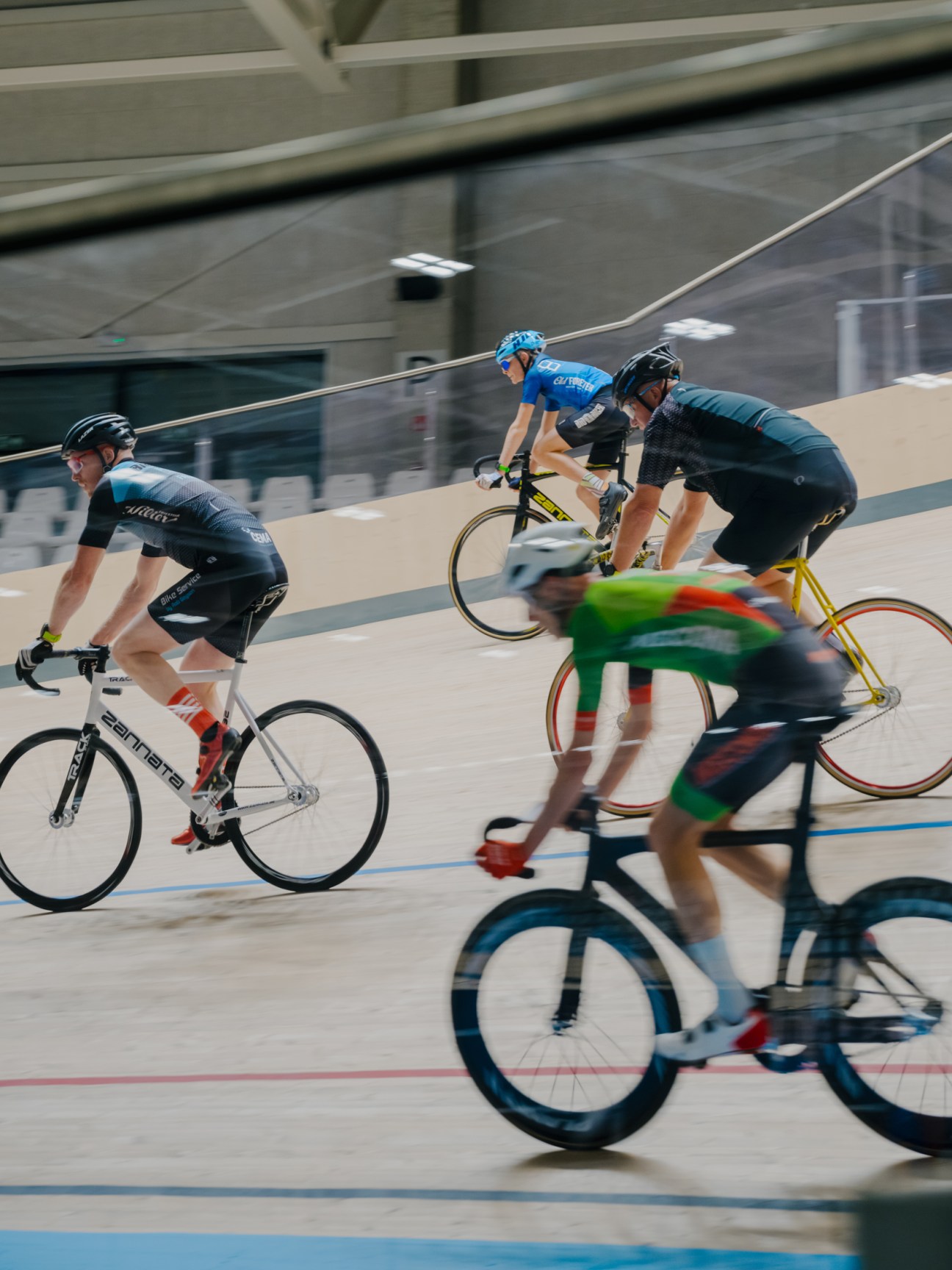
Keen to work up a sweat? The wielerdroom, or velodrome, in the Belgian province of Limburg commissioned by the municipality of Heusden-Zolder (population 33,000) and the Flemish sports agency Sport Vlaanderen is just the place. The building, which opened in late 2023, houses a sports complex with an indoor racing track, which is set to host a series of the European Track Championships in the next few years. It is a flexible space where people of all ages and fitness levels, from international competitors to recreational athletes, are welcome. The outcome is a facility that both locals and touring professionals can enjoy.
“Sportspeople spend hours training in these kinds of buildings. For them, it is like an office or living room,” says Sven Grooten, general director of B-architecten, the Belgian architecture firm that won the competition to design the complex. “As architects designing these spaces, we must ask, ‘What is the light like? Can you see some trees or is there a terrace where you can take a break?’ If we can bring in this quality of life, it will attract people.”

It’s a sentiment with which Karin Hupperts, the project leader at B-architecten, agrees. “When you design a sports complex, you must look at the project through the eyes of sportspeople, visitors and members of staff,” says Hupperts, a former athlete and keen cyclist who specialises in sports-facilities architecture. “Their wellbeing matters.”

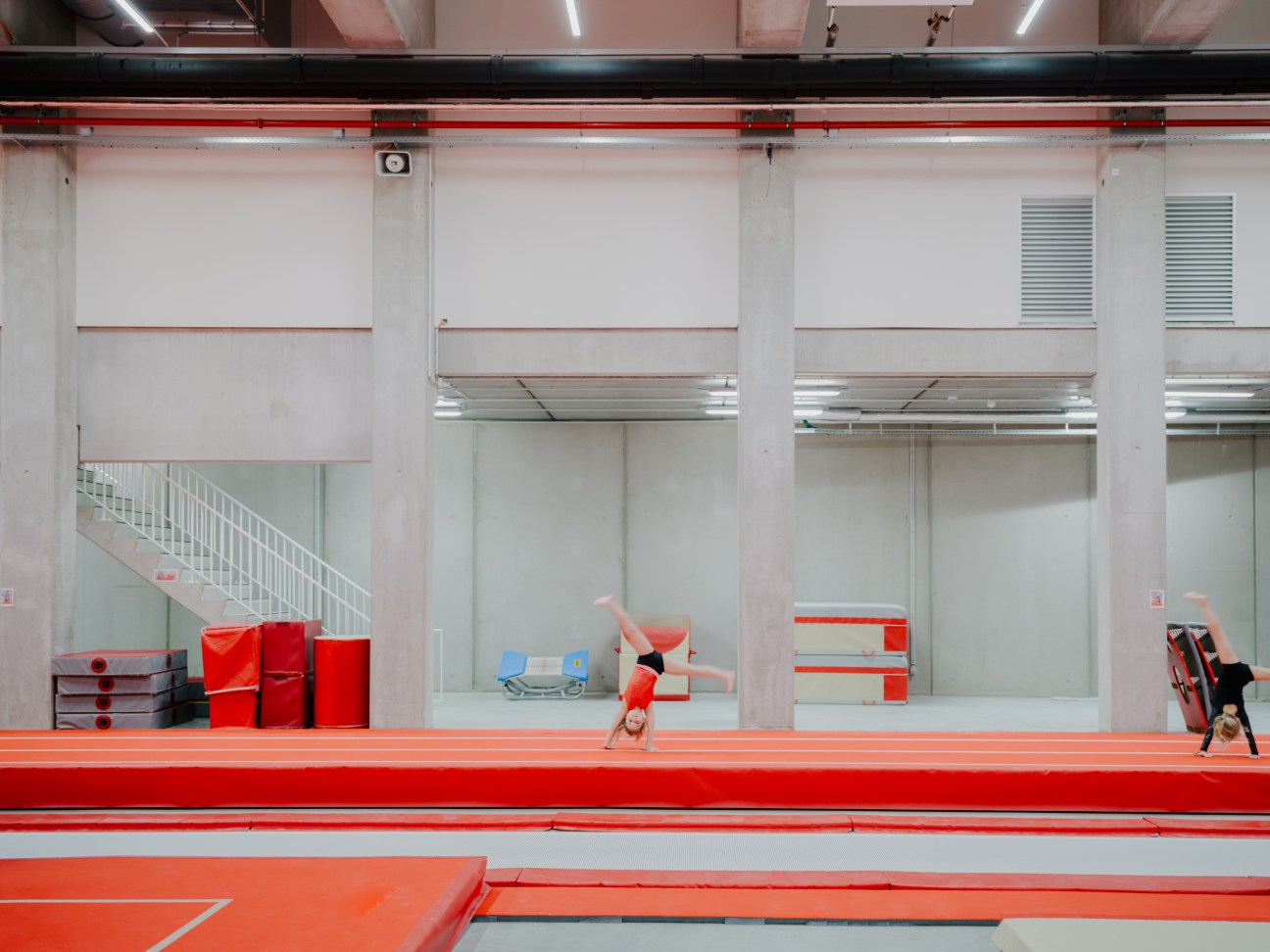
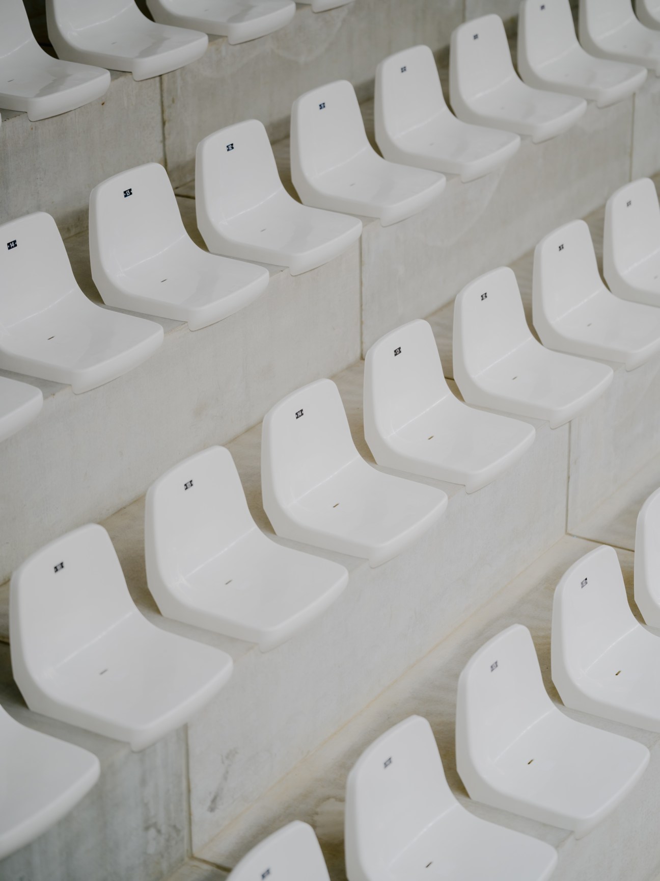
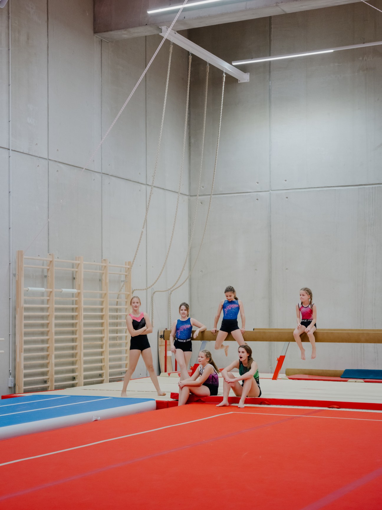
For the project, the architects joined forces with DBV Architecten, which is based in the nearby town of Hasselt, and whose staff were able to visit the construction site regularly. Their presence was essential as the team worked on narrow trapezoidal terrain and an ambitious list of requirements. Essential inclusions were a 250 metre racetrack, 1,000 fixed seats (and another 1,000 mobile seats), courts for basketball, badminton, football and volleyball, a gym, medical centre for the neighbouring Circuit Zolder motorsport racetrack and fitness room. To accommodate everything, the architects came up with a single building with courts in the centre of the cycling track. Made of Finnish pine by German company Velotrack International, the track was modelled on the Tissot Velodrome in Grenchen, Switzerland, and optimised for top performance. Changing rooms fit neatly under the stalls. “Every square metre is accounted for,” says Hupperts. The one-building design has a further advantage: sportspeople from various disciplines can interact. “It is good for sportspeople to meet, including for the atmosphere in the building,” says Hupperts. “It is like an Olympic Village.”
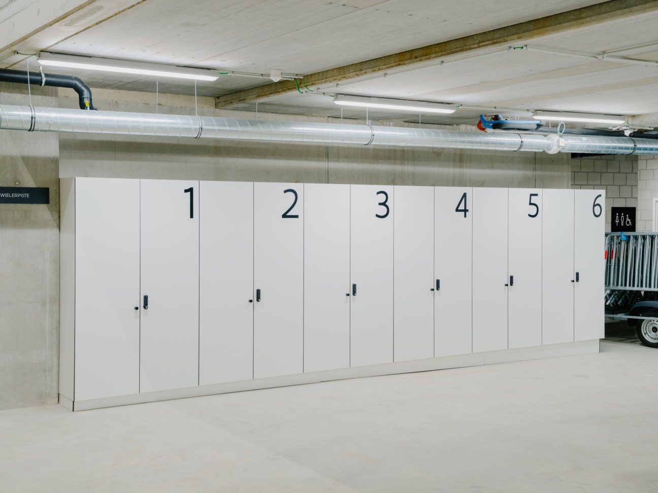
Inside, there is a sense of openness, with a view of the cycling track from the café upstairs, and wide corridors can comfortably accommodate cyclists with their bikes or a crowd of spectators. Interior windows offer views of the gym below. The architects stuck to a palette of black, yellow, grey and white, which recurs throughout, from the lockers to the racing bikes by Belgian brand Ridley Bikes that can be hired on site (cyclists can also store their own in lockers inside the complex). “We wanted to build a timeless building. The idea is that sportspeople are the ones who bring in colour with their flashy gear,” says DBV’s Robin Jame, who led the project with Luc Baert.
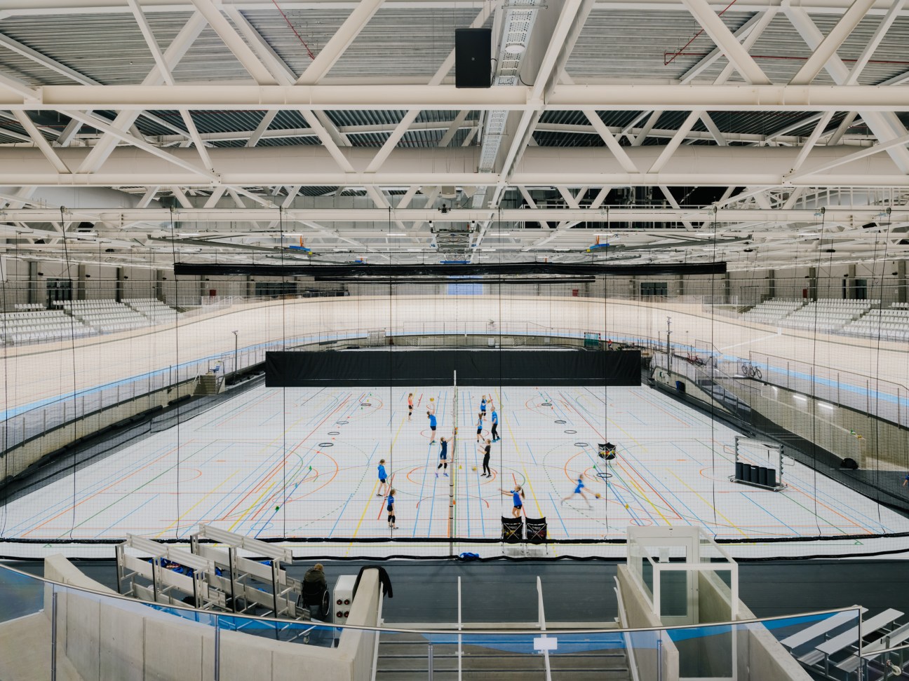
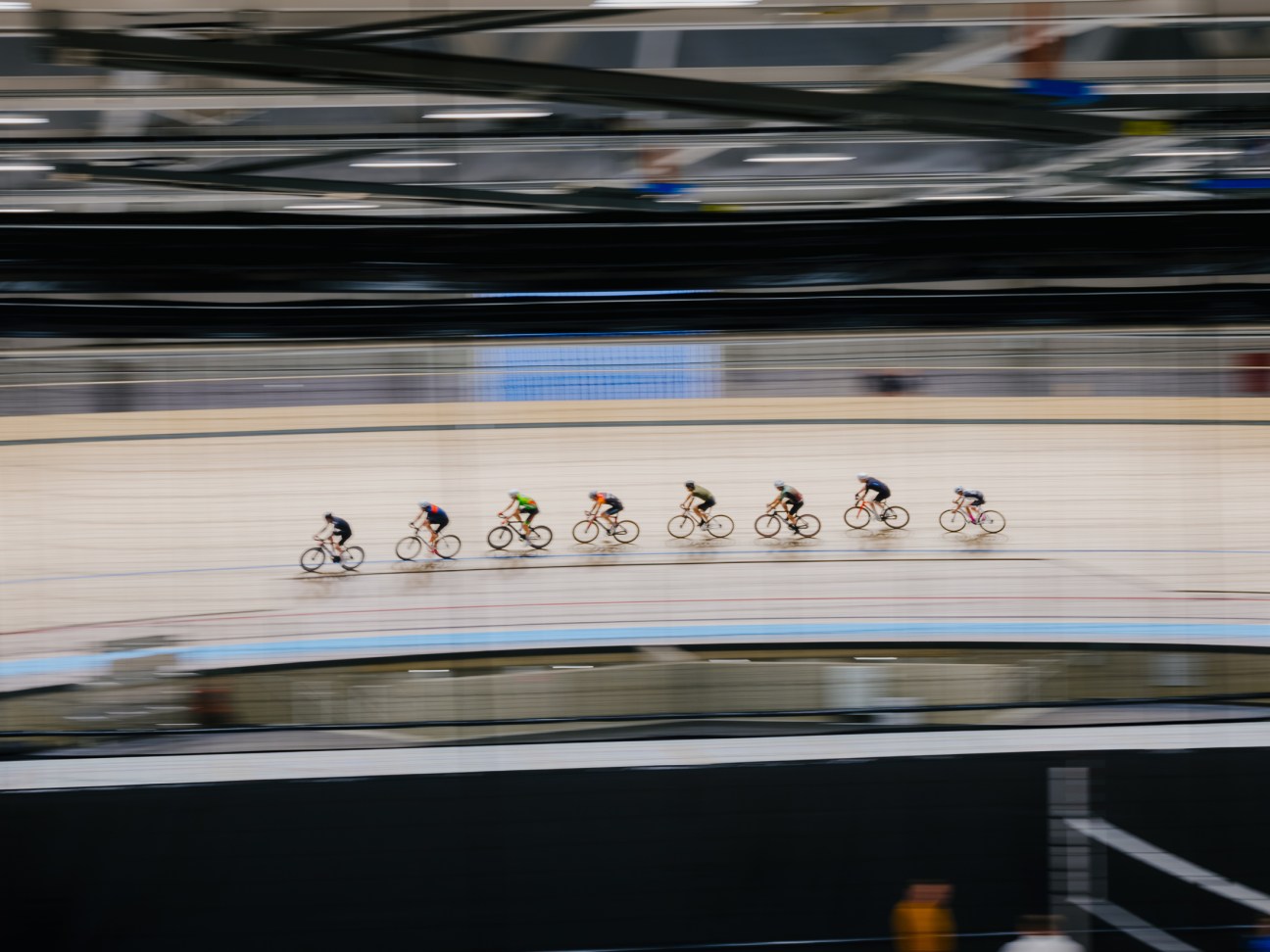
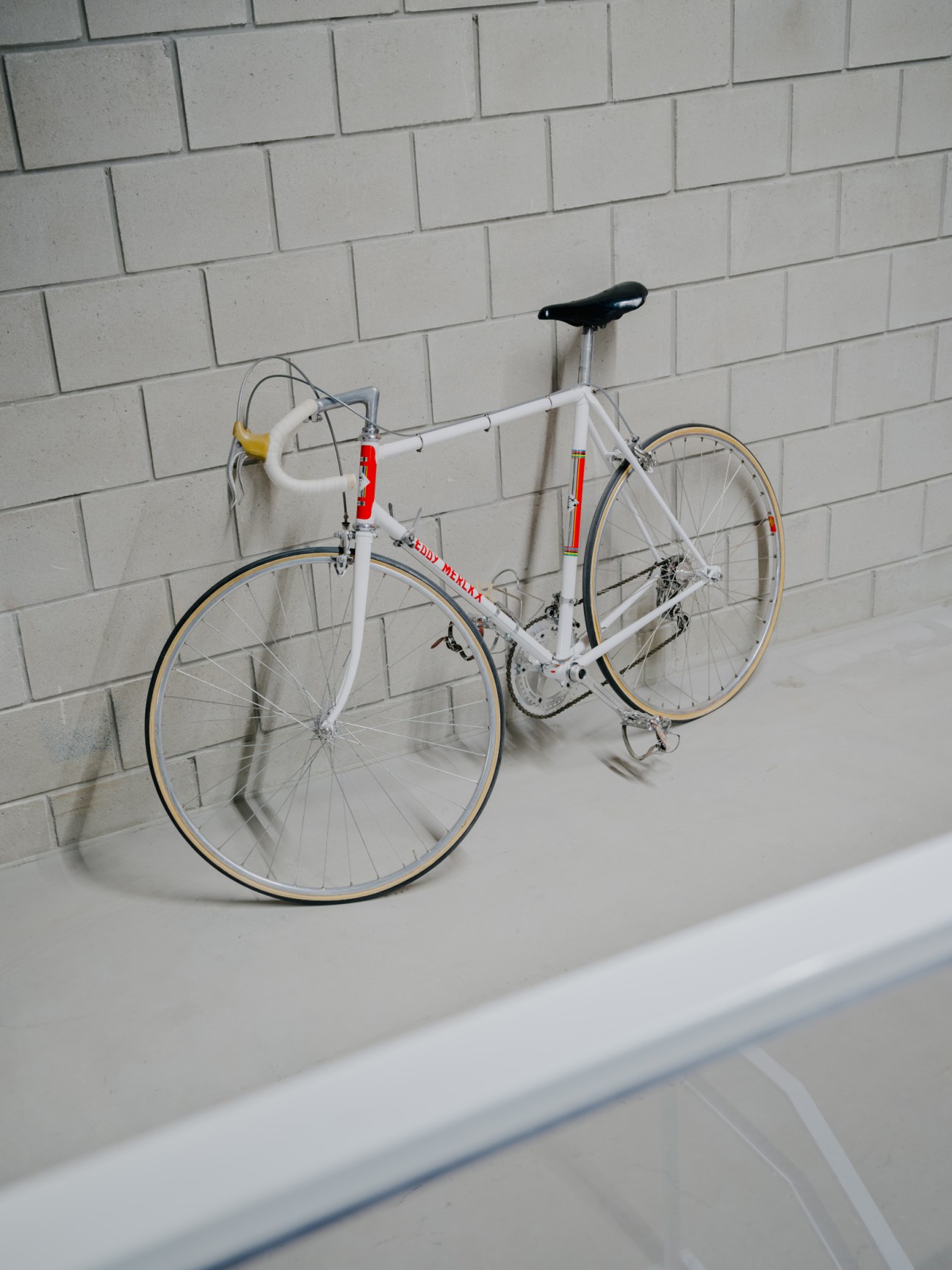
The complex is the second Union Cycliste Internationale-approved cycling track to be built in Flanders (the first is the Eddy Merckx track in Ghent, also designed by B-architecten) and both are informed by Hupperts’ personal experience. “When I was an athlete, we spent the whole day training indoors without daylight. Here, you can see that it is daytime,” she says, gesturing at the windows and the trees beyond. To add more light, the architects incorporated translucent skylights that bring in natural light while avoiding glare on the track, which could distract the cyclists.
The wielerdroom has already become a fixture in the local community as a place to watch and play sport, book a cycling initiation session, work up a sweat in the fitness room or simply catch up over a beer. “As an architect, you want to design a nice building,” says Jame as cyclists whizz around the track below. “Here you have to be humble and put the people who will use the complex first.”
monocle.livement: Good design can anchor a community. When Monocle visits the wielerdroom, the complex is buzzing. Friends chat as they prepare their bikes, volleyball players warm up for practice and visitors watch from the café.
Adopt your own look: The case for dressing in a personal uniform
For New York writer Fran Lebowitz, it’s an Anderson & Sheppard suit, made bespoke on Savile Row. For the designer Rei Kawakubo of Comme des Garçons, it’s a black leather biker jacket and a trademark razor-cut bob. At Milan Fashion Week, Miuccia Prada tends to take her catwalk bow in a pleated midi skirt topped off with some fine knitwear. In a world filled with novelty, a recognisable look, a trademark garment or signature silhouette, can work as a calling card. Think of a uniform as a kind of personal branding. However you choose to dress, the clothes you don are a chance to impress a version of yourself upon the world, to say something to those you meet without speaking out loud. To wear the same item, or a variation on a theme, wherever you go, adds another layer of definition to your image. At the same time, having a uniform removes a layer of decision-making from your morning routine. Perhaps that’s partly why for generations, men in positions of power have relied on the same variation of a well-cut, navy or grey suit. There’s something quite precious about having a signature look: it speaks to an intentionality around getting dressed that requires time and attention – two of the ultimate luxuries of the modern world.
I’ve always aspired to have a uniform, poring over pictures of Diane Keaton as Annie Hall in masculine Ralph Lauren separates and envying peers who built wardrobes around a single designer or trademark piece. Instead, for the majority of my twenties, my own wardrobe was a collection of oddities with no through-line connecting them. In hindsight, I wasn’t ready to pin myself down. My work-life often felt precarious, so I wanted my clothes to act as armour and give me the flexibility I needed to move from one project to the next. That’s one of the powers of clothing, after all – it’s the camouflage an individual needs to gain access to different kinds of context. One morning, I would put on a turtleneck and a smart blazer to meet a new client in a boardroom; another afternoon, I would wear a vintage Laura Ashley dress and trainers to interview an off-duty actor in a neighbourhood café. The single signature style felt like an indulgence that I couldn’t quite afford.
Over time, though, I started defining a uniform and turning particular colours, fabrics and silhouettes into staples. To get there, you can start by tracking down multiple iterations of your favourite styles and silhouettes, the moment you find them. I like slightly wide-legged trousers, men’s shirts, tweed or corduroy layers, knit turtlenecks, a little blue denim, a little white linen and always a dark woollen coat in winter. It’s also better to aim for coherence over strict concurrence and dress for your lifestyle. Out of practicality and a love of walking, I wear my colourful Hoka trainers almost every day.
It’s an ever-evolving process, informed by the places we experience and the people we meet along the way. Last year, I moved home to Dublin, fully aware that the cities we inhabit leave traces on us. It’s not that a city comes with its own dress code but it pushes us to adapt to a new set of circumstances. Until recently, I felt myself to be a Londoner and I dressed for the city’s temperamental nature: its rain and morning fog; its influences, from Savile Row and sportswear alike. I was conscious that my neighbours, my colleagues, strangers on the Tube carriage – most of us had not grown up here. We decided to move here of our own volition; like getting dressed in the morning, it was a choice we had made for ourselves, as a way of determining our own lives.
Dublin, by contrast, is a smaller city – you can walk across it in an hour or two – with long winters that are reminiscent of the Nordics. It’s why here wool is mandatory and a big coat trumps everything. Since making the move, I’ve started wearing colourful vintage scarves to keep warm. I reach for one almost every day and tie it loosely at the throat. Then I go about my day, just the smallest bit more certain of who I am, where I find myself and why. This evolution is a reminder that signature style is a way of taking stock of the changes that defined you: places, jobs, people, decisions made and regretted.
Where to begin to figure out your own style signature? Pinpoint the garments you most enjoy wearing – it might be a blazer with particularly sharp shoulders, a fedora in a specific shade of green or the perfect pair of loafers – and double down. Filling your wardrobe with the items that bring pleasure will shape the impression you leave among acquaintances both new and old.
The unmistakeables
Major players who defined their own look
1.
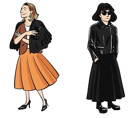
Miuccia Prada
Embodying Milanese elegance, Prada is always seen in midi skirts and slim-fit cardigans of her own design.
2.
Rei Kawakubo
The Comme des Garçons designer carries an air of mystery, partly thanks to her all-black uniform and signature bob.
3.
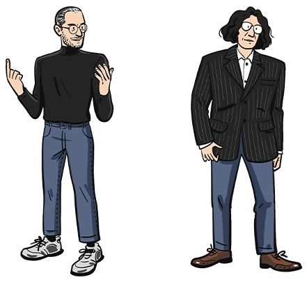
Steve Jobs
Never without his signature Issey Miyake rollneck sweaters, Jobs understood the power of personal branding from early on.
4.
Fran Lebowitz
The writer is known as much for her sharp wit as her flair for boxy Savile Row blazers and brown cowboy boots.
5.
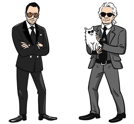
Tom Ford
Ford applies his sense of precision when dressing himself in a uniform of slim suits and aviator glasses.
6.
Karl Lagerfeld
A uniform of fingerless gloves, sharp suits and dark sunglasses turned the fashion designer into a pop-culture icon.
monocle.livement: Rethink your shopping habits by taking a step back from the fast fashion cycle and returning to the atelier, where you get to meet the makers, learn about the production process and invest in fully personalised items.
How Canada keeps immigration simple and strategic
From Rwanda deportation schemes to walls on the Rio Grande, rich countries are flailing on immigration. The exception is Canada, which is ramping up its annual immigrant quota to 500,000 from 2025 in an orderly fashion: no “migrant crisis”, no undocumented population living in the shadows. How did the country arrive at such a different approach to its peers?
In 1971 this vast territory with an ageing workforce and declining birth rate needed labour. Then prime minister Pierre Trudeau made Canada the world’s first country to embrace multiculturalism as a national policy, a decision that evolved into today’s immigration system. “Canada is a global social experiment,” says Chris Friesen, COO of Immigrant Services Society of British Columbia (ISS of BC). Nowhere is that more evident than in ethnically diverse British Columbia, anchored by Vancouver, where 10 per cent of marriages are interracial. BC’s population grew by 3 per cent in 2022, the fastest in 40 years, and a record 40,000 international migrants settled there in the first quarter of 2023, drawn by a temperate climate and strong economy.
So what makes Canadian immigration tick? First, applicants are judged on a points system. Stem degree? Points. French speaker? Points. Under 45? Points. Since immigration is treated as a labour issue, the rubric shifts based on employment needs. Once it prioritised healthcare workers, now tradespeople. The rules are logical, transparent and widely understood. Nobody shows up expecting an open-border policy. Second, linguistic integration is paramount. Publicly funded charities abound teaching English or French, Canada’s two official languages. Canada discourages linguistic isolation and the formation of ethnic enclaves.
In the Vancouver suburb of Richmond, where 60 per cent of residents are foreign born, Monocle sees a Pakistani immigrant facilitate English conversation in a room of Taiwanese, Indians and others. They cheer when a South Korean mum recounts how she conducted her son’s parent-teacher conference in English rather than relying on a translation. Down the road, the senior vice-president of a pan-Asian shopping mall proudly explains how the company’s design guidelines require English prominence over native languages on signage. Third, new arrivals aren’t left to the wolves. Annual expenditure of CA$1.8bn (€1.2bn) in civic infrastructure for settlement services operates coast to coast. Social workers assist immigrants with transferring professional credentials, training for new jobs, enrolling children in school and opening a bank account.
Canada is a humanitarian superpower, accepting more than 100,000 refugees and asylum seekers a year from the likes of Syria and Afghanistan. For extreme cases, facilities such as the Vancouver headquarters of iss of BC offer trauma counselling, childcare and temporary housing. But Canada’s generosity is even keeled. When the UN calls, Ottawa doesn’t accept more people than it can handle.
There are, of course, discontents. Public opinion partly blames high rates of immigration for Canada’s housing crisis. Settlement agencies lament that finding affordable rental housing is the biggest hurdle for new arrivals and images of refugees sleeping on Toronto’s streets have shocked the nation. The squeeze of unobtainable housing might hurt prime minister Justin Trudeau’s Liberal Party during soon-to-be-held elections. But Conservative opposition leader Pierre Poilievre remains broadly pro-immigration. So many new voters went through the Canadian system that keeping an open door is popular politics.
monocle.livement: Be pragmatic and show compassion. If you are in a position of influence, be up front about the benefits of immigration rather than simply playing to the negative crowd. A mix of cultures will enhance any community.

Cap Karoso, the resort that put Sumba on the map of globetrotters
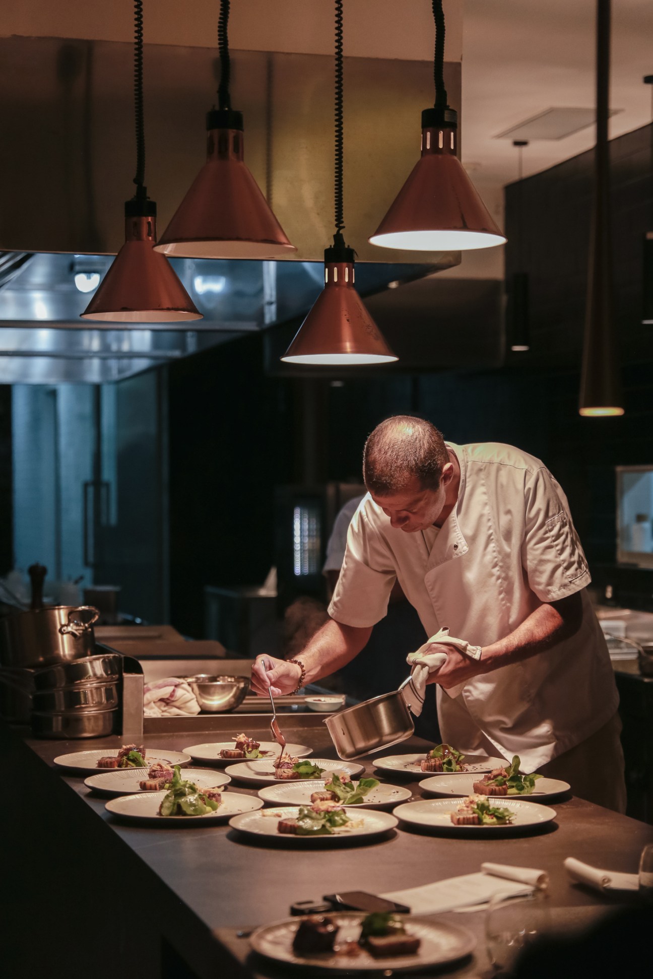
French chef Antoine Levacon crouches and plucks a sprig from a bright-green shrub in the undergrowth and passes it to Monocle. It’s fragrant yet unfamiliar: a scent that’s somewhere between basil and lemongrass. “Kemangi,” says Levacon. “It’s amazing. Now we have it everywhere on the farm.”
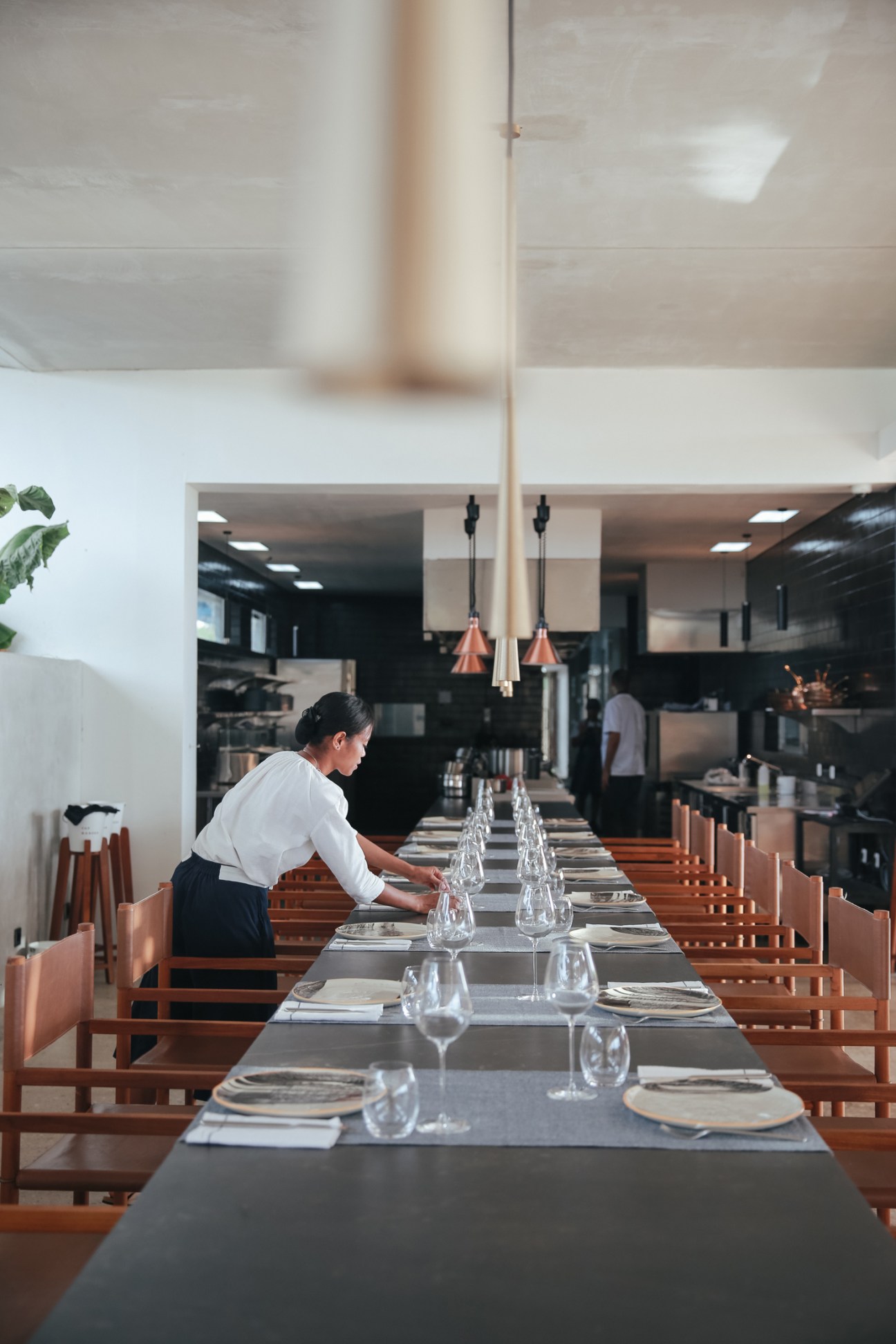
Levacon gestures to another patch and a crop of small watermelons resting on the warm, dark earth. Checking on these crops is part of the daily routine of the executive chef of Cap Karoso, a hotel and resort on the island of Sumba, eastern Indonesia. The soil here is fertile and everything from papaya to edamame and even an olive tree grows on this substantial plot of land, which supplies half of the restaurant’s food.
Entrepreneurs Fabrice and Evguenia Ivara came to Sumba on holiday in 2017 and were so taken by the island that they decided to make good on their long-held dream of opening their own resort. “We had always said, ‘After we retire, we’ll build a hotel,’” says Evguenia as we walk along the sand beside Cap Karoso. “When we came here we fell in love and felt that it had a lot of potential. The island was at the tipping point of becoming known.”
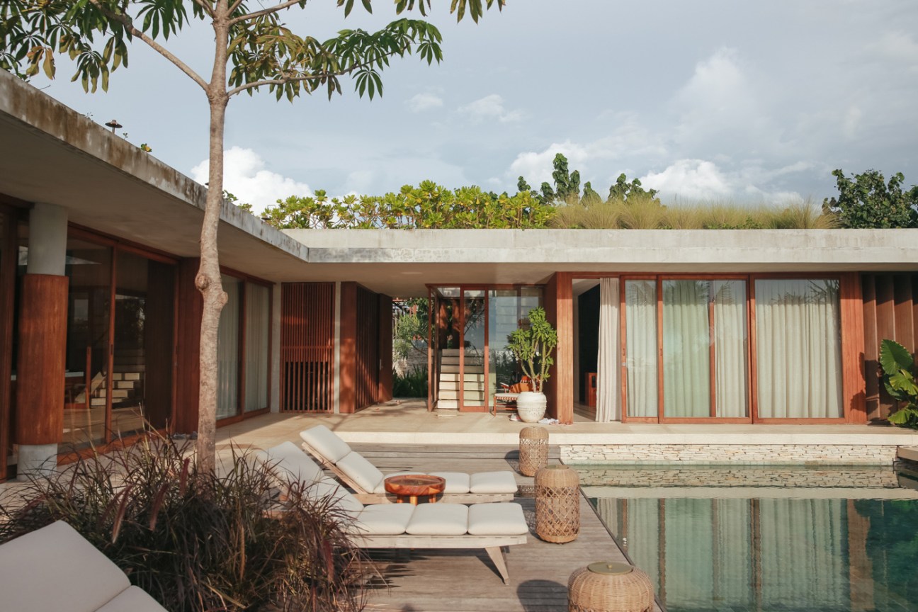

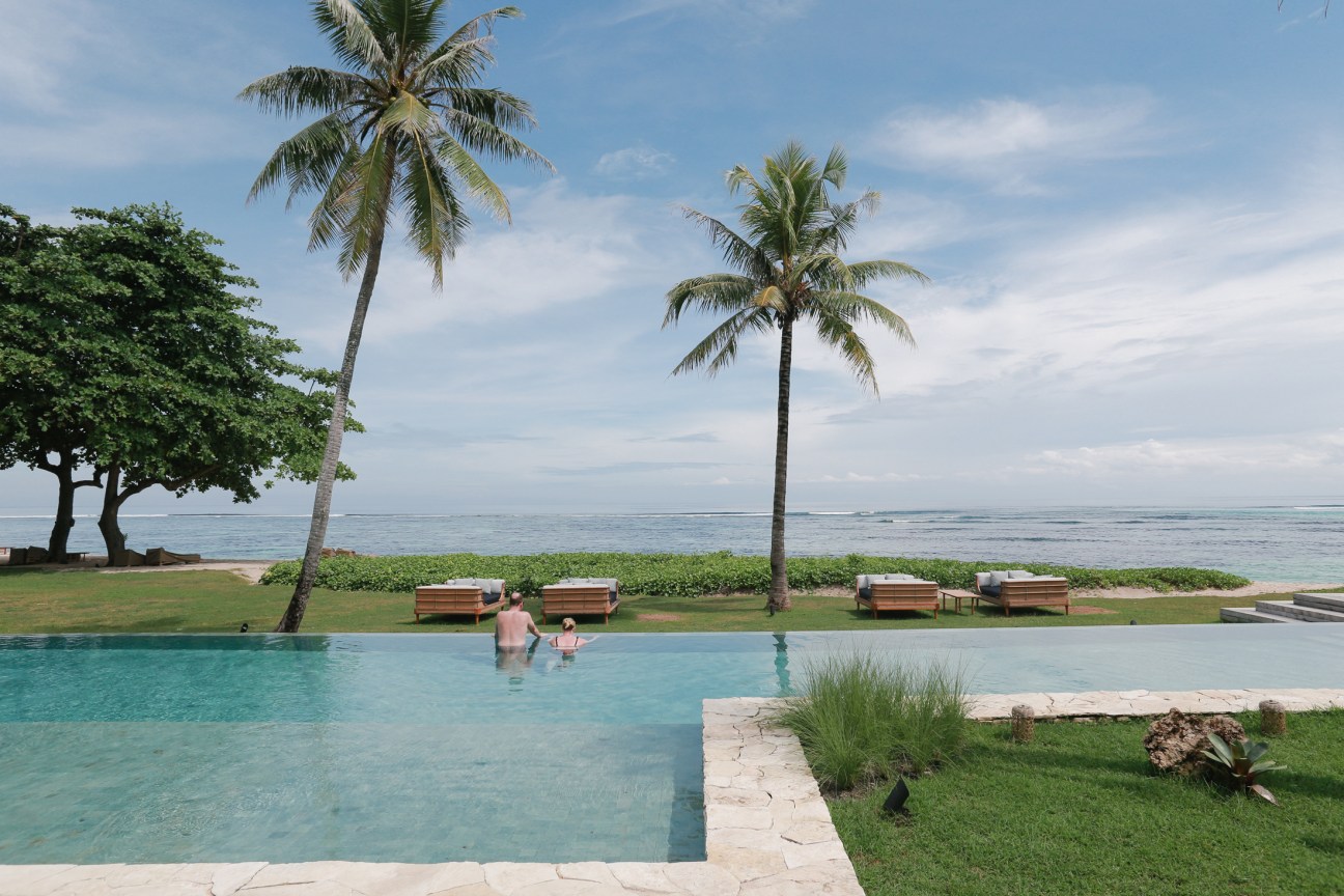
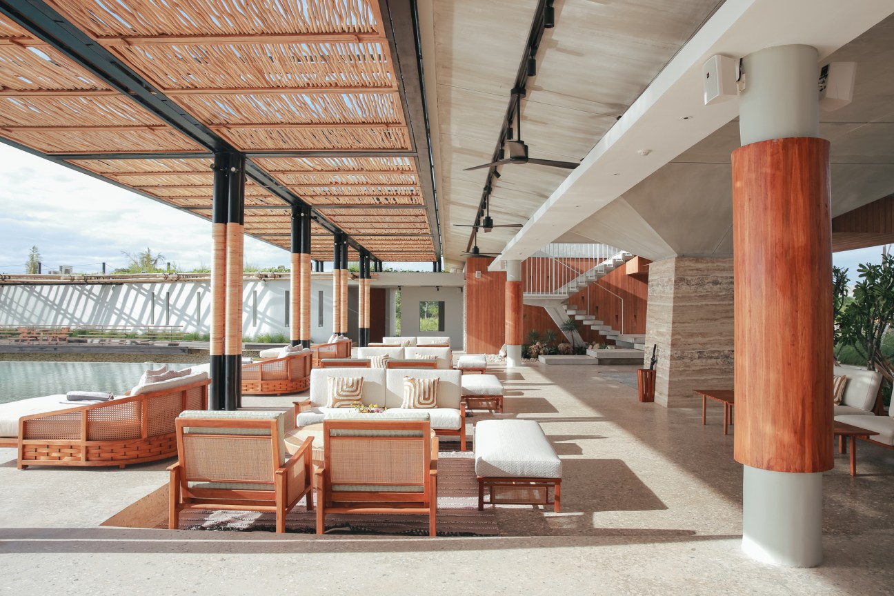
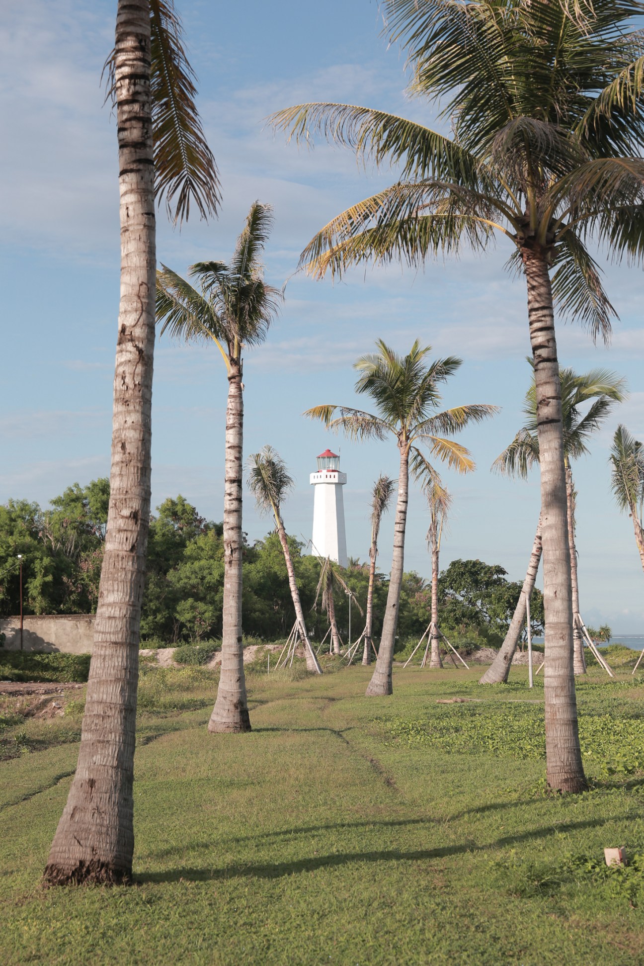
The hotel sits on the western tip of Sumba, with striking views of the Indian Ocean. The water seems to stretch out endlessly; to the west, the closest land is Africa’s distant eastern coast. This sense of remoteness is calming. Getting here requires taking a propeller plane from Bali, then hopping into a car for a drive past cornfields, water buffalo and cliff-fringed beaches.
The property’s entrance is understated. It’s only after you’re greeted at the check-in and turn a corner that the full picture comes into view, including an infinity pool, a bar overlooking a white-sand beach and the vast ocean. “We worked on creating this little unexpected moment,” says Evguenia with glee.
There are 44 rooms and 20 villas, all with private pools. Bali-based GFAB Architects gave the resort a terraced layout in a nod to rice paddies, making it fit in well with the landscape. The warm-toned interiors are trimmed with wooden furniture made by Indonesian craftspeople and almost everything in the rooms is bespoke, including the teacups from Bali’s Gaya Ceramic and the French cushion fabric. The owners picked the novels and nonfiction books on the shelves. “Every night, people stay up late, drinking and talking, then they meet the next morning at breakfast,” says Evguenia. “Friendships and interesting discussions arise. Our guests connect and exchange ideas. We want to have a community here.”
capkaroso.com
monocle.livement: Take some time off. It’s important to decompress at least once a year. And if you can do nothing somewhere spectacular, then do – your health and your work will benefit.
The Florentine art residency and hotel fostering creativity in a Renaissance palazzo
Creativity is the lifeblood of cities but in Florence, where its Renaissance past looms large enough to overwhelm the present, contemporary culture needs some champions. This is why the art residency and hotel Numeroventi is fostering a community of artists, designers and musicians from around the world – the city’s historically creative spirit revived in the 16th-century Palazzo Galli Tassi.
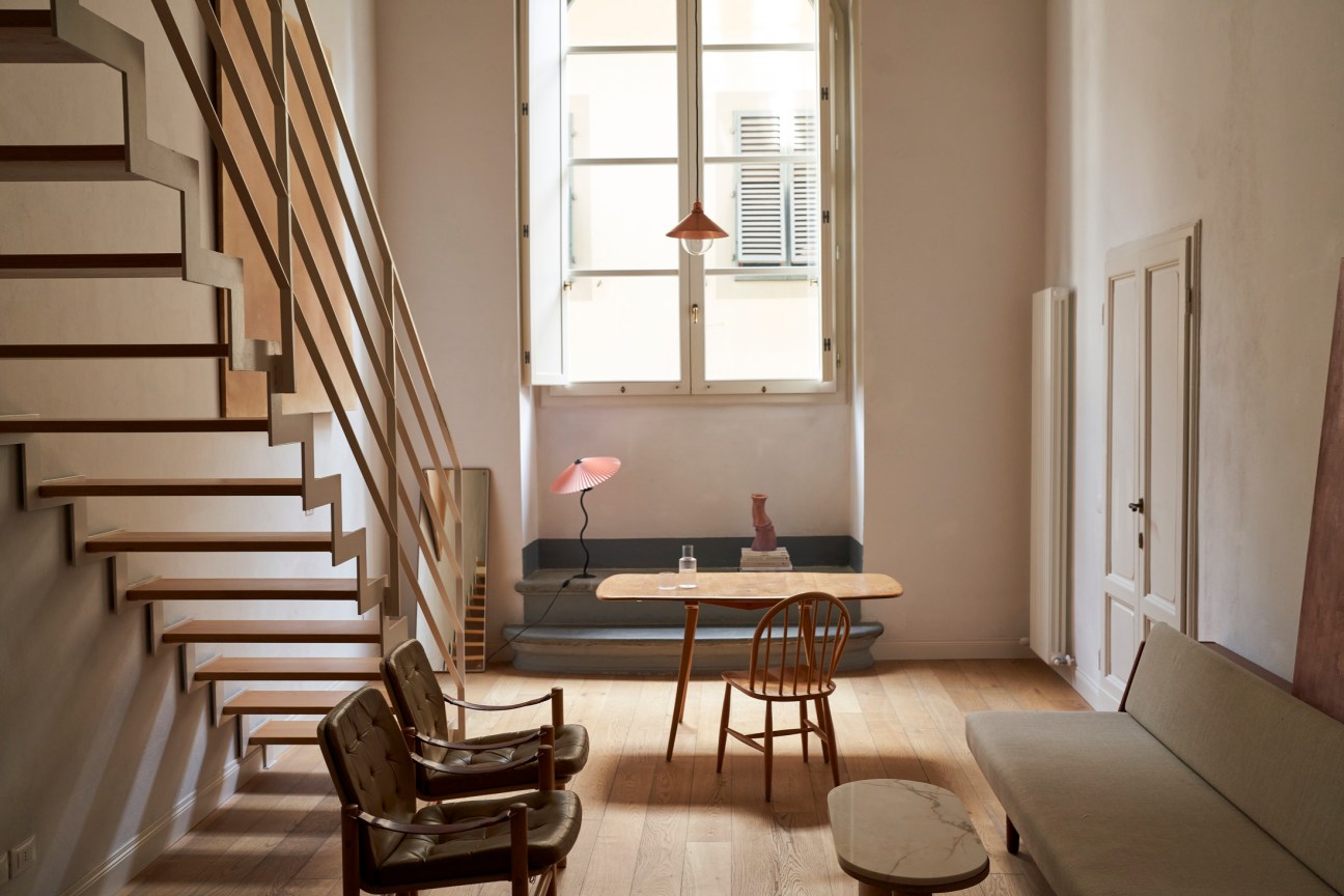
Numeroventi was established by Martino di Napoli Rampolla, who transformed this noble residence into a design destination in 2016. Gradually clearing out the accumulated detritus and remodelling each floor, he filled the centuries-old rooms with icons of modern design and new works by residents, transposing influences of Scandinavian and Japanese interiors to this grand Florentine palazzo.
“Making another Airbnb out of this place would have killed me,” says Rampolla. The time he spent living abroad after university, in Barcelona, Ghent and Tokyo, showed him how vibrant, artistic cities could give a “feeling of participating in something bigger than my own small life”. “I had the need for a sense of belonging and I wanted to create that for others,” he says.
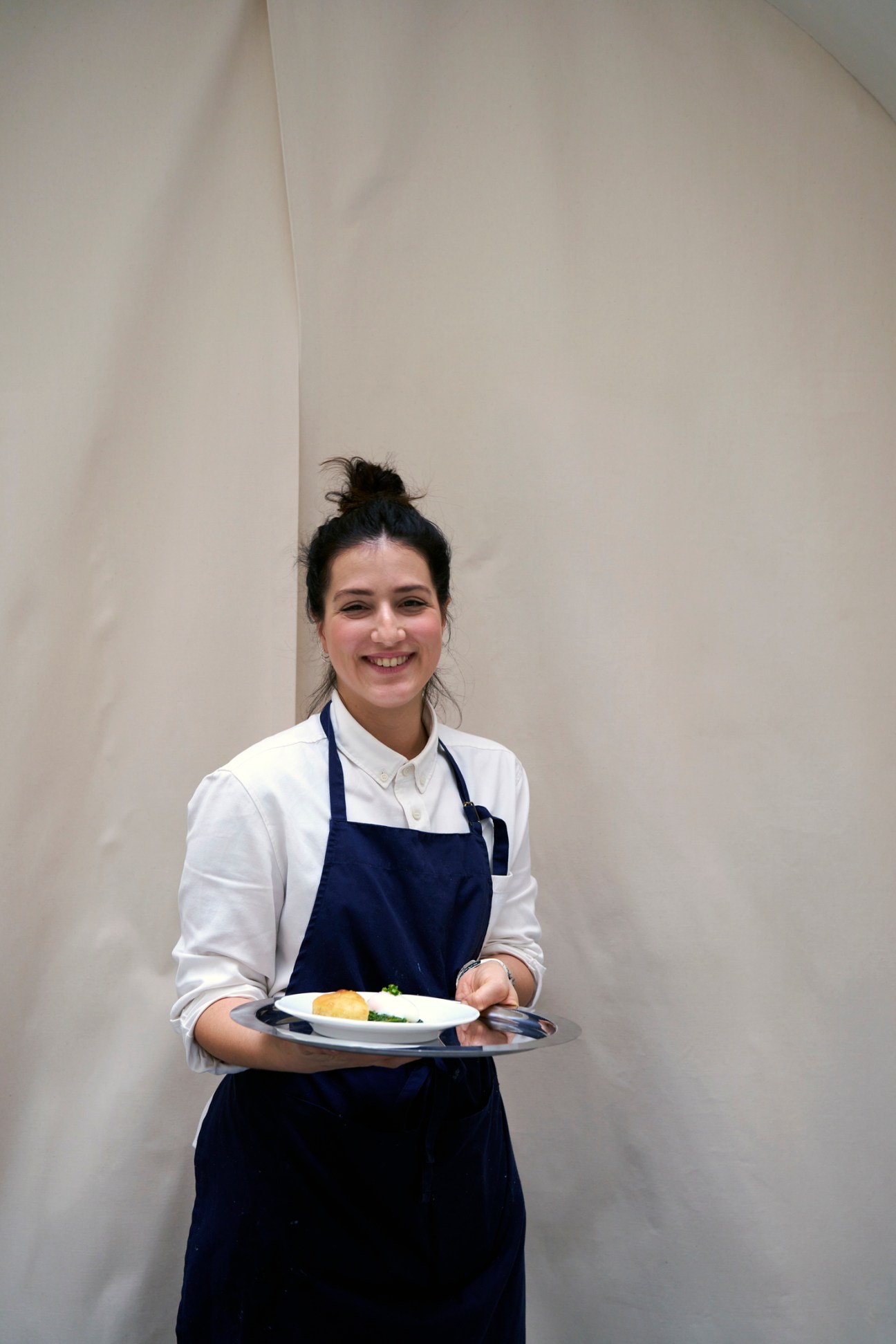
Numeroventi is buzzing with preparations for a new exhibition when Monocle stops by. Recent collaborators have produced a series of works still on display in the ground-floor gallery rooms, with a bullfighting ring and hand-carved wooden spectator seats crafted by South Korean designer Minjae Kim and fantastical paintings by Samuel Guerrero from Mexico City. In the palazzo’s arch-lined courtyard, facing a 1659 marble statue of Hercules and Iole, New York-based artist Gala Prudent has built a twisting ziggurat from local clay bricks. Meanwhile in Numeroventi’s lounge, the young team, which includes a full-time chef, rushes about lighting pillar candles and sticks of palo santo, arranging wine glasses and silverware to prepare for the day’s brunch and inauguration party.
Artist Kasia Fudakowski eyes one of her bulbous glass sculptures as it is wired up to hang mid-air, floating above a long table arrayed with the other works she has produced during her residency. Based in Berlin, Fudakowski has used her time in Florence to imagine these shapes but also to make them with the artisans of a glass-blowing workshop in nearby Colle di Val d’Elsa.
Numeroventi funded and oversaw the production of Fudakowski’s glass pieces. “My relationship with my gallery isn’t like that,” she says. Connecting artists with Tuscan artisan workshops has become increasingly central to the residency’s model. The vicinity abounds in craft for those looking to create in collaboration with artisans, including metal casters, woodworkers, mosaic makers, Carrara’s marble quarries, Volterra’s onyx and alabaster carvers and Impruneta’s ceramics experts. Residencies, with candidates arriving via applications and invitations, are financed by Numeroventi’s hotel operations, with support from the Castello dei Rampolla winery run by Martino’s family in Chianti, which also sponsored the palazzo’s refurbishments.
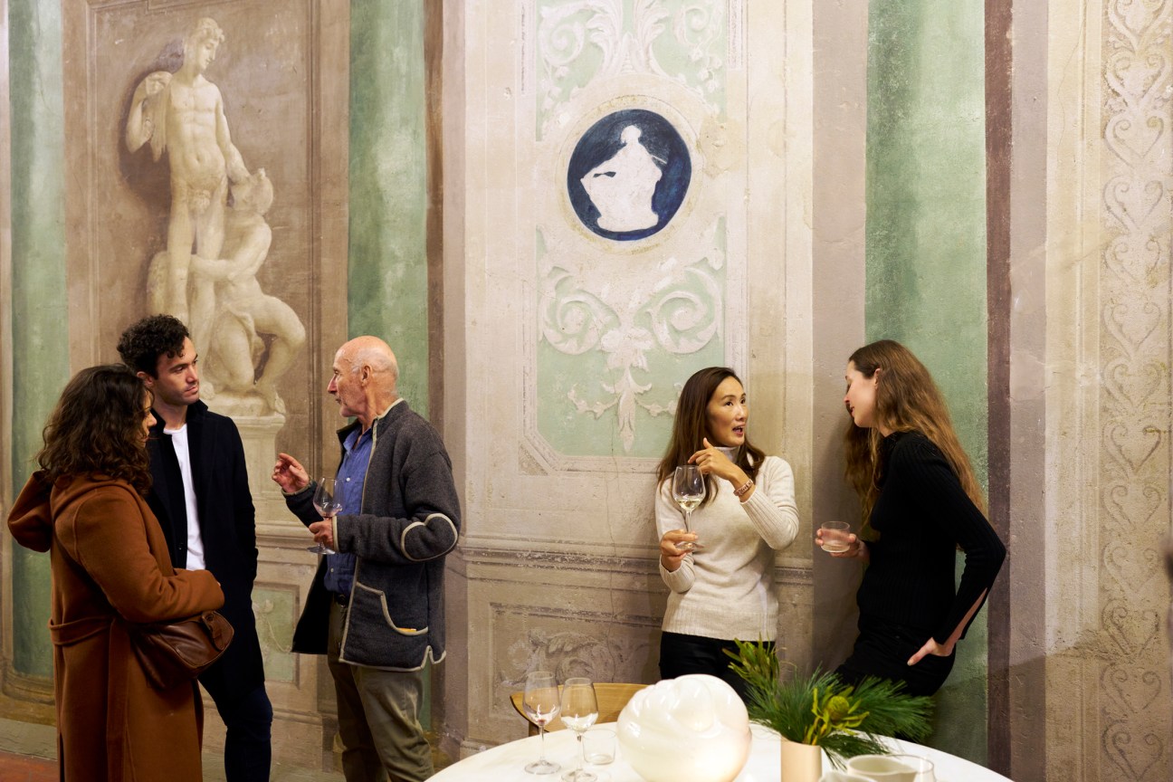
“The focus here is on experimenting,” says Arianna Iandelli, Numeroventi’s gallery manager, who previously worked in a commercial gallery. “We’re involved from the beginning, getting artists and designers to go beyond what they’ve done in the past. And the space itself helps. It’s not a white-cube exhibition room or a blank, white studio to work in – it’s Numeroventi.”
The galleries offer a platform for the fruits of the residencies and open up the palazzo to the Florentine public which, after the brunch for special guests, crowded into the palazzo to see the latest works on view. “This team guides you to greater depths in your practice,” says Maya Dikstein, a Brazilian artist who in her own previous residency at Numeroventi turned deconstructed pianos into tapestries of colourful threads that were played by dancers. “It’s like travelling. If you have the right local guides, you’re able to go deeper than a tourist who can only scratch the surface.”
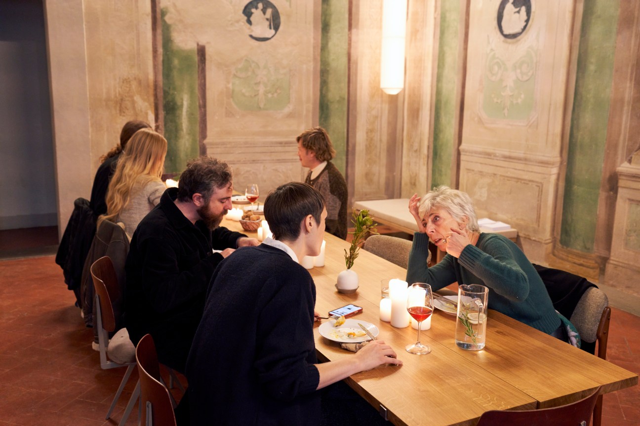
Numeroventi is a favourite getaway for international songwriters such as Dev Hynes (aka Blood Orange), Benjamin Clementine, Lewis Ofman and Christophe Chassol, who have also performed intimate concerts for locals. Today the music residency is taking a more constructive form, offering sought-after tools to work on pieces in a new collaboration with the Vintage Audio Institute, which holds one of the world’s premier collections of rare Italian synthesizers from the 1970s and 1980s.
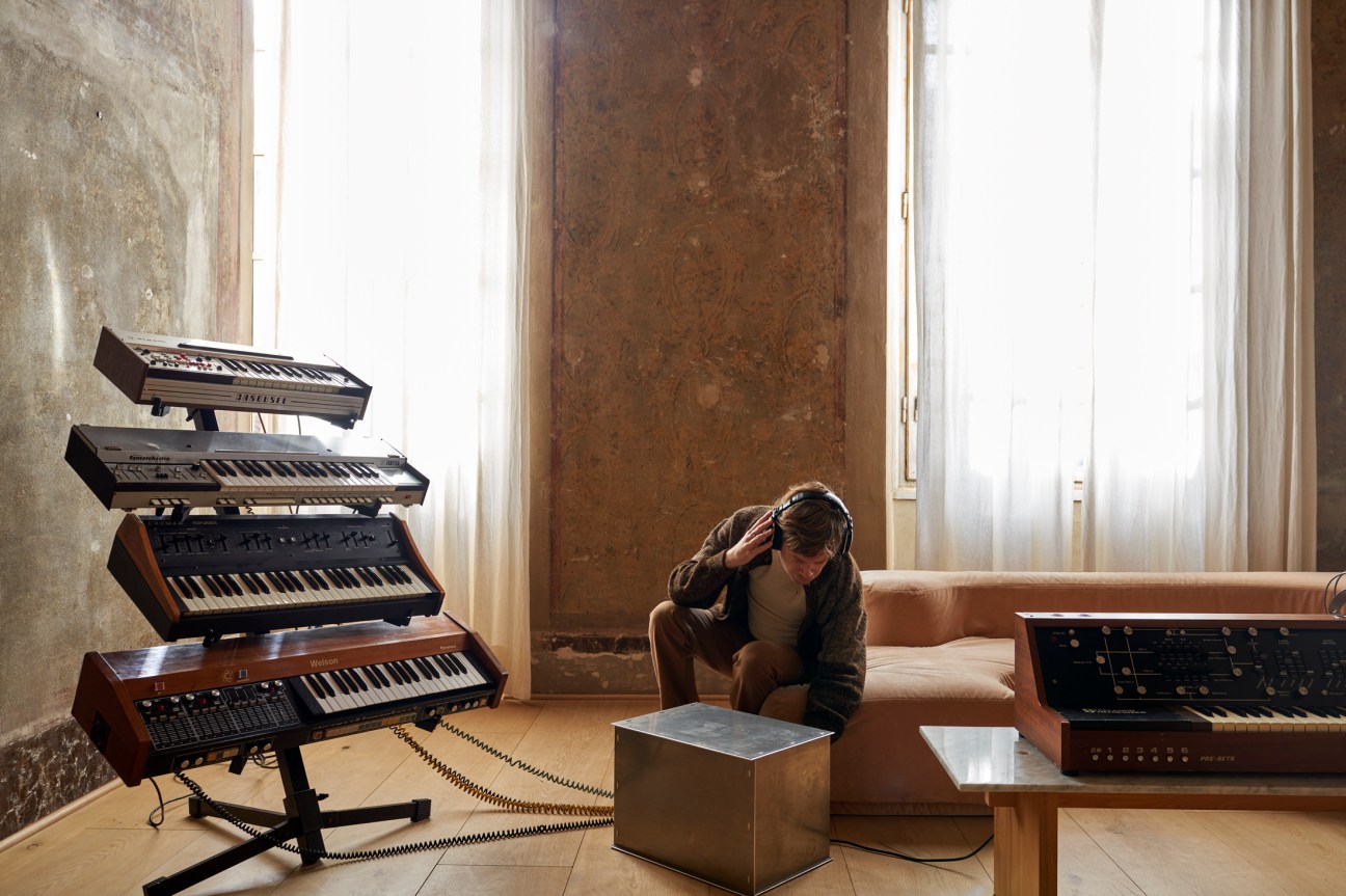
On the day of the opening, a slew of the machines are set up in the top-floor loft, a soaring room whose 17th-century floral-painted walls were only revealed in a recent renovation. “Each machine has a unique character that you’ll never get from digital instruments,” says Pontus Berghe, a musician and founder of the Vintage Audio Institute.
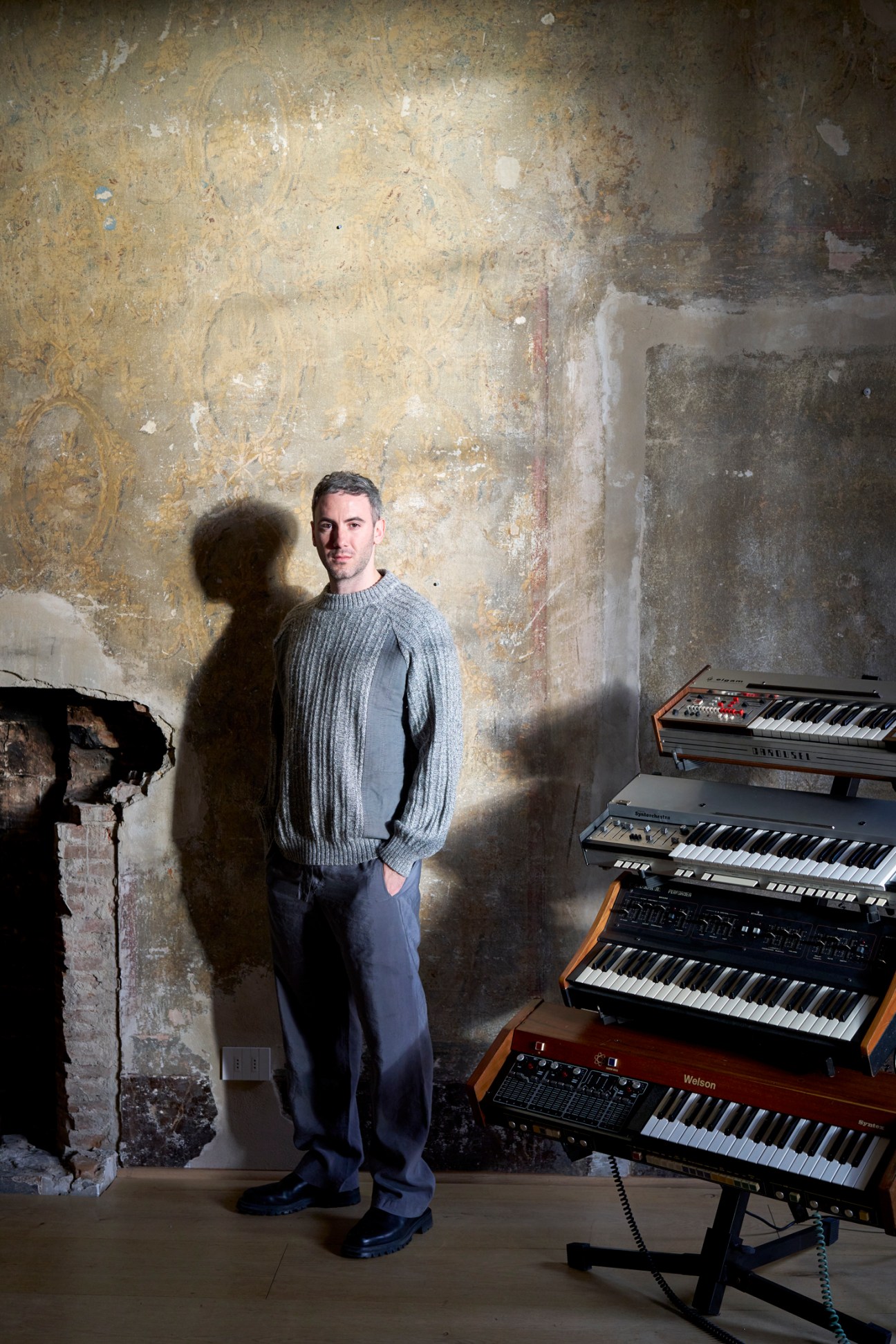
The residency for artists, designers and musicians was, says Rampolla, “conceived as a space to explore your imagination far from career demands”. He is plotting more ways to grow, with a tract of seaside land in Brazil for a Numeroventi outpost abroad, and plans for a natural wine bar in-house in Florence. “This city caters to what we already have, to tourists – not to the youth and the contemporary scene,” he says. “But can the future be based on the past?” It’s a rhetorical question. With Numeroventi, it no longer has to be.
numeroventi.it
monocle.livement: Find a creative corner. Surrounding yourself with like-minded individuals and a nurturing environment will do wonders for your own imagination.
Step into atelier Luca Avitabile, Naples’ bespoke shirtmaker
Calling on an expert cloth-cutter shouldn’t be reserved for special occasions or formal suiting. Skilled artisans around the world take commissions for everything from made-to-measure shirts to custom-made gloves, ties and footwear designed to last a lifetime. Booking an appointment with a local tailor or visiting a specialist atelier while on the road is a smart investment that will ensure that you feel good and look your best during professional engagements and social gatherings. The process also opens up opportunities to build relationships with the people making your clothes and to follow the process from beginning to end, a refreshing change from fast fashion and next-day deliveries.
Naples is a city that’s teeming with workshops that produce one-of-a-kind items. You’ll find the best ties at Marinella, expertly cut trousers at Marco Cerrato, elegant leather gloves at Omega and the finest-quality shirts at Luca Avitabile. “A made-to-measure shirt offers almost infinite possibilities and a level of comfort that is hard to get any other way,” says Neapolitan shirtmaker Luca Avitabile, who is part of a tight circle of southern-Italian sartorie offering bespoke shirting for discerning shoppers from around the world.
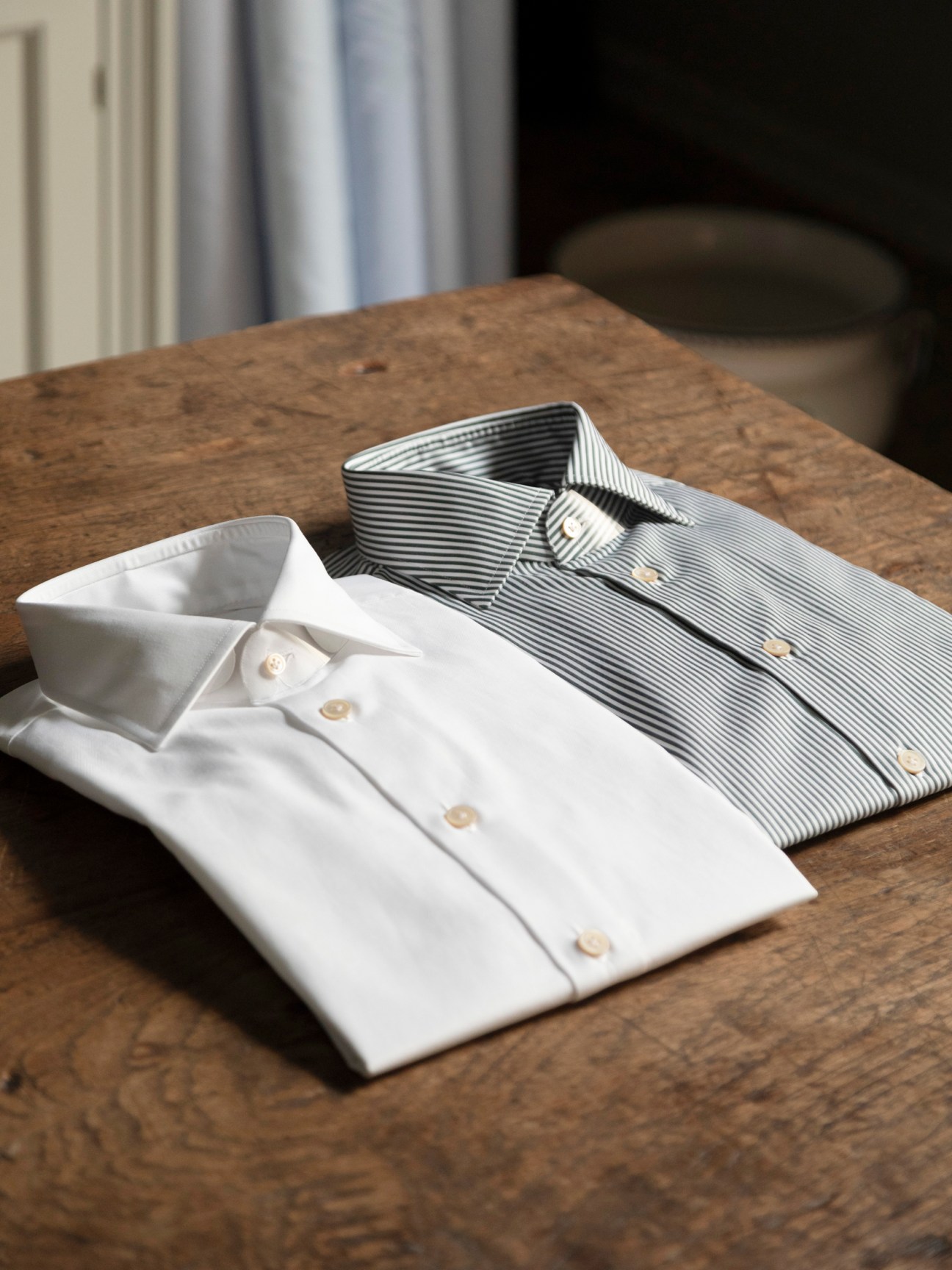
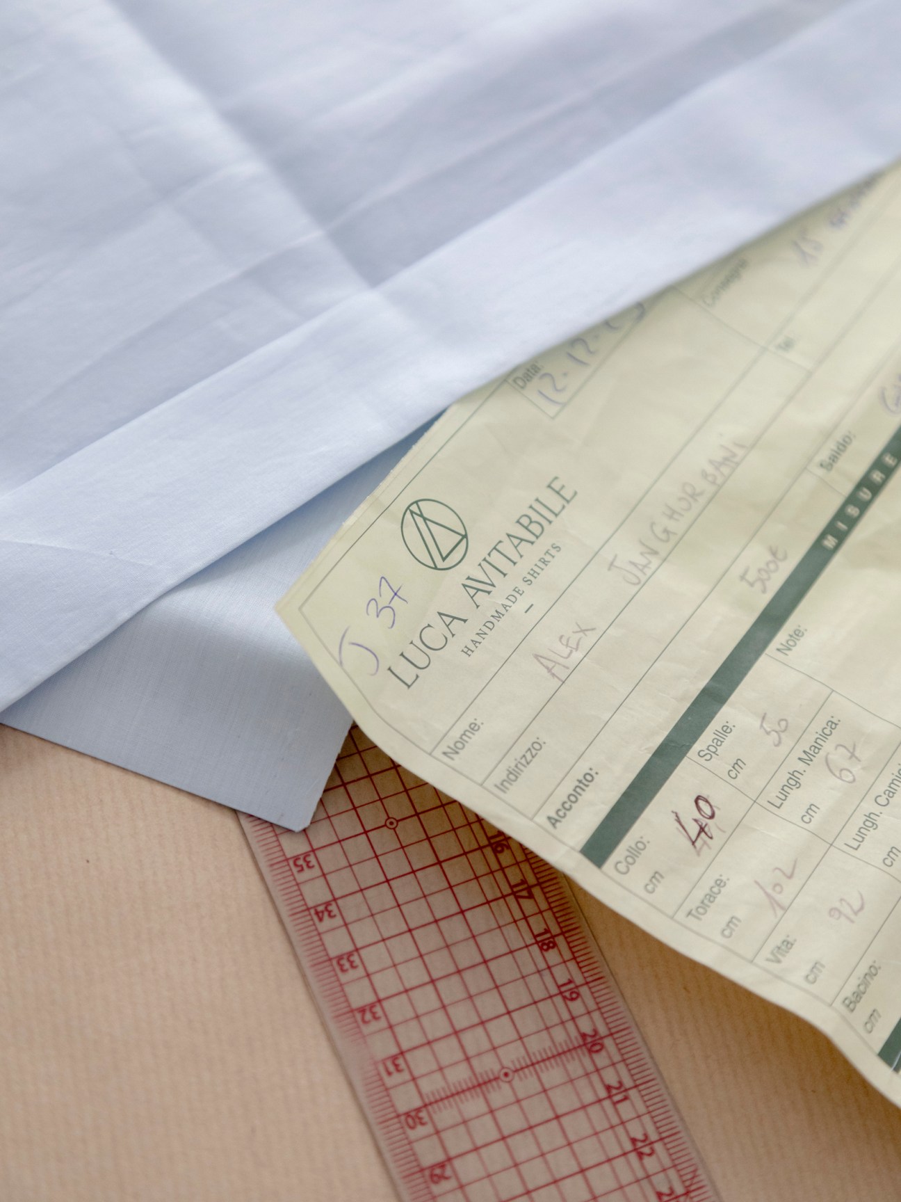

The experience of having a shirt made at Avitabile’s atelier usually starts with a walk along the streets of Naples. Connoisseurs know to steer their way to Via Toledo, a hectic shopping promenade in the city centre. Between the blinking shop signs, they duck through a discreet entryway, walk one flight up an echoing stone stairwell, ring the bell and step into Avitabile’s terrazzo-floored fitting room. After a cup of coffee and the usual pleasantries, Avitabile will pull out a tape and swiftly start taking measurements. It is a seasoned performance. Avitabile was born into the trade – his father was a shirtmaker, as were his grandparents – and also has a degree in shirt-cutting from the Instituto Secoli in Milan.
The model of the shirt follows the Neapolitan custom of having slightly higher armholes than the English standard. “It allows for a snug fit without sacrificing comfort,” he says. Then it’s time to get creative and choose from an array of options: the shape and stiffness of the collar, the type of cuff, the question of front pockets. In Avitabile’s drawers, there are hundreds of fabric swatches, from striped Carlo Riva twill to Alumo’s soft Swiss cotton or even Japanese denim. And don’t forget the buttons: should the mother-of-pearl be Australian or Tahitian? Though Avitabile works with old-school rigour, his version of the tailored look is relaxed. On most days the shirtmaker wears the Friday polo, sewn from a lightweight piqué fabric, paired with a sharp overshirt. The casual models were introduced in 2020 as part of a ready-to-wear line and have proven to be just as popular custom-made. “Clients who come for a classic shirt usually add a [made-to-measure] overshirt or a polo to their order,” says Avitabile.

After the introductory appointment, Avitabile sits down to cut a shirt pattern from plain muslin. He then follows this up with a fitting. “This is the most delicate part of the whole process,” says Avitabile, who is a firm believer that there is nothing that can’t be fixed with a few pins and another turn of the sewing machine. “That is my favourite part.”
After the fitting, the atelier is ready to start cutting into real fabric. Within six weeks the finished shirts land on customers’ doorsteps, wherever they are in the world. The workshop archives every customer’s personal shirt pattern, meaning that after your first order, in-person fittings are no longer essential.
Of course, this decidedly old-fashioned process is far lengthier than heading to a department store and picking out a mass-produced item that’s sitting on a shelf. But it’s also a satisfying one that gives you a chance to invest in valuable craft traditions, experience exceptional service and get creative too.
lucavitabile.it
monocle.livement: Fast fashion is convenient but also limited and bad for the environment. Having clothes tailored puts you at the centre of the process – and the outcome. The result? A wardrobe that you’ll love for a lifetime.
Spaces that inspire: Exploring seven architecturally unique places around the world
1.
Somewhere to read
Dipòsit de les Aigües
Barcelona, Spain
Water is calming. It’s appropriate then, that the meditative confines of Dipòsit de les Aigües, which hosts the main library at Barcelona’s Universitat Pompeu Fabra (UPF), are in the vaults of a former reservoir. The structure, which dates from 1874, was originally built to store water for nearby Parc de la Ciutadella, the largest park in Barcelona. Designed by architect Josep Fonsterè (with assistance from a young student named Antoni Gaudí), the interior is defined by monumental pillars that support the arched ceiling.
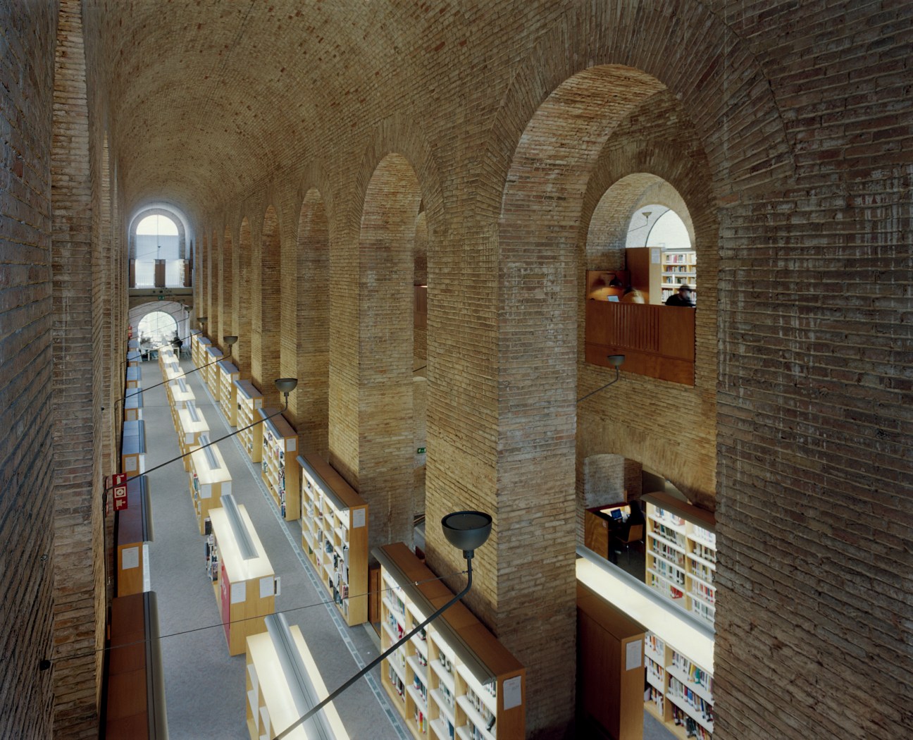
Over the course of the building’s life, it has been used as an exhibition space, an archive and a car park for the city’s police force until, in 1992, it became the property of UPF. After its acquisition, the university gathered a team of architects to develop a sensitive proposal for a new library in the historic vaults. Architects Lluís Clotet i Ballús and Ignacio Paricio i Ansuategui, of Barcelona-based studio Clotet, Paricio and Associats, won the commission and stripped the building back to its bare structure, preserving the historical brickwork. The duo then used prefabricated scaffold-like structures to create tiered floors along the edges of the structure while leaving the central nave at its original level.
It’s an arrangement that can be disassembled and feels more like a furniture fit-out that complements the building and enhances its original value, rather than an imposition on the historic structure. This is an architectural move that has also created a variety of atmospheres within the space, catering to the varied needs of its users. The powerful and open central space is an inspiring environment in which to read, while the cosy corners on its tiered levels are ideal for writing.
“What is surprising is that a structure that seems, at first sight, to be alien to the needs of a library has in fact proved to be the perfect building,” says Anna Magre, director of Biblioteca de les Aigües. The result, she says, is a library that has a monastic quality, where one can find solace from the hustle and bustle of the Catalan capital.
2.
Somewhere to reflect
Paul-Gerhardt-Kirche
Berlin, Germany
One of the most poignant examples of postwar reconstruction in the German capital stands in the southern district of Schöneberg, courtesy of long-defunct city practice Fehling+Gogel. Its jagged concrete spire is visible from afar, the Paul-Gerhardt-Kirche has long flown under the radar; visitors who press down its formidable brass door handle often have the brutalist space all to themselves.
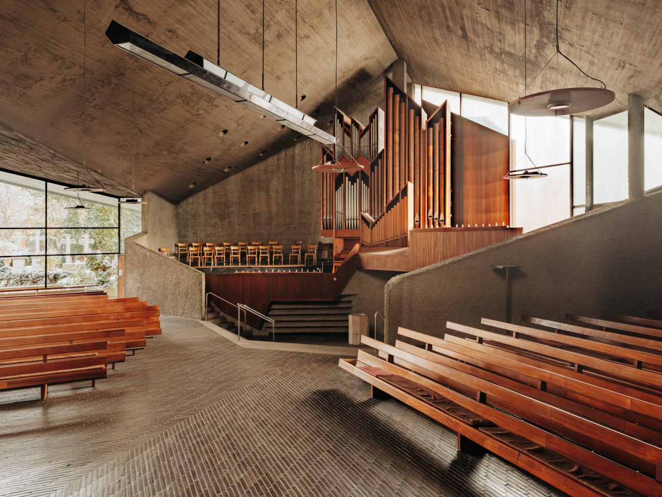
Part of Schöneberg’s old Protestant parish, the church was built in 1962 to replace a large art nouveau original that was destroyed in the war. It now stands next to a surviving 18th-century village church and, whereas the quaint elder sibling is pink-washed and upright, the béton brut Paul-Gerhardt-Kirche has barely a straight angle. Inside, the pews are placed on two sides around the altar, in a layout reminiscent of a concert hall. Indeed, the interior was modelled after the Berliner Philharmonie and it has acoustics to match.
The Paul-Gerhardt-Kirche remains in active use by the community: its choir has swelled to more than 100 members, and it is home to Berlin’s Japanese and Central African congregations. Among the parish staff, the unconventional architecture has always divided opinion. “I am one of the few who actually like it,” says Carola Dieckmann, the church sexton. She appreciates the spartan but tactile materials, the soft light falling through windows on three sides, and the communal feeling that the asymmetric space creates. “You have the sense of being enveloped by people,” she says. Such a sensation is rare in Christian churches, where the architecture is less about building a sense of community on Earth and more focused on a sense of reverence and awe for a deity above. But in Berlin the result is a building that inspires people to connect with their fellow man.
Even so, Dieckmann admits that upkeep of the heritage-protected building is a headache. She points to the milk-glass window above the entrance, which obscures the traffic outside while letting in a misty light. When one pane cracked, the parish had to track down the only workshop in Germany that could manufacture the right glass – for a six-figure sum. Twice, the new window shattered before it could be installed. Resorting to another type of glass would have lost the church its listed status. “We said we would give it one last chance before we give up,” says Dieckmann. Call it luck or divine intervention, but on the third attempt, the glass made it into place intact.
3.
Somewhere to listen
Teatro Regio
Turin, Italy
The regimented 18th-century façades of the buildings flanking Turin’s Piazza Castello give little away in terms of what hides behind them. Indeed, it’s very much by design that the Teatro Regio – renovated to the plans of eccentric mid- century architect Carlo Mollino in the early 1970s – is still so ravishingly surprising today.
“Whereas the exterior might be in keeping with the historic surroundings, the interior is anything but traditional,” says Laura Milan, an architecture historian and Mollino expert. With its quadruple-height foyer crisscrossed with concrete walkways, transparent escalators, dazzling brass light fittings, and with acres of red carpet throughout, the opera house is quite a spectacle. And that’s just the entrance.
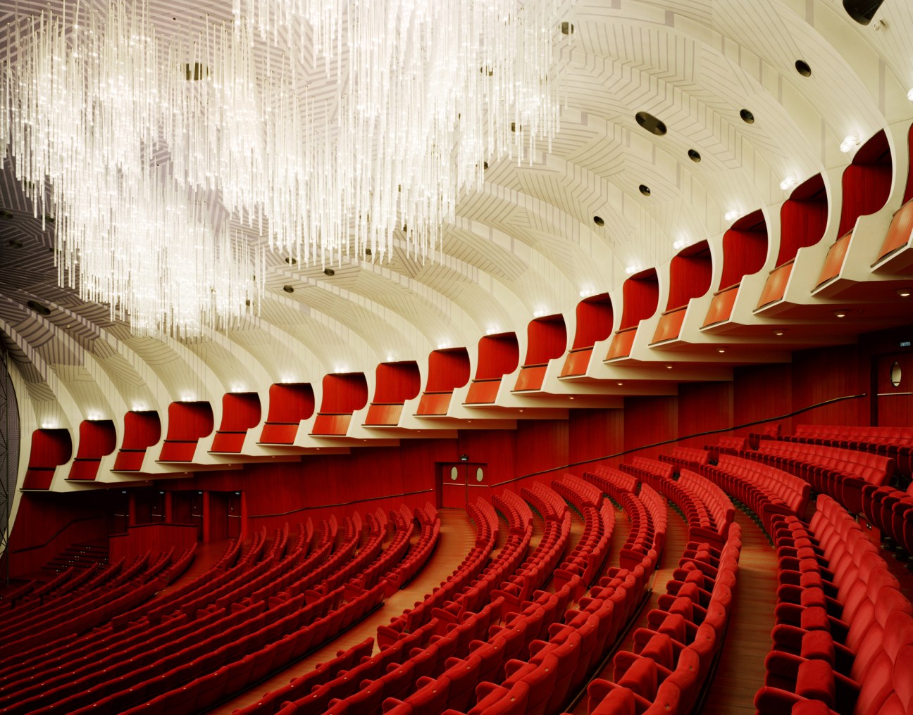
Its opening night in 1973 (when a production of Verdi’s I Vespri Siciliani was staged, directed by Maria Callas and Giuseppe Di Stefano) came after decades of anticipation, says Milan, who holds a PhD from Turin’s Politecnico, where Mollino himself taught. The original structure, an opulent affair built in 1740 to the designs of rococo architect Benedetto Alfieri, burned down in 1936. War-damaged and with other priorities, Turin was left without an opera house for almost 40 years. But beyond that impressive foyer, Mollino’s spectacular auditorium must surely have been a sight worth waiting for.
“Gone was the opera house all’italiana,” says Milan. Instead of boxes arranged in a horseshoe, Mollino designed a vast auditorium with seats sloping down to the stage, while elegant balconies add glamour and hundreds of translucent Perspex tubes create an unforgettable chandeliered ceiling. The resulting hall is mesmerisingly modern – and it’s these features that make an evening at the opera here so breathtakingly distinct from any other performance experience.
A fixation on the forms of modern technology combined with the use of sumptuous materials, Mollino’s designs are a juxtaposition, like the Turin that gave birth to him. This noble seat of the Savoy dynasty is as full of bourgeois restraint as it is of the innovative fervour that enabled auto manufacturer Fiat to be founded here. Mollino, son of a successful engineer, had plenty of that rich dichotomy that so characterises the Torinese spirit. An architect, downhill skier, aerobatics pilot and sadomasochism photographer, Mollino’s legacy is hard to gauge given his eclectic output. But taking a plush red velvet seat in his fabulous opera house is surely the best way to consider it.
4.
Somewhere to escape to
Grampians Peaks Trail Cabins
Victoria, Australia
Western Victoria’s Grampians region – also known by its Aboriginal name, Gariwerd – is renowned for its dramatic landscapes, sloping sandstone mountains and sprawling heathland. The best way to take in this landscape is to follow the Grampians Peaks Trail, which links the range’s most famous vistas, and stay at one of its campsites, where there are multiple structures created by Australian studios McGregor Coxall and Noxon Giffen.
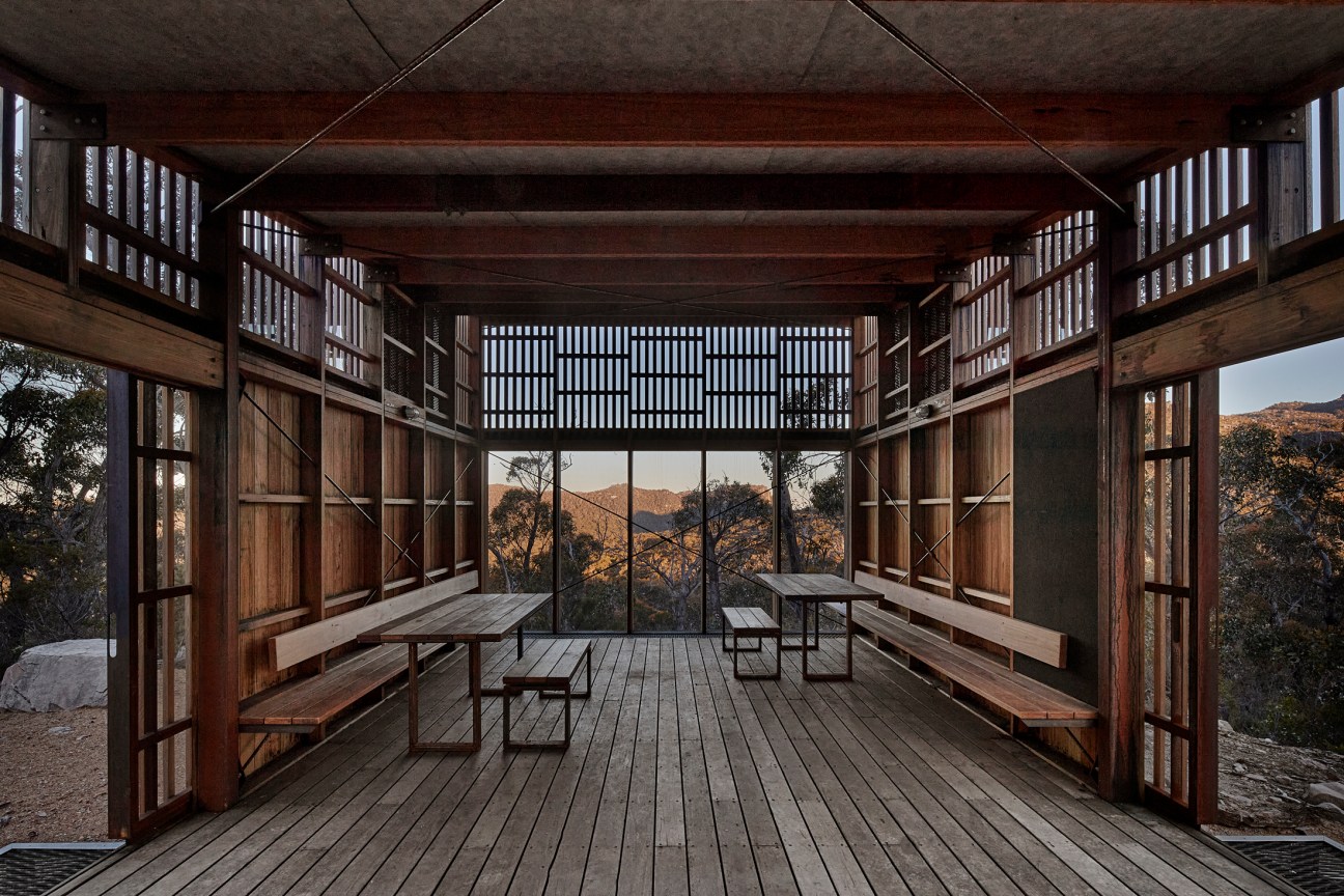
Located at 11 sites along this 160km-long hiking route, the collections of weather shelters, amenities, tent pads, furniture, communal areas and cabins have been designed to discreetly complement the geography and nature. “It’s a pretty strong experience, doing that walk,” says Justin Noxon, co-founder of Noxon Giffen. “We wanted the architecture to be strong enough to honour this majestic and quite powerful landscape but also gentle enough to be part of it rather than dominating it – because the Grampians landscape is the hero of the trail experience.”
The structures have achieved this tricky balance – and that’s what makes them so remarkable. Spending time inside the cabins and shelters increases one’s appreciation for the landscape. This was, of course, by design. Noxon Giffen took direct inspiration from the surroundings – all its structures have sloped roofs, a reference to the Grampians’ distinct peaks. In addition to creating a visual through-line and design family for the entire trail, the roofs also assist rainwater collection. The buildings mimic their backdrop in other subtle ways: in the communal shelters, a clerestory ribbon emulates a gumtree canopy, filtering the light while also providing ventiliation. Many of the materials used were local and recycled, from sandstone and mild-steel cladding to silvered and bushfire-charred gumtree timber.
It is architecture that entices people into the landscape. Those considering a walk along the route can navigate and provision themselves or opt for a short, catered guided tour, providing access to exclusive private cabins. These huts are framed by timber battens and wrapped in a translucent skin, which diffuses soft, mottled light. Inside, there are beds, mattresses and little else. There’s nothing to do but reflect, steep in the serene mountain views and connect with your fellow hikers. “Everything about the architecture is gentle, restrained and part of the landscape language,” says Noxon. It’s about making a place in this ancient landscape, in harmony with it, that enriches you, your experience and your connection with the trail.”
5.
Somewhere to learn
Gund Hall
Massachusetts, USA
The Harvard Graduate School of Design’s Gund Hall in Cambridge, Massachusetts was completed in 1972 by John Andrews having been approved by the school’s dean, and award-winning Spanish architect, José Luis Sert. Andrews, Australian-born and Toronto-based, designed the school with five floors offset like terracing, in “trays”. A single, sloped and ridged glass roof and sides covers the structure, recalling a greenhouse. The resulting building is a work of grand early 1970s exposed concrete with brutalist tendencies, crowned in glazing.
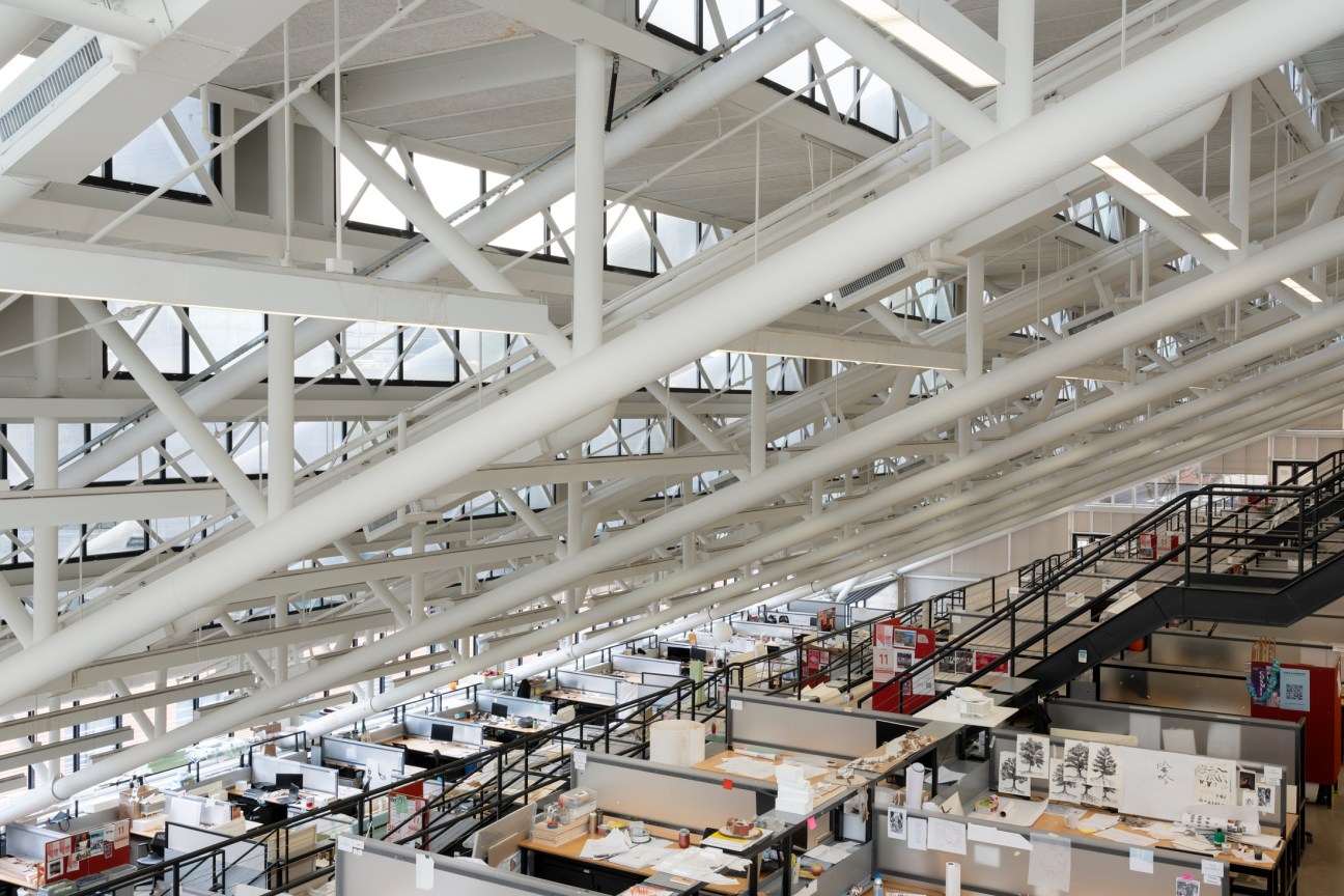
“Andrews was intent on making the studio space the heart of the school,” says Sarah Whiting, current dean of the school, which is commonly known as GSD. And, as students here will tell you, he emphatically succeeded, with the interior landscape a riot of design, from top to bottom. Many GSD students have a desk in the trays. When viewing them from the uppermost fifth tray, looking towards the first, the workspaces appear to be on a mountainside covered by all manner of models, drawings and paraphernalia. The GSD is now home to about 1,000 students and faculty members. The majority are split between three core departments: architecture, landscape architecture and urban planning and design. Much is learned in the building by simple observation, often between design disciplines that in most schools overlap only rarely. “Students feel that they have a cohort,” says Whiting. “The building renders visible what they’re doing and makes a community.”
But while the trays have helped to create an inspiring learning environment, no building is perfect. Famously, Andrews’ design leaks, is cold in winter, hot in summer and entirely unsustainable to operate. A spate of renovations will begin in summer 2024, including new, highly efficient glazing. This hi-tech minimalism comes from “respect for the architecture and architect”, says Professor David Fixler, an expert in architectural preservation and chair of the Faculty Building Committee for the renovation. “At GSD we are leaders in approaching the cutting edge with gusto.”
Yet the building is comfortingly protective of its students. Nooks, back staircases, secret lounge areas at the ends of hallways – there is always somewhere half-hidden to offer refuge. The building itself teaches a core lesson: the trick to much of good design is kindness and an understanding of human scale and needs, even in the grandest or most sublime structures and landscapes.
6.
Somewhere to dine
Casa de Chá da Boa Nova
Porto, Portugal
In architecture, there is no set formula for the perfectly composed space. It comes from trial and error. But Álvaro Siza Vieira, Portugal’s most gifted interpreter of modernism, found one solution early in his professional life with his design of Casa de Chá da Boa Nova, a fine-dining restaurant situated in a seaside suburb of Porto.
Commissioned in 1958, when Siza was just 25, the low-slung structure, which was initially a tea house, invites visitors via a series of steps and landings that lead up to the whitewashed exterior in a gradual procession. Perched a few metres from the Atlantic on a rocky outcrop, the building follows the rugged topography of the site to minimise its artificial profile, save for two mast-like angular chimneys.
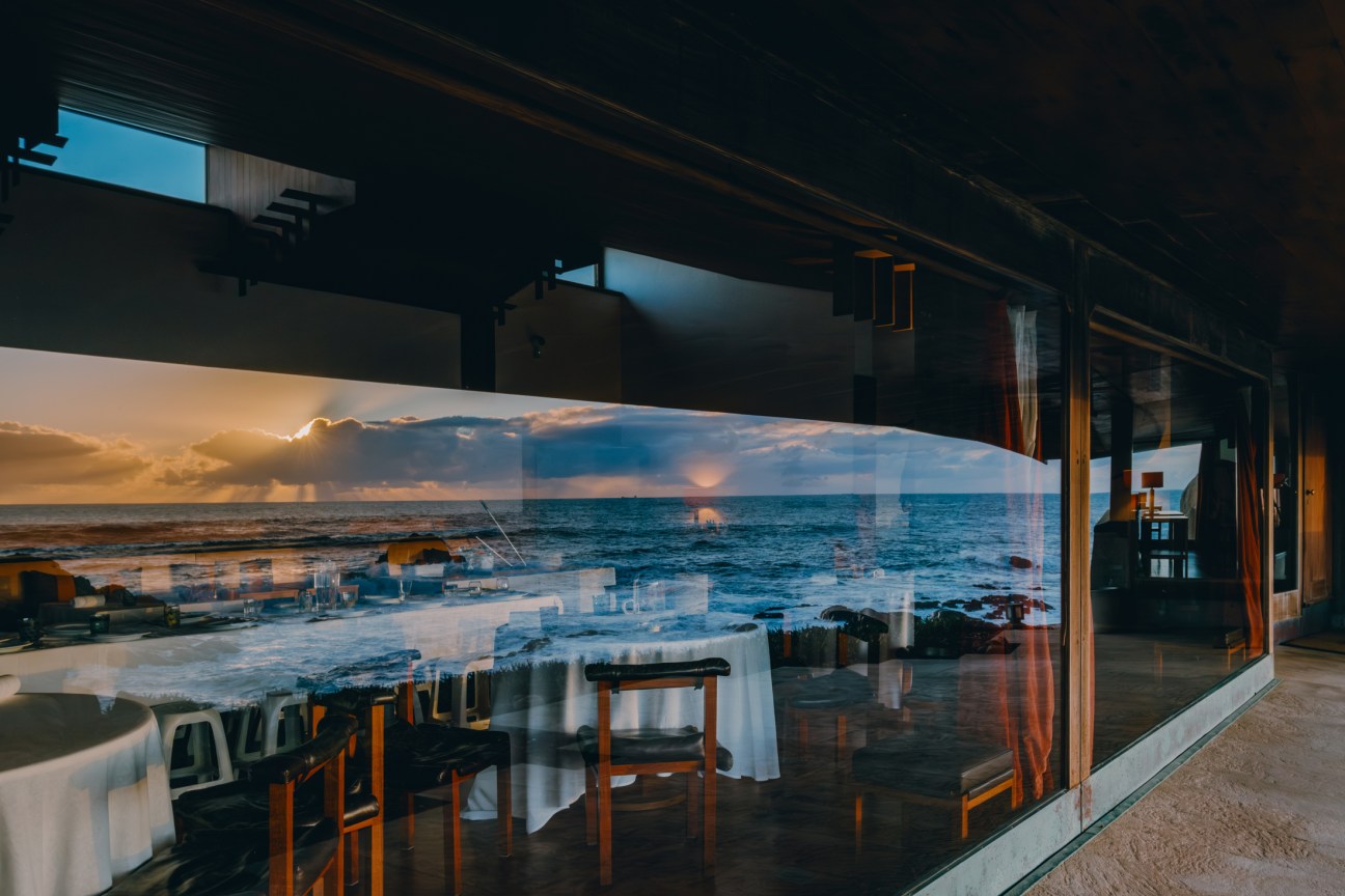
Siza used a gently sloped, terracotta-tile roof with a pattern and colour that mimics a nearby chapel. Inside, visitors are greeted by a double- height atrium lined in Afzelia, a red-hued African hardwood, and stairs leading down to a south-facing bar and a west-facing dining room that offers sweeping views of the ocean via floor-to-ceiling windows. To maintain focus on the sea, the roof extends, similar to a ship’s bridge, so that a diner’s gaze goes straight out to the blue horizon. This makes for an ideal pairing with the two-Michelin-starred restaurant’s sea-based menu.
“Our guests have direct contact with the Atlantic,” says chef Rui Paula, who notes that Siza even designed a mechanism to lower the windows to the floor to allow people to enjoy alfresco dining when weather permits. “Our menu revolves around the Atlantic, which is very cold and oxygen-rich, and fish and shellfish from Portuguese waters; this one-of-a-kind location allows us to reinforce this within a beautiful setting.”
The interior, which underwent a faithful renovation before being converted into a restaurant in 2014, reflects Siza’s obsession with detail, as he designed every aspect of the restaurant down to the service trolley and table lamps. A subtle, yet effective decorative feature is the wood slats that protrude from the ceiling in the 20-seat restaurant. For Paula, the conjunction of his finely crafted tasting menu and the rich Afzelia wood, with white walls and abundance of natural light, often leaves patrons speechless. “There is a quiet harmony in the ambience that Siza has created,” he says. “For a chef, you cannot ask for a better backdrop in which to present one’s cuisine. I never tire of coming to work when I have this space and this view to look forward to.”
7.
Somewhere to meet
Fujio
Nagasaki, Japan
Long before high streets were populated with global coffee chains, Japan had its kissaten – independent cafés that offered proper service and a place to sit quietly; some specialised in classical or jazz music, or books. Against the odds, many survive today, offering an experience that could hardly be more different from the conveyor belt we’ve all had to get used to.

Nagasaki’s Fujio opened in 1946 and is now under the stewardship of the founder’s nephew, Tatsumasa Kawamura. There have been gentle updates – this is an interior to savour with earthy colours, gentle lighting and plenty of warming timber – but the basics are the same: a cheery welcome with a glass of iced water and hand towel on arrival followed by excellent coffee and perhaps a warm egg sandwich made with fluffy white bread. Fruit sandwiches are another staple of the kissaten menu and are a particular speciality of this café.
A visit to Fujio is a reminder that architecture is enhanced by the people who inhabit it – in this case, the community in which it is ingrained. Indeed, Fujio is part of the city’s history (it even gets a mention in famed novelist Shusaku Endo’s Sand Castle). As regulars stream in and out, there’s a gentle camaraderie that only a long-time business, in cosy confines, can provide. The Japanese kissaten should be celebrated not just as a retro relic but as a great example of good hospitality. Many of us don’t relish streamed music and our name misspelt on a paper cup. “Kissaten culture is unique,” says Kawamura. “I want to keep it alive.”
The new net-zero fire station carrying the flame for considered civic architecture
Among the civic buildings that anchor an urban setting, from public libraries to neighbourhood police outposts, there’s one urban structure that holds a particular potency for the Canadian architect Pat Hanson, who co-founded her studio, GH3*, in Toronto in 2005: the fire station.
“The fire hall is one of those city buildings that is embedded in a neighbourhood,” she says. “It embodies a community’s sense of security. Even the way in which these buildings are depicted in children’s storybooks captures the excitement at watching the fire engines coming out of the station. And they’re usually built with masonry and stone, which gives them a sense of permanence and creates a feeling of trust.”

It is in that spirit that Hanson approached her design for a new fire hall in a suburban neighbourhood in the Canadian city of Edmonton, in the province of Alberta. “We would never worked on a fire station before, so that was our starting point for what we really wanted to imbue in this building – a little bit of that cultural and social context, as well as how it functions.”
Windermere Fire Station, which opened last July, is Edmonton’s first net-zero building, which means that all of the energy that the complex uses is generated by the building itself. There are 382 solar panels embedded in the long, south-facing sweep of the station’s asymmetrical pitch-roof and an underground geothermal facility, buried 70 metres beneath the complex, heats and cools the building. Any surplus power is sold on to Edmonton’s electricity grid.
The way that a fire station operates, however, made ensuring that the building wastes as little energy as possible a challenge, Hanson says. “A fire hall’s doors open thousands of times during the year. That has a huge effect on the ability to control the amount of energy that escapes, especially in winter.”
Hanson overcame that by replacing the type of doors that are common in fire stations in North America: doors that roll upwards to allow the fire engines to exit. Instead, European-style bi-fold doors were installed. “The speed at which doors open is absolutely crucial and we found that these doors could do that faster.” Minimising the number of windows in the fire engine hall and installing thicker insulation panels in the walls also help to keep the energy in.
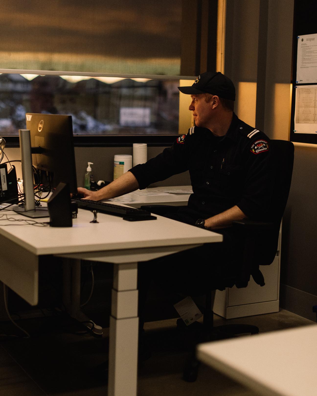
The station’s asymmetrical, pitch-roofed silhouette and exterior walls, which are in dark-grey interlocking brick, are playful nods to the residential architecture that will populate the surrounding neighbourhood once its construction is complete. It is also a reference, says Hanson, to the dual function that a fire station has to perform.
“Fire stations are very interesting building types,” says Hanson. “They are basically domestic quarters for the firefighters; while they’re on duty, they live in the fire station. So a portion of it is really like a big house. And then the rest is the kind of technical, industrial and mechanical area where the fire engines are kept. We wanted to get those two spaces to feel architecturally as though they were one. Firefighters are often the first at the scene of an emergency, so they see the worst of everything. It was important to create a feeling of peacefulness and serenity in the domestic quarters. That was key.”
Windermere Fire Station is the latest addition to the city of Edmonton’s burgeoning roster of well-designed civic architecture – an approach to urban design that has caught the attention of procurement departments at city halls elsewhere across Canada. “Culturally, it has made a huge difference across the whole city,” says Hanson. “Architecture has become something that people in Edmonton pay closer attention to. The city is really setting an example.”
monocle.livement: It takes some courage to commission civic buildings that go beyond the banal and dare to be beautiful. When it happens, it is to be applauded – and held up as a benchmark for others to aspire to.
Roger&Sons: Singapore’s next-generation woodworkers
Take one look into the Roger&Sons workshop in Singapore and you’ll know that there is something special about the operation. In place of spit and sawdust is a high-ceilinged space that’s spick and span, with woodworking benches flanked by detailed drawings and handmade objects. To top it off, the workshop is in Jalan Besar, a central neighbourhood known for its cafés and boutiques. Most of the island’s carpenters, in contrast, have plonked themselves around Singapore’s fringe. “In our effort to make carpentry more accessible and less intimidating, we wanted to be closer to people,” says co-founder Morgan Yeo.
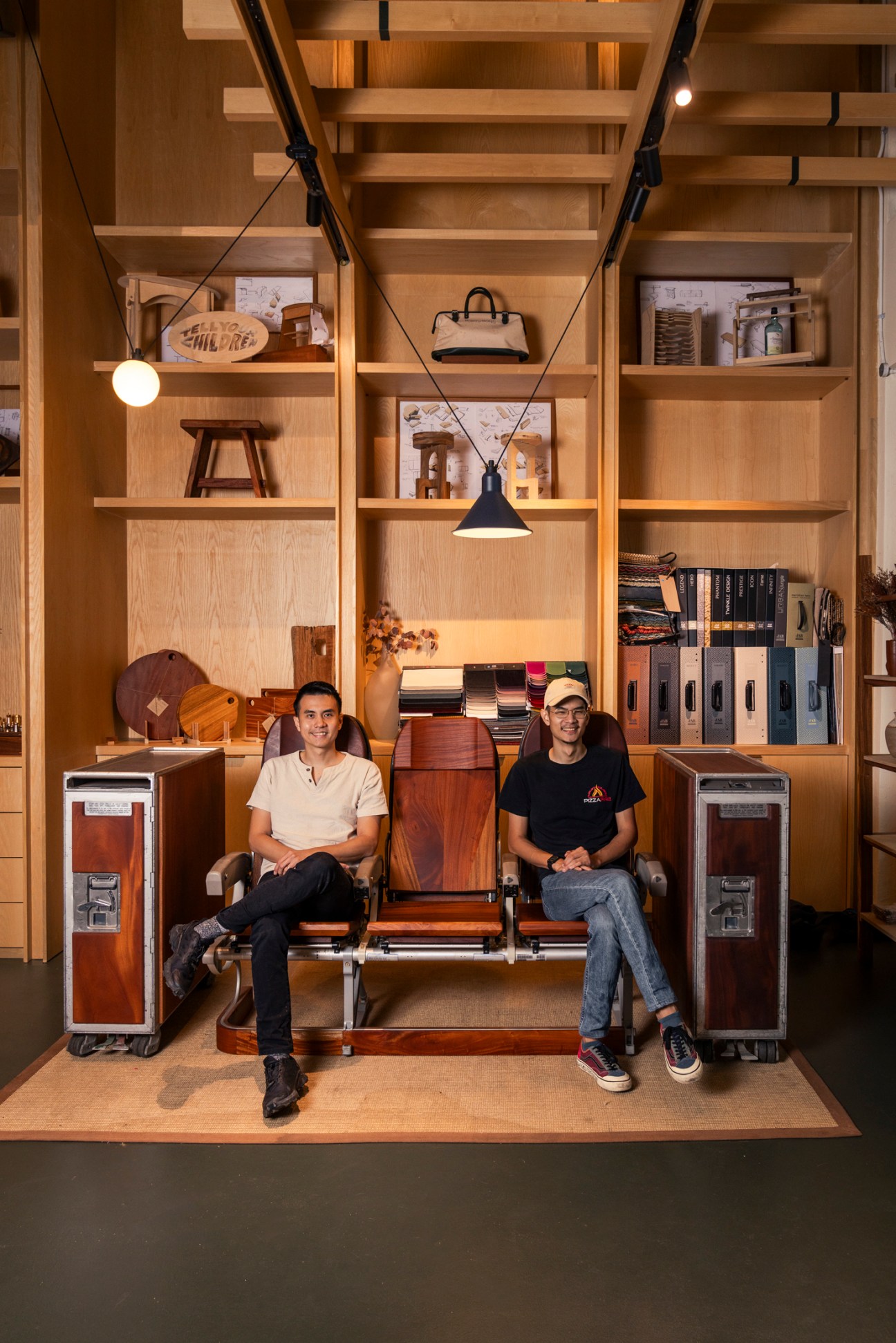
But it hasn’t always been this way. In 2014, Yeo’s father passed away, leaving behind JR&P Industries, a business that made run-of-the-mill furniture, such as kitchen cabinets and wardrobes. “For the past 50 years, the bulk of carpentry work in Singapore was basically nailing plywood with an air gun and applying laminates over it,” says Yeo. Bespoke woodworking in the city-state was a dying trade.
So when Yeo and his two brothers, Lincoln and Ryan, chose to continue their father’s legacy in 2014, they knew that they needed to go against the grain. Rebranding the family firm as Roger&Sons, they buckled down to create custom furniture. “We wanted to take on projects that most local carpenters would reject without batting an eyelid,” says Yeo.
It’s an outlook that is reflected in its portfolio: custom wooden ear cups for headphones and a levitating shaving brush are just two of Roger&Sons’ unconventional projects from the past few years. Such works often start from a personal place, as their clients are looking for the perfect solution to a specific problem. Over the course of a few weeks or even months, Yeo learns about their needs, makes prototypes, then pours himself into making the object. He sees Roger&Sons as a kind of guide who joins its client on a journey to create something that means the world to them, whether that’s an oak wine cellar for a homeowner or tables for Italian restaurant Fico.
Sustainability rests at the foundation of Roger&Sons. This is beautifully reflected in The Local Tree Project, Yeo’s ground-up initiative that salvages trees that have been felled for urban development and are considered waste. “We have stockpiles of abandoned logs in Singapore’s sawmills waiting to be turned into mulch or pallet wood, yet we’re still importing so much wood from overseas,” he says. His team extends the lifespan of this discarded timber by using it in Roger&Sons projects. Since founding the programme in 2019, it has refashioned local rain trees into benches for Singapore’s new aviary, Bird Paradise, and created a public playground in the city’s Tanjong Pagar neighbourhood using reclaimed African mahogany. In fact, 80 per cent of Roger&Sons’ work today involves felled wood from Singapore. Now other woodworking companies are open to exploring the use of these sources – all thanks to Yeo.
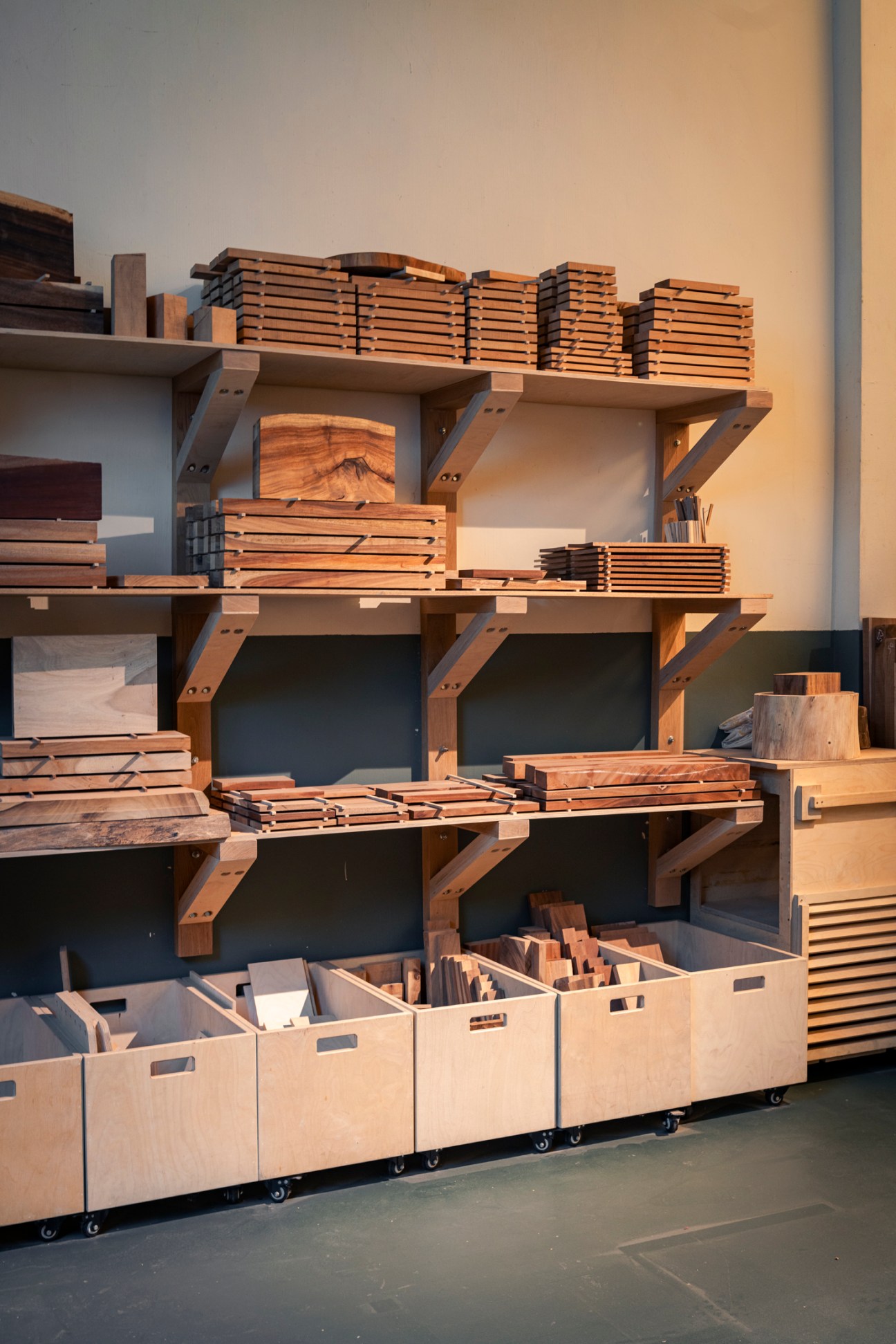
What drives Roger&Sons is Yeo’s restless pursuit in levelling up his craft. Spend some time with him and you’ll quickly learn that he never stops thinking about new ways of woodworking. “How we make a box today and how we make it in 10 years’ time will be different for us,” he says. This spirit of openness and inquiry has led him to collaborate with like-minded vanguards, even those outside woodworking. For example, he partnered with Semula, a company that processes plastic bottles into reusable high-density polyethylene, to create bespoke stools for Creamier, a local ice-cream joint. Recycled milk bottles from the shop were used to form plastic chair tops, while the legs were made from restored African mahogany.
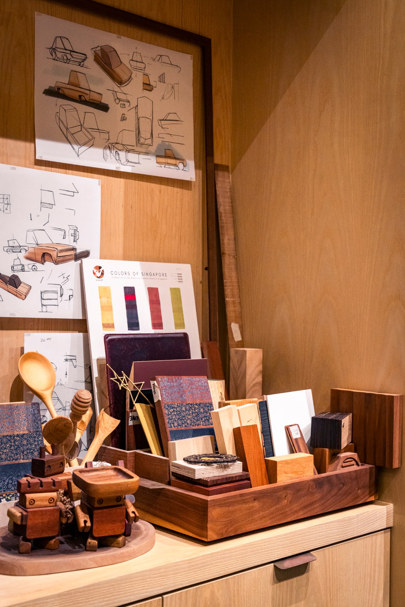
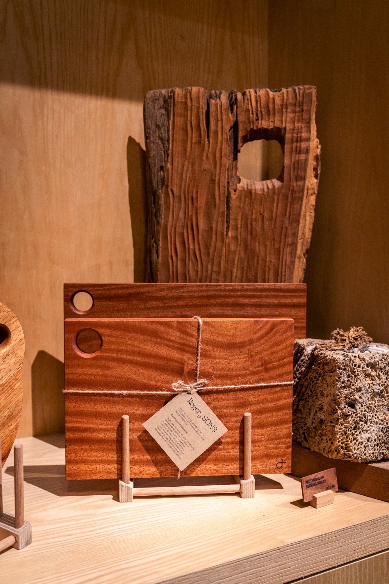
Recently, Paris-based product designer Christophe Machet and Yeo tinkered with sawdust and eco-friendly glue to create a new material for lampshades. With such blue-sky experimentations, Yeo hopes to open up possibilities for Singapore’s makers and designers. “We’ve often looked to America and Europe for cutting-edge design and materials,” he says. “But I believe that we’re able to develop innovative materials using the resources here too.”
Roger&Sons turns 10 in February, marking a fruitful decade of transformation in which Yeo and his brothers not only turned their father’s flagging business around but have forged a new way forward for Singapore’s woodworking industry. One thing stays the same, though: their palpable passion for carpentry. So what does Yeo think sets Roger&Sons apart? “A lot of heart goes into our woodworking and this will come through in our products,” he says. “When you touch it, you’ll instinctively know that it was made from love.”
rogerandsons.sg
monocle.livement: Consider bespoke furniture and fit-outs for your home. A skilled carpenter tailors to your needs. Plus, independent makers are better connected with local supply chains, limiting your carbon footprint.